- Home
- Blog
- Data Science
- Data Visualization Interview Questions

- Big Data Vs Data Science Vs Data Analytics
- Data Science Interview Questions
- Top Data Science Tools
- Data Science Tutorial
- Data Science with R Interview Questions
- Overview of Data Modeling for Unstructured Data in Data Science
- What is Data Scientist?
- What is Data Visualization?
- Data Cleansing
- What is Data Science
- What is Data Analytics?
- Job Roles For A Data Science Enthusiast
- RapidMiner Tutorial - Introduction To RapidMiner
- Top 12 Data Science Resources
- Data Scientist Interview Questions
- Programming Languages For Data Science
- MATLAB Interview Questions
- Data Engineer Interview Questions
- Toughest Courses in India
- Data Mining vs Data Science
- Data Scientist Job Description
Data visualization is a method of conveying data or information through the use of graphical elements like points, lines, and bars. It's a way to visualize information visually. It improves one's understanding of the data while making it more accessible to the intended audience.
Some things to know about Data visualization:
- Data visualization employs a variety of tools, including plots, statistical graphics, and information graphics, to convey data understandably and concisely.
- In the business world, applications for data visualization are commonly referred to as dashboards. Infographics are another well-liked format for presenting data.
We discuss the most frequently asked data visualization interview questions in this article. Based on
Top 10 Frequently Asked Data Visualization Interview Questions
- What is data modeling?
- Define "Data Wrangling" in terms of data analytics.
- What are the most important qualities of good data visualization?
- How does the method of visualizing work?
- What are the characteristics of scatterplots?
- What is a Boxplot?
- Why is sunburst visualization a better way to use sunburst plots?
- What kinds of data does Tableau work with?
- How can more than 3D be represented in a single chart?
- What is Tableau's purpose?
| If you are considering placing a job in Data visualization, enroll your name in Data Visualization Training Course to get a good score. |
Data Visualization Interview Questions For Freshers
1) What is data modeling?
Data modeling is the process of analyzing data objects used in business or other situations and figuring out how they relate to each other. Data modeling is the first step in object-oriented programming.
2) Why is data visualization necessary?
The creation of charts and graphs is only one component of data visualization. Simplifying and presenting the information in a simple and easy-to-grasp format is essential to making the data more meaningful to the audience.
| Related Article: What is Data Visualization? |
3) What are the different types of data visualizations?
Different types of popular data visualizations are pie charts, bar graphs, line graphs, and scatter plots.
4) What steps create the data analysis process?
Below are the steps that help create the data analysis process are
- Data investigation
- Preparation of data
- Modeling data
- Validation
- Model implementation and tracking
5) Is SQL a visualization tool?
Data discovery, exploration, and visualization are all made easier with the help of a SQL dashboard tool, which can be used as a part of a larger business intelligence (BI) platform. The final result is a dashboard with dynamic, interactive charts and graphs for analyzing data and discussing findings.
| Related Article: Data Modeling Examples |
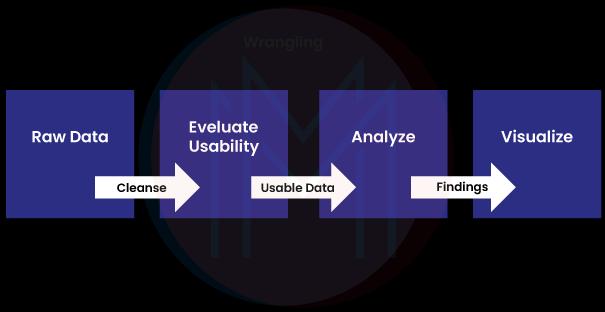
6) Define "Data Wrangling" in terms of data analytics.
Data wrangling is the process of structuring, cleaning, and enriching raw data in order to prepare it for use in decision-making. Some processes include in data wrangling are data exploration, structuring, cleaning, enrichment, validation, and analysis.
7) What is the concept of depth cueing in visualization?
Some 3D objects lack surface identification and discernible lines; to highlight the discernible lines, one should change them into dashed lines. The inability to visualize 3D objects is a fundamental issue with visualization techniques.
8) What are the main challenges facing data visualization?
Although data visualization continues to be a helpful tool for many different types of businesses, it has its own set of issues. Input errors, oversimplification, and an increasing reliance on this form of communication are some issues that still need to be fixed.
9) What are the most important qualities of good data visualization?
Some important data visualization qualities are
- Localization of information.
- Shapes of squares and circles topped with bars.
- Employing the principles of color design.
- Avoiding 3D charts in favor of pie charts can reduce chart clutter.
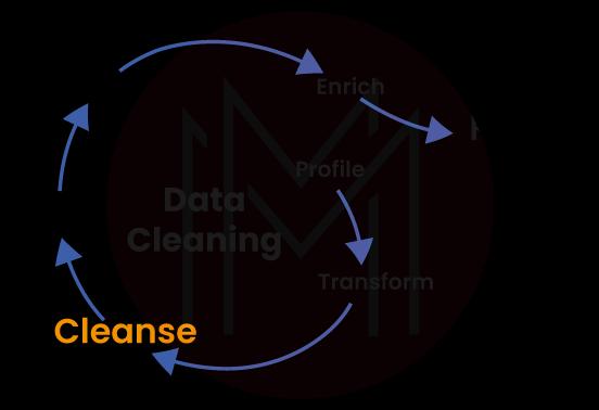
10) What is the significance of data cleansing in data visualization?
The data quality can be improved through "data cleansing," which consists of locating and removing errors and inconsistencies from the data. This critical process should be emphasized because accurate data can lead to better analysis. This step ensures that the data quality is met to prepare the data for visualization.
11) How does the method of visualizing work?
Data visualization is the graphic representation of information and data. Data visualization tools, which use visual elements such as charts, graphs, and maps, provide an easy way to see and understand outliers, trends, and patterns in data. Other visualization methods include pie and donut charts, histogram plots, scatter plots, kernel density estimation for nonparametric data, box and whisker plots for large amounts of data, and correlation matrices.

12) What's the difference between an a.twb file and an a.twbx file?
A Tableau workbook is saved as a.twb file, which stores the workbook's layout and any selections. This XML file does not include any data, but the. twbx file extension is a zipped archive that includes the. twb file, as well as any additional files.
13) What is the primary goal of data visualization?
The main goal of data visualization is to facilitate the process of recognizing patterns, trends, and outliers within large data sets. Statistical graphics, information graphics, and information visualization are frequently interchanged with one another and serve similar purposes.
14) Is Excel a data visualization tool?
Excel is universally acknowledged as one of the most effective data visualization tools that can be made available to professionals and business owners. On the other hand, this freemium spreadsheet tool comes with fundamental graphs and charts, such as Grouped Bar Charts and Pareto.
| Related Article: Top 15 Data Visualization Tools |
15) Can a pivot table be used as a visualization tool?
A pivot table is a type of data visualization tool that summarizes a table's rows and columns and allows you to rotate (or "pivot") the columns to display those summaries in various formats. Even though averages or subtotals are usually used as summary rows, other metrics can be used instead.
Data Visualization Interview Questions For Experienced
1) Does PivotTable resemble Tableau?
After all, you need to drop your fields into rows, columns, and filters to generate a summary similar to a pivot table but also includes graphics. In addition, Tableau is similar to a pivot table but has many additional features.
| Related Article: Tableau Reporting Tool |
2) What should be done with suspicious or missing information?
- Make a report detailing any doubtful information to use in the validation process. Not only should the time and date be included, but also a list of the validation requirements that were not met.
- Suspicious data needs to be examined by qualified personnel to determine if it is acceptable.
- Incorrect information must be updated and labeled as invalid.
- When missing data must be dealt with, it is best to use the analysis technique that proves to be the most efficient, such as the deletion method, single imputation techniques, mean/median/mode imputation, model-based techniques, Etc.
3) What are the characteristics of scatterplots?
- Correlation: While the two variables may have a relationship, such as when one is dependent on the other, this is not the same as causation.
- Associations: There may be links between the different factors.
- Outliers: The two-dimensional data might occasionally deviate from the norm in some situations.
- Clusters: Clusters of points on a graph represent aggregations of related data.
- Gaps: In some circumstances, combining specific values might not be possible.
- Conditional relationships: Some correlations between variables are conditional on a precondition being met.
4) What is an outlier?
The term "outlier" is frequently used by analysts to refer to an exceptional value within a sample that departs from the generally observed pattern. Univariate outliers and multivariate ones are the two categories they fit into.
5) What kinds of information are often shown by box plots? Why?
Boxplots are frequently used in the process of data representation when continuous variables are involved. When applied to discrete data, the plot must always produce correct results.
6) What is a Boxplot?
A Box and Whisker Plot, also known simply as a Boxplot, is a graphical representation of data distribution through its quartiles. The graph is presented in the form of a rectangle with lines emanating from both the top and the bottom. These lines, called "whiskers," depict the variability outside the upper and lower quartiles.
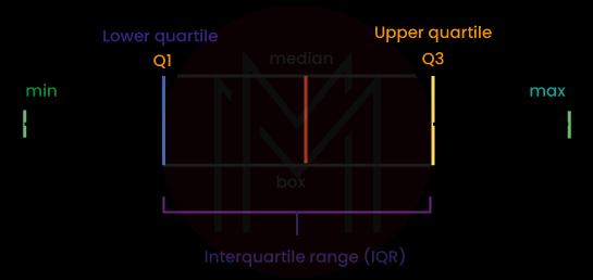
7) When should boxplots be used as opposed to histograms?
Box plots are used to show the statistical distribution of a single variable or to compare the statistical distributions of two or more variables. The statistical summary of the five numbers is shown visually. Boxplots use less space than histograms to show how the data is likely to be distributed and are better at comparing data sets.
8) Name some R libraries that are useful for data visualization.
ggplot2, Lattice, Leaflet, Highcharter, RColorBrewer, Plotly, sunburstR, RGL, and dygraphs are some of the R library plotting and graphing tools available.
9) What makes nominal data different from ordinal data?
- Information that doesn't fit neatly into any established categories is called nominal data.
- Ordinal data are categorical data that have a predetermined order.
10) What are the benefits of dot plots over bar charts?
- The dot plot takes up less space when there are many categories because it can fit more dots in a given area than bars.
- The dot plot lets you see two values at the same time.
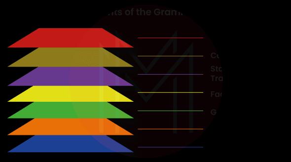
11) What are the ggplot2 library's key components or grammar?
The following components are present in every ggplot2 package visualization in R:
- Themes: Controls the display's details (i.e., size, fonts, color Etc.)Coordinates: This is from the perspective of visualization (i.e., tables, grids Etc.)
- Faceting: Allows for "visual drill-down" into the data.
- Layers: What can be seen or pictured on plots (i.e., points, lines, maps Etc.).
- Scales: Finds a way to convert the data into a visual format.
- Data: The building blocks of your visualization.
12) What is Row-Level Security?
Row-level security is a fundamental data protection method that limits access to particular rows or columns of a database. It does this by encrypting the data in those rows and columns. Under the row-level security model, every row in the table has its own set of permissions settings for each column. The settings for these permissions are referred to as row-level permissions.
13) What exactly is Rmarkdown? What function does it fulfill?
The generation of dynamic documents and reports that include R widgets and outputs can be accomplished with the help of a tool called RMarkdown, which is made available by R. A document that uses R Markdown is written in markdown, which is a straightforward, plain text format, and contains embedded R code.
14) Which Python libraries do data scientists use to plot data?
Matplotlib is the library that is used by default in Python for plotting data. The plots that are developed using this library have much room for improvement if the author wants them to appear polished and professional. Many data scientists choose Seaborn as their plotting tool because it only requires one line of code to produce aesthetically pleasing and helpful plots.
15) Which Python plotting library do you like better, Matplotlib or Seaborn?
- The Matplotlib Python library is used for plotting but requires extensive customization for good results.
- Seaborn aids data scientists in creating meaningful plots that are both statistically sound and aesthetically pleasing. There are a few different ways to approach this question, each tailored to specific data plotting requirements.
16) What is Tableau's purpose?
Tableau is an engine for visual analytics that makes it easier to develop interactive dashboards for visual analytics. It paves the way for individuals and organizations to realize Tableau's full potential in their work.
17) Why is sunburst visualization a better way to use sunburst plots?
Sunburst visualization is superior for hierarchical plots because it is ideal for clearly representing hierarchy. Color can be used to highlight particular categories or hierarchical groupings, making it an excellent choice for representing hierarchy.
Most Common Data Visualization FAQs
1) What kinds of data does Tableau work with?
The various forms of data are:
- Date values
- Boolean
- Cluster groups
- Geographic values
- Date & Time values
- Numerical values
- Text string values
2) What exactly is a scatter plot? What data types work best in scatter plots?
Using data points randomly distributed across a chart, a scatter plot can be used to show the level of association between two or more variables. It is best utilized when there is no consideration of time, and it can assist in demonstrating the relationship between the variables, such as a positive, negative, or absence of correlation. For instance, if you wanted to demonstrate the connection between height and weight effectively, you could use a scatter plot.
3) How can more than 3D be represented in a single chart?
In most cases, the data is depicted in the charts by using the dimensions of height, width, and depth in the images. However, to visualize more than three dimensions, we use visual cues such as color, size, shape, and occasionally animations to depict changes over time.
4) How does the 3D transformation of data visualization work?
The data must first be transformed in 3D because this provides a clearer and more all-encompassing picture of the information and the opportunity to examine it in greater detail.
The following are the general steps:
- Viewing Transformation
- Modeling Transformation
- Workstation Transformation
- Projection Transformation
Conclusion
After a quick look at data visualization, it's clear that the field can be used in many different ways. A good data visualization should use graphics to show a set of data clearly and easily to understand. We also provided data visualization interview questions for those seeking questions that will help them land their dream job by answering all of the questions quickly during the interview. To that end, I hope you find these interview questions helpful in preparing for the test.
 On-Job Support Service
Online Work Support for your on-job roles.

Our work-support plans provide precise options as per your project tasks. Whether you are a newbie or an experienced professional seeking assistance in completing project tasks, we are here with the following plans to meet your custom needs:
- Pay Per Hour
- Pay Per Week
- Monthly
| Name | Dates | |
|---|---|---|
| Data Science Training | Jul 14 to Jul 29 | View Details |
| Data Science Training | Jul 18 to Aug 02 | View Details |
| Data Science Training | Jul 21 to Aug 05 | View Details |
| Data Science Training | Jul 25 to Aug 09 | View Details |

Madhuri is a Senior Content Creator at MindMajix. She has written about a range of different topics on various technologies, which include, Splunk, Tensorflow, Selenium, and CEH. She spends most of her time researching on technology, and startups. Connect with her via LinkedIn and Twitter .


