
- Alteryx vs Tableau
- The Assistance of Tableau Rest API, You Can Now Automate Server Administration Tasks
- How to Blend Different Data sources in a Single Worksheet in Tableau
- Tableau Essentials
- Components Of Data Warehouse - Tableau
- How to Connect to Your Data and Generated Values of Tableau
- Create Visual Analytics Using Tableau Desktop
- Generate a new data with forecasts in an ad hoc analysis environment
- Future and Career Growth as a Tableau developer
- Import Custom Geocode Data / Map in Tableau
- Tableau Essentials: Chart Types
- How to Enhance Views with Filters, Sets, Groups and Hierarchies in Tableau?
- How to become a Tableau Developer -A Perfect Guide
- How to edit views in tableau server?
- Detailed Guide to Get Certified in Tableau
- Building Interactive Tableau Dashboards
- Introducing the Tableau Desktop Workspace - Tableau
- How to Join Database Tables with Tableau
- Introduction to Joins In Tableau
- Lumira Vs Tableau
- Top Reasons To Learn Tableau
- Authoring and editing reports via server in tableau
- Tableau 10.2.1 – New Capabilities and Corrected Issues in TABLEAU
- Tableau Advanced Interview Questions
- Introduction to Tableau API
- Why Tableau is Considered the Best BI Tool ?
- Growth of Tableau BI (Business Intelligence) Among Trending Technologies
- Tableau Calculated fields
- Table calculation in Tableau
- Tableau Careers and Salaries
- Tableau Case Statements
- Tableau Certification
- Create Pie charts, Scatter Plot, Area Fill charts & Circular View in Tableau
- Tableau Competitors
- Tableau Data Blending
- Tableau Desktop Tutorial
- Tableau Drivers
- Tableau Ecosystem Contains Of Different Components
- Tableau Interview Questions And Answers
- Tableau Latest Version
- What are the web mapping service pros and cons in tableau?
- Tableau Maps Tutorial
- Tableau Parameters
- Tableau Reporting
- Tableau Reporting Tool
- Tableau Reshaper Tool
- Tableau Server
- Tableau Server interview Questions
- Tableau Server Tutorial
- Tableau Show Me feature
- Tableau Version History
- Tableau Visualization Course and its advantages in the current job market
- Tableau vs Cognos
- Tableau vs Domo
- Tableau vs Looker
- Tableau Vs Microstrategy
- Tableau vs Power BI
- Tableau vs QlikView
- Tableau Vs Spotfire
- Animating maps using the pages shelf or slider filters in Tableau
- Succession Planning analytics and Hr Dashboard in Tableau
- How to publish dashboards in tableau server?
- How Tableau geocodes your data?
- How to use Date Field in Tableau?
- How the Table Calculations Use Building Formulas in Tableau
- How to Add Flexibility to Calculations with Parameters in Tableau
- How to Build your first Advanced Dashboard in Tableau?
- How to Change the Scope of Trend Lines Tableau
- How to configure tableau server for the first time?
- How to consume information in tableau server?
- How to create a Standard Map View in Tableau?
- How to Create Calculated Values using Dialog Box in Tableau
- How to Customize Shapes, Colors, Fonts and Images in Tableau?
- How to deploy tableau server in high availability environments?
- How to deploy tableau server in multi-national entities?
- How to Determine your Hardware and Software needs in Tableau server?
- How to embed tableau reports securely on the web?
- How to improve appearance to convey meaning more precisely in tableau?
- Install Tableau Server and Reasons to Deploy it
- How to Install the Command Line Tools in Tableau?
- How to monitor activity on tableau server?
- How to organize reports for consumption in tableau server?
- How To Sort Data In Tableau
- Use Custom Background Images to Plot Spatial Data
- How to use maps to improve insight in Tableau?
- How to use performance recorder to improve performance in tableau server?
- Tableau Subscription and Report Scheduling
- How to use tabadmin for administrative task automation in tableau?
- How to Use Table Calculation Functions in Tableau
- Learning to leverage tabcmd in tableau
- Leverage existing security with trusted authentication in tableau server
- Managing tableau server in the cloud
- Planning for a successful tableau deployment at ACT
- How to Plot Your Own Locations on a Map in Tableau
- Tableau Self-Service Ad Hoc Analysis with Parameters
- Quality metrics in a hospital in tableau
- Trend Lines and Reference Lines In Tableau
- What Are Calculated Values and Table Calculations in Tableau?
- What are the advanced chart types in tableau?
- Tableau Dashboard Best Practices
- What are the common use cases for tabcmd in tableau?
- What are the licensing options for tableau server and tableau online?
- What are the Options for Securing Reports in Tableau?
- Sharing Connections, Data Models, Data Extracts in Tableau
- What are the tips, tricks and timesavers in tableau?
- What are the typical map errors and how to deal with them in tableau?
- What do tabcmd and tabadmin do in tableau’s command line tools?
- Tableau Aggregate Functions
- What is the right way to build a dashboard in tableau?
- What is the wrong way to build a dashboard in tableau?
- What kinds of tasks can be done with tabcmd commands
- When and how to deploy server on multiple physical machines in tableau?
- Tableau Extracts or Direct Connection - When to Use
- The Practicality of Using Tableau Mobile to Create Visualization
- Web Data Connector in Tableau Server
- Data Visualization and its influence on Businesses
- Tableau Charts Types
- How to Use Date Functions in Tableau
- Tableau Architecture and Ecosystem Components
- Looker vs Power BI
- How to Create Sets in Tableau
- Tableau Projects and Use Cases
- Tableau Integration with Salesforce
- Excel vs Tableau
- Tableau Server Administration
We are flooded with information day-in-day-out through a lot of sources around us. This has been the case since technology has intervened to connect people, places, and things. We are a part of big data sources to the world beneath our computer screens, where the data is dealt with for various purposes.
As a part of the tech industry, we often use this data to analyze and create a new feature/tool/technology and overwhelm this world with another one.
With the magnitude of data available, data curation and analysis form the fundamental procedures in handling data. We often end up with mathematical figures and numbers through the obvious ways of data analysis. To communicate the results effectively, we often have to depend on effective data visualization tools.
Data visualization tools are the software programs that typically display the data in a more understandable and appealing format; Say as graphs, colors, and charts. Tableau is one of the most popular tools in the industry today.
Tableau Tutorial for Beginners
What is Data Visualization
Data visualization is defined as a process of visual communication. It is associated with the conversion of data into a visualized format that allows a user to find hidden trends in data. It is quite challenging to understand the exact meaning of the data, which is in a text format. So to make the complex data into a simplified, and understandable format, we use data visualization tools that represent the data in a graphical format with the help of charts, maps, and graphs. Data visualization tools enable us to spot the patterns, outliers, and trends in data.
Importance of Data Visualization
The human brain understands and remembers the pictures and graphical formats faster than the text. Data visualization helps you in the conversion of complex data into a graphical format, whereby you can understand the state of your business. Below mentioned are the elements that made data visualization so popular.
- Absorbs information quickly
- Understands your next step
- Predicts sales
- Connect the dots
- Understands your customer interest
- It makes the data understandable to all levels of employees.
- Makes the insights shareable
- Finds the outliers

Data Visualization Tools
There are a variety of data visualization tools developed, for various needs and applications. Here are some of the most used tools in the market. Let's understand each one of them in brief.
1) QlikView
 QlikView is one of the reliable visual analytics tools, developed by Qlik. It has good data visualization features and the best trade-off point for the tool is that it has in-memory data storage, which reduces data overhead on your disk memory. It can be used to quickly analyze data in multiple dimensions.
2) Microsoft power bi
 Power BI is the business intelligence tool developed as cloud-based software, which provides a complete overview of the most critical data.
It is empowered to connect to most of the data sources available and simplifies the process of data evaluation and analysis by providing a very interactive dashboard with impactful visuals and reports.
3) IDQ
 Informatica Data Quality is one of the popular data quality tools, which is used to curate, clean, analyze, visualize, and scorecard the data. It is mainly used for data profiling and quality analysis.
It is available in two versions.
a) Informatica developer
b) Informatica analyst
| If you would like to Enrich your career and get a certified professional, then visit Mindmajix - A Global online training platform: “Tableau Certification” Course. This course will help you to achieve excellence in this domain. |
4) Datameer
 Datameer is a data analysis tool that is capable of handling the agile data analytics lifecycle completely. It curates, prepares, analyzes, and visualizes data to provide higher-end data analysis outcomes.
It has a very intuitive UI that enables the users to data-mine without having to code extensively.
5) Excel
 Excel is a very fundamental and apparent tool that is available for all for data visualization. There are features of Excel that can be explored to depict the data analysis results in a more impactful way. Excel charts and formatting features can be used to highlight the required information to understand the analysis better.
6) Tableau
 Tableau is the front runner in the BI tools available in the market. It is programmed to create and distribute an interactive and ingenious dashboard that visualizes data to represent the variations, trends, and density of data.
This tutorial is dedicated to understanding the need of Tableau, its distinct features, and its implementation.
This article is designed to be the one-stop destination for Tableau.

What is Tableau?
Tableau is a popular and one of the widely accepted data visualization tools. It converts the raw data into a format that can easily be understood by anyone. Data visualizations are made simplified with the help of tableau, and you can present the data in the form of dashboards and worksheets. The employees at all levels can easily understand the data created by Tableau. Using Tableau, a non-technical user can also create dashboards.
The top features of the tableau are
- Real-Time Analytics
- Data Blending
- The collaboration of data.
Why tableau?
There are many BI tools available in the market, as we have seen under the previous heading. But there are certain distinct features of Tableau that make it stand out to be the best. One of the useful features is that it ingests data from any data source and creates impeccable visuals on dashboards. It is built with data visualization best practices and is constantly listening to its user community to accommodate the demands of the new releases.
Tableau Products
Understanding Tableau as a platform compels us to understand Tableau as an enterprise. The entirety of the platform can be understood upon knowing the products of Tableau that comprise it. Each of the Tableau products has its own application in a specific environment. These products are discussed below.
1) Tableau Desktop
Tableau Desktop lets you utilize the powerful features of Tableau, in a user interactive dashboard environment. You can connect to any sort of data source, be it live or a cloud source. You can create intuitive charts and reports with deep analytics features like regression, correlation, and many other drag-drop features. You can also create interactive maps of the data by addressing the "where" and "why" details of it.
2) Tableau Prep
Tableau Prep is the special feature of Tableau that reduces the human effort of data prep before the data analysis. The process of data cleaning, shaping, and combining will be performed faster and better with Tableau Prep Builder. Tableau Prep conductor, which is part of Tableau Prep will enable you to share the prepared data flow and manage the same across the organization.
3) Tableau Online
Tableau Online enables the user to achieve mobility in data visualization. It basically provides an analytics platform hosted on the cloud. You can share the created dashboards and reports with anyone. You can also invite your team members and colleagues to explore the hidden capabilities of your dashboard. Basically, you can access data using a browser or a mobile app of Tabeau.
4) Tableau Server
Tableau server lets your data extend across the organization for easy access. It assists in the ease of deployment, integration and enhances the scalability and security of the data involved.
5) Tableau Public
This is the free version of Tableau available online. Here, the dashboards and work cannot be stored locally, rather everything will be stored on Tableau's Public Cloud. This makes it open for any user to view and download the saved work. Hence there is no privacy or security against the data in this product. However, this is the best for those users who want to learn about Tableau and get acquainted with its environment.
6) Tableau Reader
Tableau Reader is the product that is built to view the workbooks and the files shared. The data can be filtered but the modifications are limited. It allows any user to view the dashboards and the files shared through the Tableau Server. It, however, does not guarantee any security.
Leave an Inquiry to learn Tableau Online Training in Bangalore
How does Tableau Work?
The main goal of Tableau is to form data visualizations that enable the readers to understand and analyze data better. To start with the data, Tableau connects to the data source of various forms and extracts the data of interest. The data sources supported in Tableau are both local files and the remote server databases.
Some of the examples of local data files are:
- Access
- Excel
- Statistical File,
- Text File, or
- Other Database files
Local connection of data source gives better processing speed compared to the local servers.
Some examples of the remote data servers are:
- Tableau Server
- Google BigQuery
- Google Analytics
- MapR Hadoop Hive
- Hortonworks Hadoop Hive
- IBM BigInsights
- IBM DB2
- IBM Netezza
- Microsoft Analysis Services
- Microsoft SQL Server
- MySQL
- Oracle Essbase
- Oracle
- PostgreSQL
- SAP
When the Tableau application is launched, ready data connectors are available on the screen, which allows the user to connect to any of the data sources.
The data thus extracted is put to use on the Tableau Desktop. This data is worked upon by the analysts and data engineers to produce the required reports and data visualization charts. The created dashboards and reports can be shared across as a static file. This file can be viewed on the user end, using Tableau Reader.
The data extracts can be published into the Tableau Server, where collaboration, data security, and other features are supported. Distributing the files to the Tableau Server enables the files to be viewed across any platform from all locations.
| Related Article: What is Anaplan |
Features of Tableau
1) Numerous data connections
The most relevant and powerful feature of Tableau is the support of various data sources. The data connection can happen to the data warehouse of any nature, be it a locally available database or the database server. This empowers the users to undeniably go for Tableau, as the kind of data sources available in the day-to-day market is a multitude.
2) Secure collaboration
Due to numerous options for data connections available in Tableau, there is a high need for secured connections. This is certainly ensured in Tableau where there is embedded row-level encryption and permission authentication for data access.
3) Embedded dashboards
Embedded dashboards and views are the integral features of Tableau. You can embed the intuitive dashboards and views into your webpage and blogs. These views will be updated automatically with the changing underlying data in Tableau Server or Tableau Online.
4) Live and in-memory data
The data availability in Tableau is in two ways. The data can be stored in memory, without consuming the disk space or can be consumed from the live connections. However, the option remains open to the application environment and demand.
5) Mobile optimized designs
The tableau application is now available on Mobile. The necessity to keep a continuous track of data has led to the mobile-optimized Tableau designs that give an insight into the Tableau Server and Tableau Online.
6) Drag-and-drop integration
While curating and analyzing the data to form visual representations, there are many tools available that aids the data formatting. These tools are available in the drag-and-drop format, which makes it easy to create dashboards and visuals.
7) Automation functionality
Tableau supports the automation of mundane and tedious tasks. Repetitive tasks like data extraction can be automated by running custom scripts. You can also program the Tableau Server content, like workbooks, users, and data sources.
Tableau Architecture
Tableau follows the famous client-server architecture with the n-tier model. The Tableau Server caters to web clients, mobile clients, and desktop-installed software. Tableau Server can run both on virtual and physical machines and is an integrated environment that supports multi-user, multi-process systems.
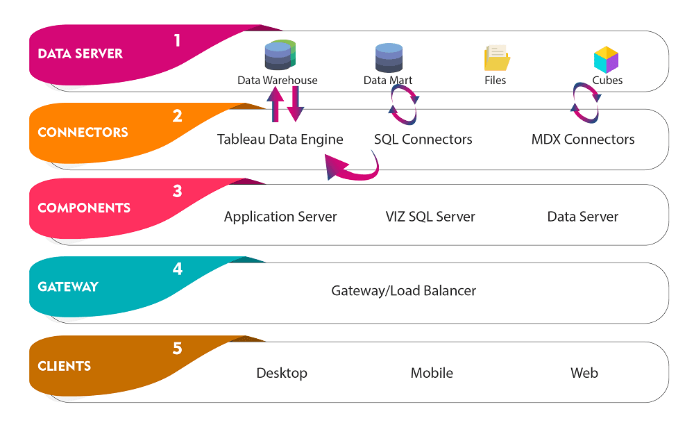
The above picture represents the architectural diagram of Tableau. There are various layers in Tableau Server that constitutes its architecture. They are discussed below:
1) Data Server
The data server is the data source that is the main data provider for analysis. Data connectors are available in Tableau, which is compatible with numerous data servers available. The data server connected can be an on-premise one or a remote server. It can blend the data acquired from the heterogeneous environment and can form relations between various sources.
2) Data Connectors
Data connectors are the intermediate interfaces that connect Tableau to the external data source. The Tableau has ODBC/SQL connector, which can connect to any data source through their native connector. Tableau can either go for a live data connection or have in-memory data stored.
a) Live Connectors
Tableau can send the current state information of the data through dynamic SQL or MDX statements, which will be directly sent to the database. This prevents the importing of all data and provides a higher-end data association with limitless data size. Hence Tableau has emerged to be one of the best front-end analytics clients to many big and small organizations in the world.
b) In-memory Data
In-memory data storage will extract the data from the source in a single tick. The data will be stored within the Tableau memory and hence while performing any analytics on the data, the reach will be better and implementation will be faster. It also prevents memory storage on the disk.
3) Components of Tableau Server
There are 3 different components of the Tableau server
a) Application Server
The application server is responsible for authentication and security. It stores a session ID for every login and authenticates it against the stored information.
b) VizQL Server
VizQL Server is responsible for converting the queries from the data source into images. The client requests will be forwarded by the VizQL server to the database as queries. The response returned will be converted to images by this server and will be presented as a visualization aid to the user. These images will be stored in the cache by Tableau for faster retrieval. However, the authenticated users can share the cache across the distributed systems to access the images.
c) Data Server
The data server is the main data management system. It stores data from external data sources. It provides functionalities like data security, data storage, metadata management, data connection, and driver requirements. It holds all the data such as calculated cache, sets, parameters, metadata, etc. The data server can either create a live connection or provide data extraction.
Visit here to learn Tableau Online Training in Hyderabad
4) Gateway
As the name suggests, Gateway acts as an interface to receive client requests and forward them to the different components. The main function of the gateway is to forward the requests to the external load balancer for processing. In case of the absence of an external load balancer, Gateway itself acts as the load balancer. In single-server configurations, one primary server or a gateway manages everything. In multi-server configurations, only one physical system works as the gateway while others work as the worker servers. In any case, there can be only one primary server (gateway).
5) Clients
The clients are the dashboards and the views that are edited by the users. This UI cancan be provided by many clients such as Tableau Desktops, web browsers, and mobile applications.
An Introduction to Tableau Workspace
Tableau Workspace
Tableau is developed to present a simpler workspace for effective user interaction. The basic workspace infrastructure looks like below:
The main Tableau window looks like this. It consists of menus, toolbar, cards, sheets, data windows and shelves, and legends.
The sheets are the worksheets or the dashboards. Worksheets are the spaces where you perform the drag-and-drop tasks to develop views and visual structures. The customization of the views can be made by resizing, adjusting, and moving the assets.
All the worksheets you ever create will be shown on the dashboard.
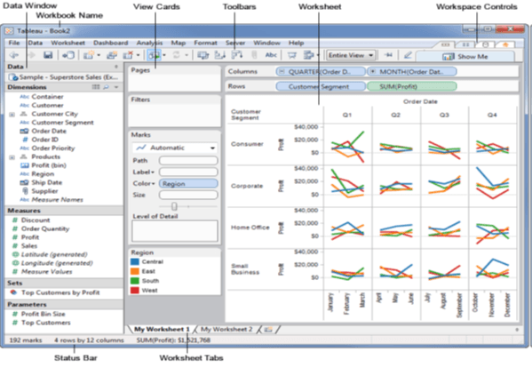
Every view you will ever create will be from this dashboard and will have similar controls present that can be applied to it.
| Read more about Tableau Workspace |
Tableau Charts
Tableau can create a visually impactful representation of data in the form of charts and graphs. This section is dedicated to learning charts in Tableau.
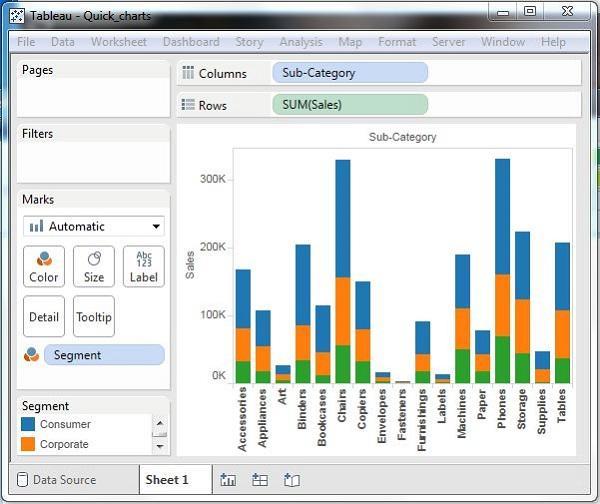
1) Bar Charts
The bar chart represents the data on a graph in the form of rectangular bars, where the height represents the value of the variable.
You can produce a bar chart in Tableau in two ways:
a) By drawing the dimension on the row and raising the height to the value on the column.
b) The bar chart option in the Show Me Button.
Note: If the data is not appropriate to draw the bar chart of the values, then the show me button remain disabled.
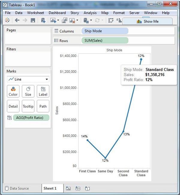
2) Line Charts
The line chart is a simple representation of variation in data through a line.
A measure and a dimension are taken on the dual axis system and the values conclude to a point on the graph where two co-ordinate value pairs meet. This extended to join all the points creates the Line Chart.
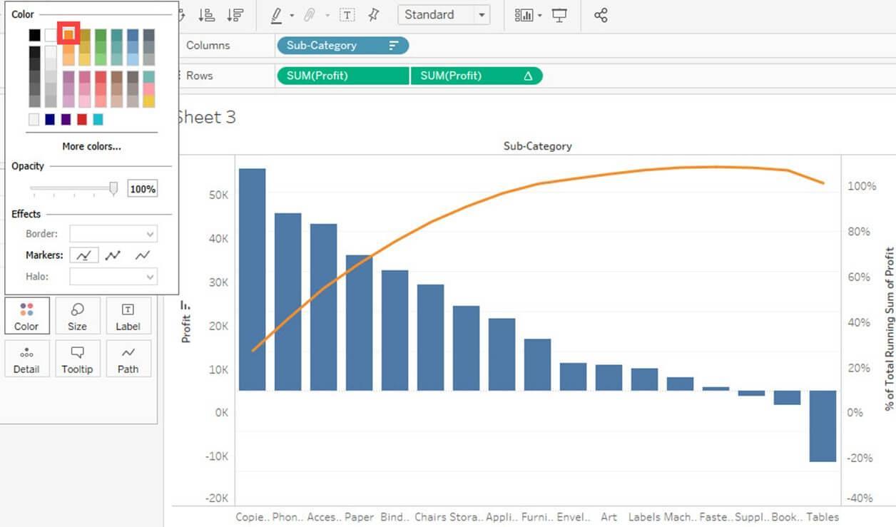
3) Pareto Charts
A Pareto chart is characterized by both the line and the bar graphs. Here the same values of measures and dimensions are considered to plot the graphs, however, the measures are manipulated differently.
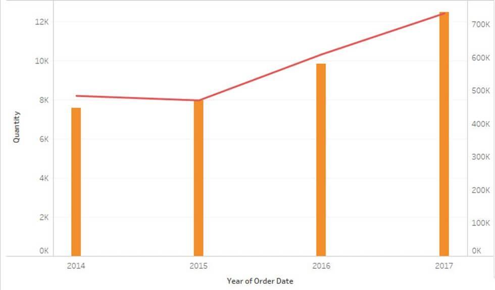
4) Area Charts
Area charts depict the measure of a certain quantity over a period of time. The area between the line graph and an axis is shaded/colored to represent the measure of the quantity.
The graph below represents the area chart.
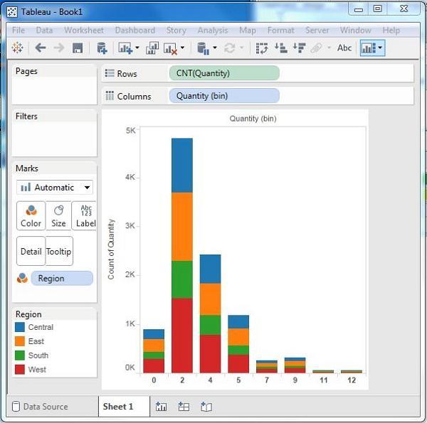
5) Histograms
The histogram represents the frequency of a value in a range. It is a group of bars of a bar chart but in a continuous range.
The height of each bar in the histogram represents the number of values present in that range.
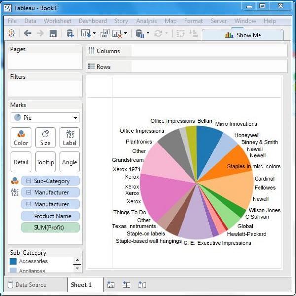
6) Pie Charts
The pie chart is described with a circle where each sector represents a data measure. Each sector gives information about the different parameters and is represented with a unique shade/color.
You can create a pie chart using the option from the Marks Card.
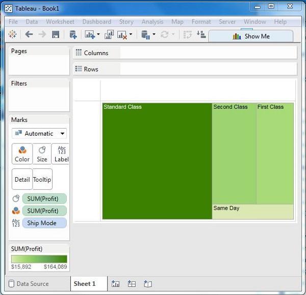
7) Tree Maps
Nested rectangles represent a treemap. The dimensions represent the structure of the treemap while the measures define the size and the color of each.
A treemap can be constructed with one or more dimensions and one or two measures.
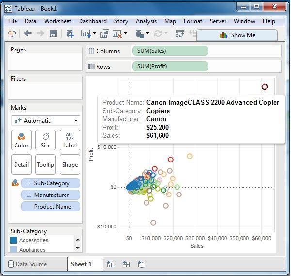
8) Scatter Plots
Scatter plots are created by points of the coordinates, scattered in the cartesian plane. The coordinates are formed by the X and Y values on each axis. In Tableau, at least one measure in row shelf and one measure in column shelf is required to plot scattered plot. However, more than one dimension field can be added to represent different colors in points of the existing plots.
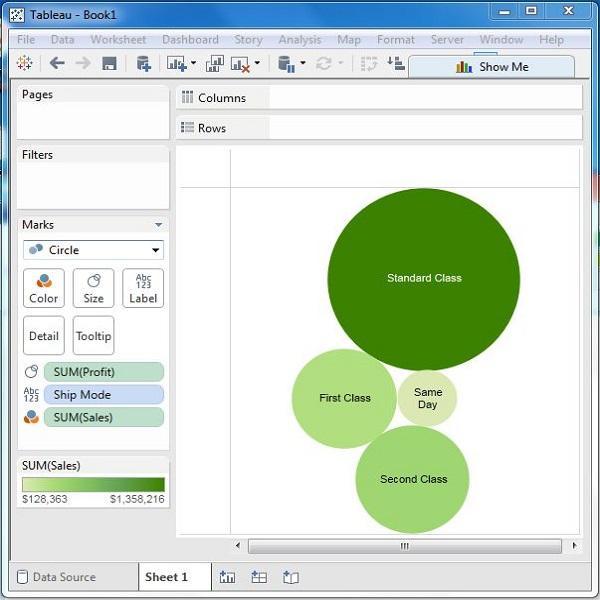
9) Bubble Charts
As the name suggests, the chart is made of bubbles, i.e., the cluster of circles. The dimension values represent the circle, while the size is determined by the measures. Since rows and columns are not involved in marking the values, you can drag and drop the required fields to various shelves under the marks card.
10) Heat Maps
A heat map can be depicted in different colors and sizes for different measures. You can visualize 2 different measures at a time on this map. The two parameters of size and color can be represented for two different measures in the heat map.
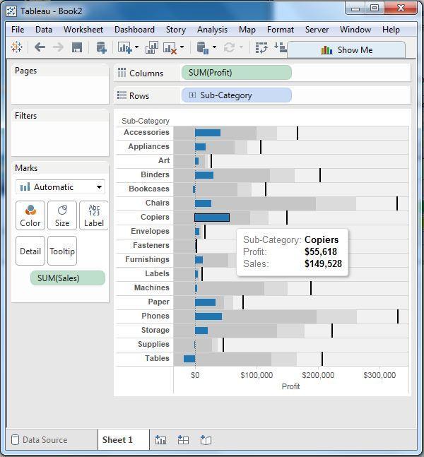
11) Bullet Charts
The bullet chart is a variation of the bar chart where two bar charts are measured at the same time for two different measures. It is a way to analyze the behavior of two measures for the same position in the graph. It indicates the variation of the first measure within the range of variations of the second measure.
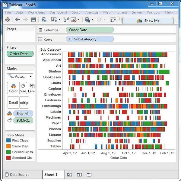
12) Gantt Charts
This chart basically represents the progress of a value in a task over a period of time. Hence one of the measures is by default time in Gantt Charts.
This chart is mostly used in industries to analyze the progress or consumption of a resource over a period of time.
13) Box and Whisker Plots
These are also called as Box charts. Here the chart has the distribution along one single axis. The boxes represent the middle 50% of the data, where the middle 2 quartiles of data distribution happen. The remaining 0% of the distribution is represented by the 2 lines called whiskers, which consists of all points within the max extent of data or displays all points within 1.5 times the interquartile range of the adjacent box.

14) Waterfall Charts
The waterfall chart plots the continuous sequence of positive and negative variations of values and depicts the cumulative effects of it. It helps us analyze the graph of increment and decrement between consecutive data points.

15) Motion Charts
Motion charts plot the points along the X-Y plane representing the changes over time by displaying the movement of data points within a space area along with the changes in the color of the lines.
This chart helps in gaining an overview of the changes in data over a complete period of time and not just a snapshot.
In Tableau, you can create the Motion Chart one Time Dimension and one Measure.

16) Bump Chart
A bump chart helps in comparing the two dimensions against a single measure value.
A bump chart can be made with two dimensions and zero or more measures.

Join Tables in Tableau
Joining data from a heterogeneous source is a common scenario in Tableau. Joining data from multiple tables often comes as a demand. Tableau allows you to join the tables using the data pane of Edit Data Source in the Data menu.
To create the table joins, first drag the two required tables in the data pane of Edit Data Source in the Data menu. based on the data type and the name of the columns, a join will be created automatically. You may edit this join in case of any changes.
| Read more about Joins |
Advanced Tableau Tutorial
We’re Going To Dig Deep Into Tableau Tutorial, But Feel Free To Jump To Any Section That Interests You :
Tableau Visual Analytics Tutorial:
Overview of Tableau Visual Analytics Creation
Tableau Visualization Advantages
Tableau data filter Tutorial:
Tableau Dashboards and stories Tutorial:
How to publish Tableau dashboard
Wrong way of building a Tableau dashboard
Tableau Interactive dashboards
Tableau dashboard design best practices
The building of the first dashboard in Tableau
Tableau Maps Tutorial:
Tableau animating maps | Shelf & Slider Filters
Tableau Calculation Tutorial:
How to use Tableau Calculation Functions
Building formulas of Tableau Calculations
Tableau Flexibility calculations
Tableau Charts Tutorial:
Tableau Commands Tutorial:
Common use cases of Tableau tabcmd command in
learning leverage of Tableau tabcmd command
Conclusion
Tableau is one of the most reliable Business Intelligence tools available in the market. It has many built-in features that aid the creation of aesthetic views and dashboards, that visually enhances the understanding of the data analysis. The installation and setup of Tableau are simple and easy to perform, without the need for any pre-exposure to the software and coding. It is suitable for all companies of size from small to large. One time installation will extend the lifelong benefit of superior data visualization.
Check out other popular BI Tool Tutorials
 On-Job Support Service
Online Work Support for your on-job roles.

Our work-support plans provide precise options as per your project tasks. Whether you are a newbie or an experienced professional seeking assistance in completing project tasks, we are here with the following plans to meet your custom needs:
- Pay Per Hour
- Pay Per Week
- Monthly
| Name | Dates | |
|---|---|---|
| Tableau Training | Jul 25 to Aug 09 | View Details |
| Tableau Training | Jul 28 to Aug 12 | View Details |
| Tableau Training | Aug 01 to Aug 16 | View Details |
| Tableau Training | Aug 04 to Aug 19 | View Details |

Sandeep is working as a Senior Content Contributor for Mindmajix, one of the world’s leading online learning platforms. With over 5 years of experience in the technology industry, he holds expertise in writing articles on various technologies including AEM, Oracle SOA, Linux, Cybersecurity, and Kubernetes. Follow him on LinkedIn and Twitter.


