
- Alteryx vs Tableau
- The Assistance of Tableau Rest API, You Can Now Automate Server Administration Tasks
- How to Blend Different Data sources in a Single Worksheet in Tableau
- Tableau Essentials
- Components Of Data Warehouse - Tableau
- How to Connect to Your Data and Generated Values of Tableau
- Create Visual Analytics Using Tableau Desktop
- Generate a new data with forecasts in an ad hoc analysis environment
- Future and Career Growth as a Tableau developer
- Import Custom Geocode Data / Map in Tableau
- Tableau Essentials: Chart Types
- How to Enhance Views with Filters, Sets, Groups and Hierarchies in Tableau?
- How to become a Tableau Developer -A Perfect Guide
- How to edit views in tableau server?
- Detailed Guide to Get Certified in Tableau
- Building Interactive Tableau Dashboards
- Introducing the Tableau Desktop Workspace - Tableau
- How to Join Database Tables with Tableau
- Introduction to Joins In Tableau
- Lumira Vs Tableau
- Top Reasons To Learn Tableau
- Authoring and editing reports via server in tableau
- Tableau 10.2.1 – New Capabilities and Corrected Issues in TABLEAU
- Tableau Advanced Interview Questions
- Introduction to Tableau API
- Why Tableau is Considered the Best BI Tool ?
- Growth of Tableau BI (Business Intelligence) Among Trending Technologies
- Tableau Calculated fields
- Table calculation in Tableau
- Tableau Careers and Salaries
- Tableau Case Statements
- Tableau Certification
- Create Pie charts, Scatter Plot, Area Fill charts & Circular View in Tableau
- Tableau Competitors
- Tableau Data Blending
- Tableau Desktop Tutorial
- Tableau Drivers
- Tableau Ecosystem Contains Of Different Components
- Tableau Interview Questions And Answers
- Tableau Latest Version
- What are the web mapping service pros and cons in tableau?
- Tableau Maps Tutorial
- Tableau Parameters
- Tableau Reporting
- Tableau Reporting Tool
- Tableau Reshaper Tool
- Tableau Server
- Tableau Server interview Questions
- Tableau Server Tutorial
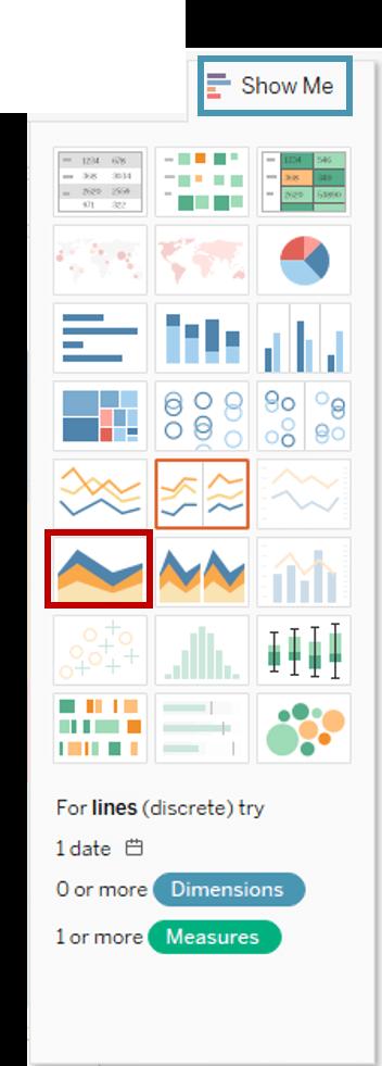
- Tableau Show Me feature
- Tableau Tutorial
- Tableau Version History
- Tableau Visualization Course and its advantages in the current job market
- Tableau vs Cognos
- Tableau vs Domo
- Tableau vs Looker
- Tableau Vs Microstrategy
- Tableau vs Power BI
- Tableau vs QlikView
- Tableau Vs Spotfire
- Animating maps using the pages shelf or slider filters in Tableau
- Succession Planning analytics and Hr Dashboard in Tableau
- How to publish dashboards in tableau server?
- How Tableau geocodes your data?
- How to use Date Field in Tableau?
- How the Table Calculations Use Building Formulas in Tableau
- How to Add Flexibility to Calculations with Parameters in Tableau
- How to Build your first Advanced Dashboard in Tableau?
- How to Change the Scope of Trend Lines Tableau
- How to configure tableau server for the first time?
- How to consume information in tableau server?
- How to create a Standard Map View in Tableau?
- How to Create Calculated Values using Dialog Box in Tableau
- How to Customize Shapes, Colors, Fonts and Images in Tableau?
- How to deploy tableau server in high availability environments?
- How to deploy tableau server in multi-national entities?
- How to Determine your Hardware and Software needs in Tableau server?
- How to embed tableau reports securely on the web?
- How to improve appearance to convey meaning more precisely in tableau?
- Install Tableau Server and Reasons to Deploy it
- How to Install the Command Line Tools in Tableau?
- How to monitor activity on tableau server?
- How to organize reports for consumption in tableau server?
- How To Sort Data In Tableau
- Use Custom Background Images to Plot Spatial Data
- How to use maps to improve insight in Tableau?
- How to use performance recorder to improve performance in tableau server?
- Tableau Subscription and Report Scheduling
- How to use tabadmin for administrative task automation in tableau?
- How to Use Table Calculation Functions in Tableau
- Learning to leverage tabcmd in tableau
- Leverage existing security with trusted authentication in tableau server
- Managing tableau server in the cloud
- Planning for a successful tableau deployment at ACT
- How to Plot Your Own Locations on a Map in Tableau
- Tableau Self-Service Ad Hoc Analysis with Parameters
- Quality metrics in a hospital in tableau
- Trend Lines and Reference Lines In Tableau
- What Are Calculated Values and Table Calculations in Tableau?
- What are the advanced chart types in tableau?
- Tableau Dashboard Best Practices
- What are the common use cases for tabcmd in tableau?
- What are the licensing options for tableau server and tableau online?
- What are the Options for Securing Reports in Tableau?
- Sharing Connections, Data Models, Data Extracts in Tableau
- What are the tips, tricks and timesavers in tableau?
- What are the typical map errors and how to deal with them in tableau?
- What do tabcmd and tabadmin do in tableau’s command line tools?
- Tableau Aggregate Functions
- What is the right way to build a dashboard in tableau?
- What is the wrong way to build a dashboard in tableau?
- What kinds of tasks can be done with tabcmd commands
- When and how to deploy server on multiple physical machines in tableau?
- Tableau Extracts or Direct Connection - When to Use
- The Practicality of Using Tableau Mobile to Create Visualization
- Web Data Connector in Tableau Server
- Data Visualization and its influence on Businesses
- How to Use Date Functions in Tableau
- Tableau Architecture and Ecosystem Components
- Looker vs Power BI
- How to Create Sets in Tableau
- Tableau Projects and Use Cases
- Tableau Integration with Salesforce
- Excel vs Tableau
- Tableau Server Administration
Data from every corner surrounds the present age. With a splurge in the amount of data available, relevant questions are rising as well. Whether operating a massive organization or working individually, you can effortlessly find a graph or a chart showcasing the data you wish to see.
Out of all the types available out there, you can also get your hands on tableau charts. If you are new to this type, this post highlights the meaning of tableau charts and their types.
Table Of Content
-
- Text Table
- HeatMap
- Pareto Chart
- Highlight Table
- Symbol Map
- Map
- Pie Chart
- Bar Chart
- Stacked Bar Chart
- Side-By-Side Bar Chart
- TreeMap
- Waterfall Chart
- Scatter Plot
- Side-By-Side Circles
- Line Graph
- Area Chart
- Dual Axis Combination
- Histogram
- Box and Whiskers Plot
- Gantt Chart
- Bullet Chart
- Stacked Bubble Chart
Why Charts or Graphs?
Implementing data-oriented charts or graphs in your professional life can make result generation efficient for you. While charts are meant to represent an extensive set of information into diagrams, graphs, or tables, a graph displays mathematical relations between various data sets.
Want to enrich your career and become a professional in Tableau?, then Enroll to Tableau Course online"
- This course will help you to achieve excellence in the Business Intelligence and Analytics domain.
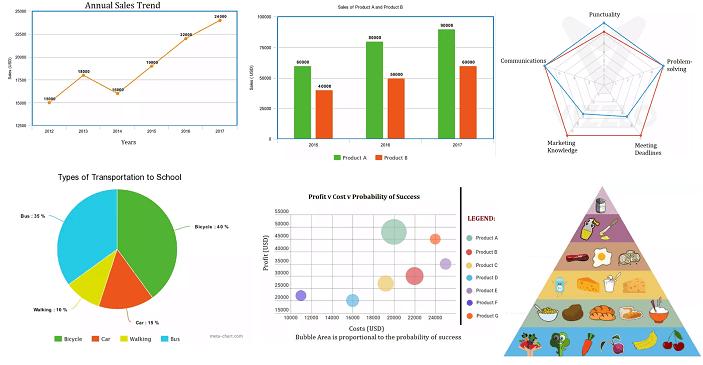
Tableau Charts List
Here are the different types of Tableau Charts / Tableau Graphs to make your Data Visually Effective and Interactive;
1. Text Table
A text Table is the most straightforward form of tableau chart that represents data in columns and rows. Also known as pivot tables, it places one dimension on the Rows and another on the Columns.
How to Create a Text Table?
Follow these steps to create a text table:
- Create a worksheet and give it a name as per your choice
- Drag Subcategory into Rows
- In Marks Card, there will be a text box, drag Profit into it
- A text table will be created by default
 2. HeatMap
Another effective yet simple method to display data is by using HeatMaps. They showcase data in the form of colors. HeatMaps are curated in the tableau with the help of one or more dimensions and a measure.
How to create a HeatMap?
Here are the steps that will help you create a HeatMap:
- Create a new worksheet and give it a name
- On your keyboard, hold the Control (CTRL) key and choose Sub-Category and Sales from the data pane
- Now, click Show me in the top right corner
- Choose HeatMap icon
- In the Color box, drag Profit
- Drag Regions in Columns

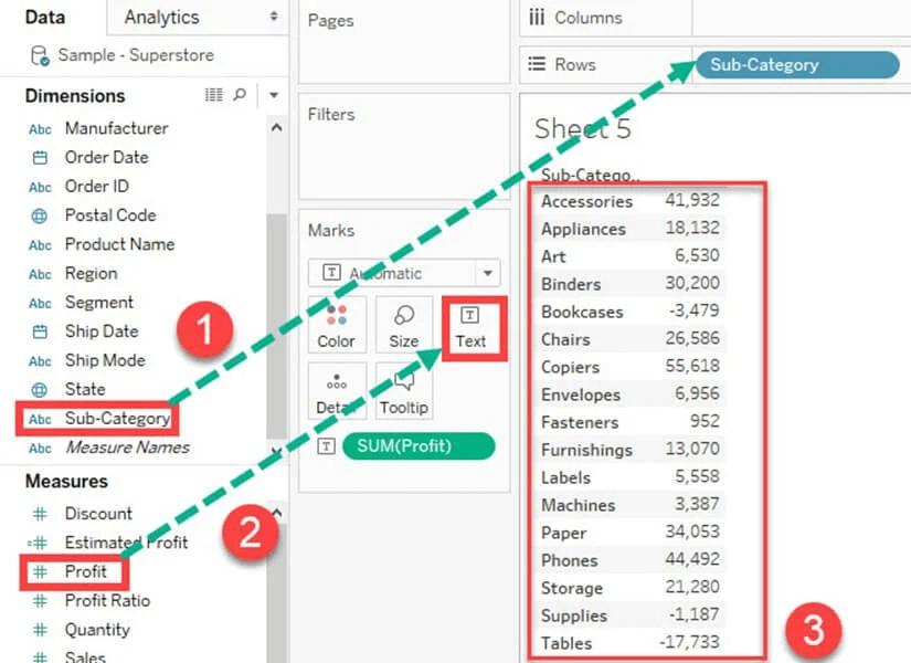
3. Pareto Chart
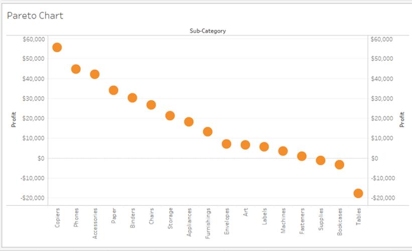
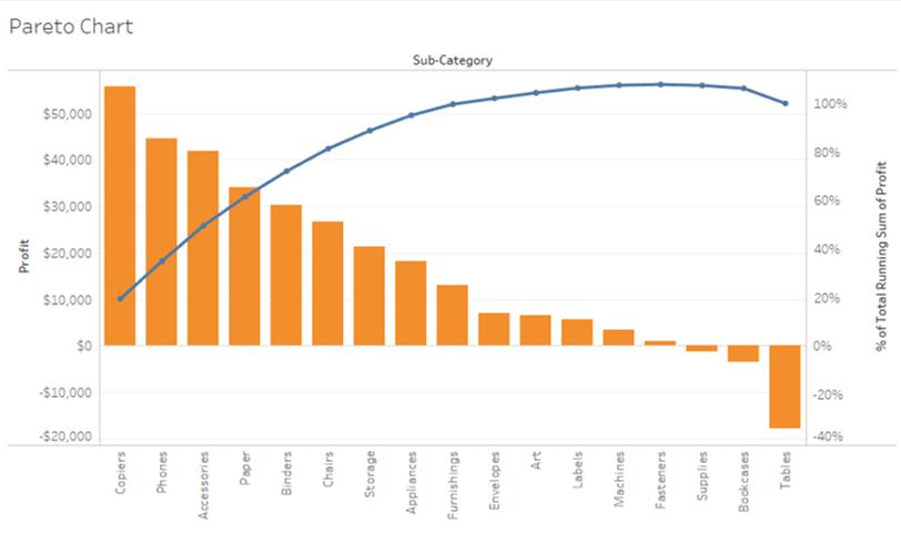
The Pareto chart is meant for visually representing more significant situations. This chart type has a line and bar graph. The individual values are represented in descending order by bars, and the line represents the ascending cumulative total. The primary objective of this chart is to discover the contribution of members in a field.
How to Create a Pareto Chart?
Here is how you can create a Pareto chart:
- Create a new worksheet
- Drag Sub-Categories into Columns
- Drag Profit into Rows
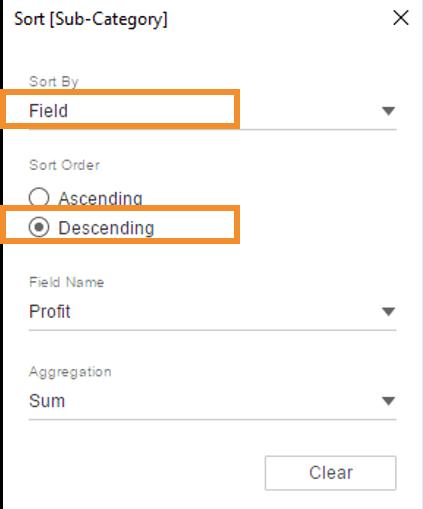
- Right-click on the Sub-Category option and choose the Sort option from the drop-down list
| Related Article: Learn Complete Tutorial in Tableau |

- A Sort Window will open up
- Now, in the Sort order, choose the Descending option
- Choose the Field option in the Sort by section and choose the field as Profit and select the Sum as aggregation
- Click OK
On your screen, you will see something like the following:
- Into Rows, drag Profit again
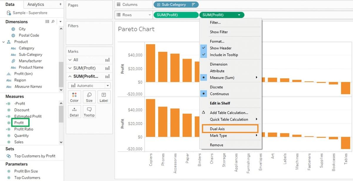
- Now, right-click on the newly added Profit and choose the Dual Axis option
- You will then get a dotted graph
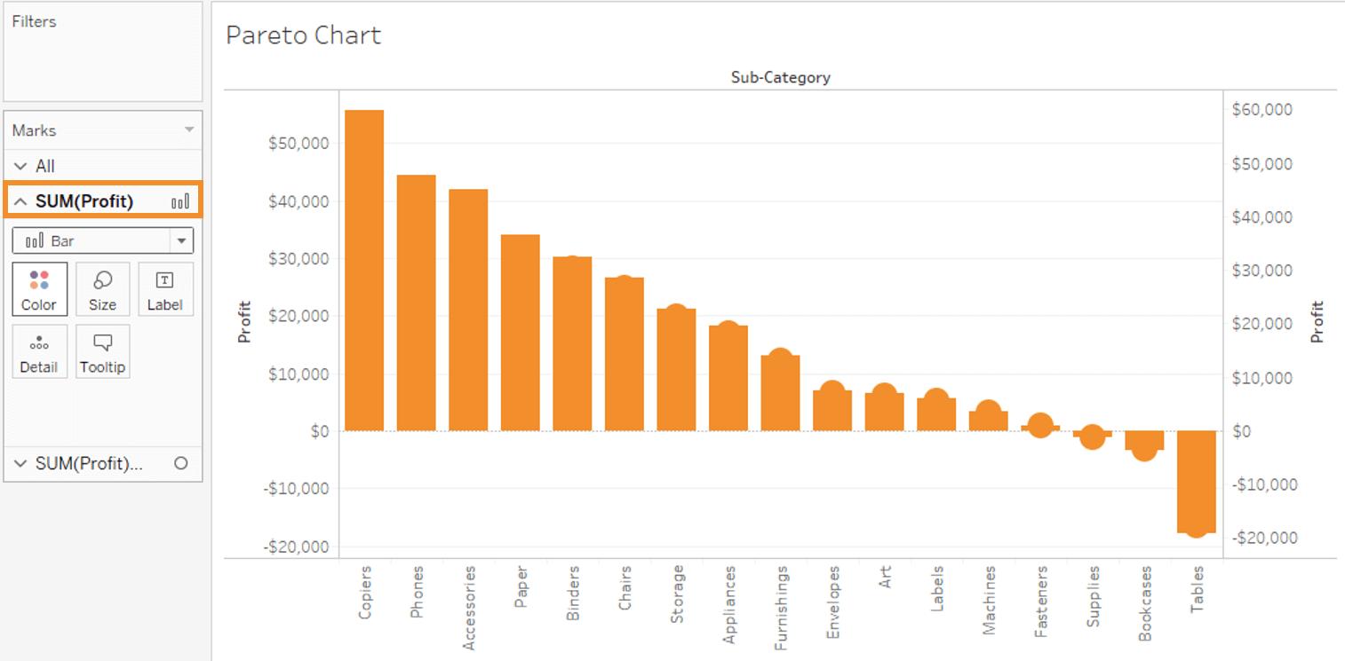
- Now, the next step will be to visit the Marks Card
- Choose SUM (Profit) for the marks card list
- Now, click on the drop-down option and choose Bar as the chart type
- Choose SUM (Profit) (2) from the given list and click on Line
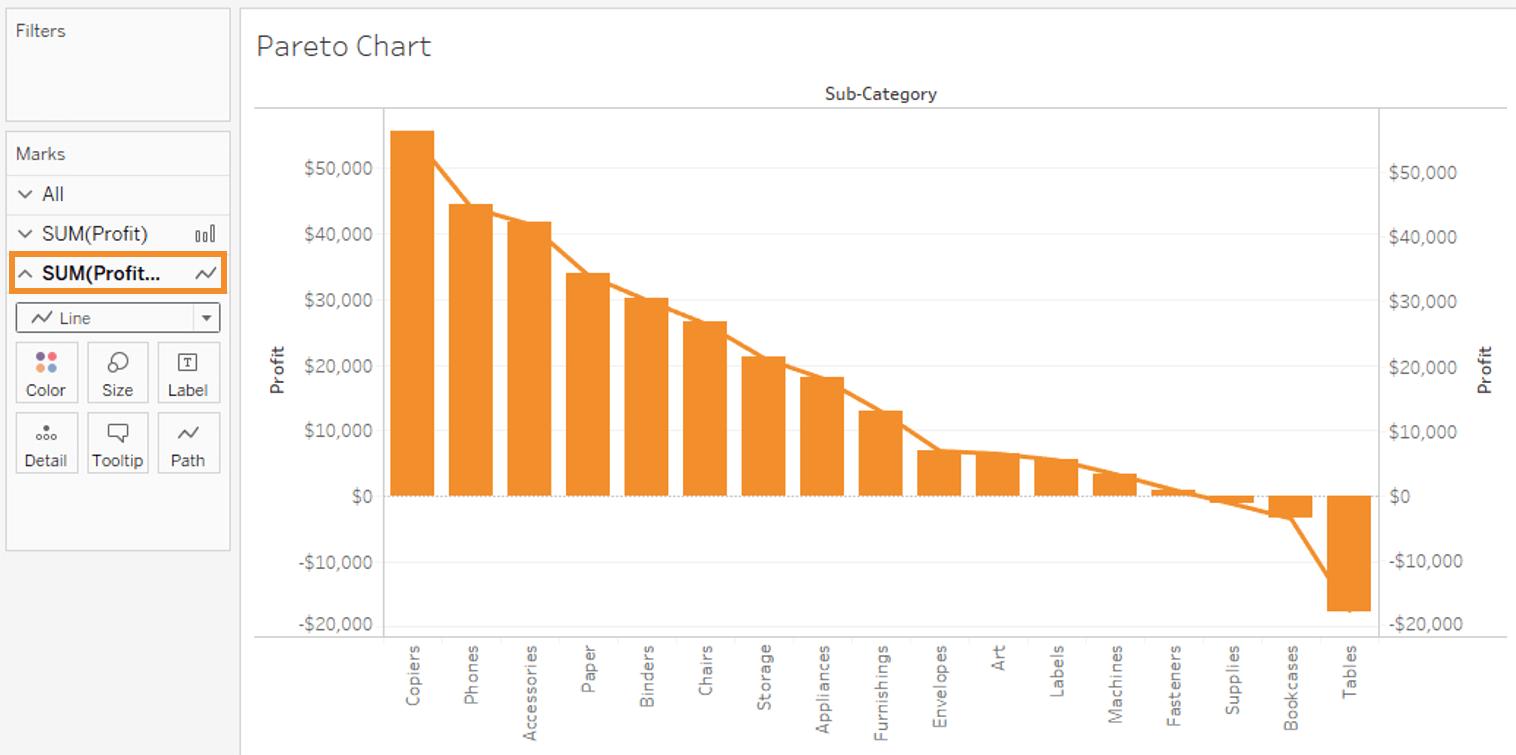
- The next step would be choosing SUM (Profit) on the right side of the rows
- Now, right-click on the same and choose Add Table Calculation from the list
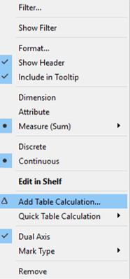
| Related Article: Tableau Certification |
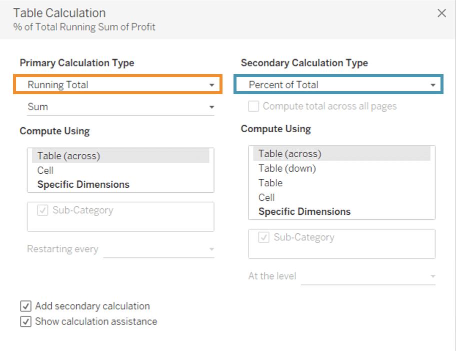
- It will then open a Primary Calculation Type
- From the drop-down menu, choose Running Total
- Next, from the drop-down, choose Sum as Aggregation
- Click on Compute Using Table
- Check into the Add Secondary Calculation box
- It will expand the window for Secondary Calculation Type
- From the drop-down list, choose Percent of Total
- Choose the Compute Using Table option
- Now, close the window and go to the last marks card - SUM (Profit)
- Click the Color icon available in the marks card
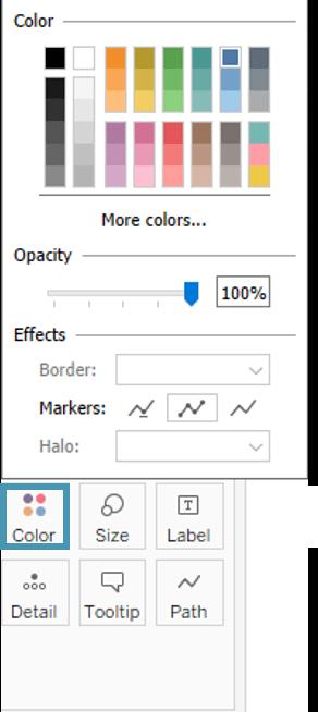
- Choose any color as per your preference. This will change the line’s color in the graph
| Preparing for Tableau Interview? Here’s Top Tableau Interview Questions and Answers |
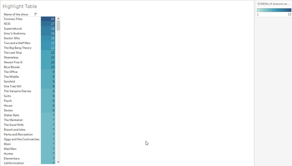
4. Highlight Table
The Highlight table is absolutely the same as the text table. However, the only difference between the two is that the data in the highlight table is showcased with the help of varying colors based on their categorical values.
How to create a Highlight Table?
The steps below will help to create a Highlight Table.
- Create a new worksheet
- Click on the Show Me icon
- Then, drag a category to Rows
- Choose the Highlight table from the Show Me
- Drag the next category to Color and another to Label
| Related Article: Click Here to Learn about Tableau Server |
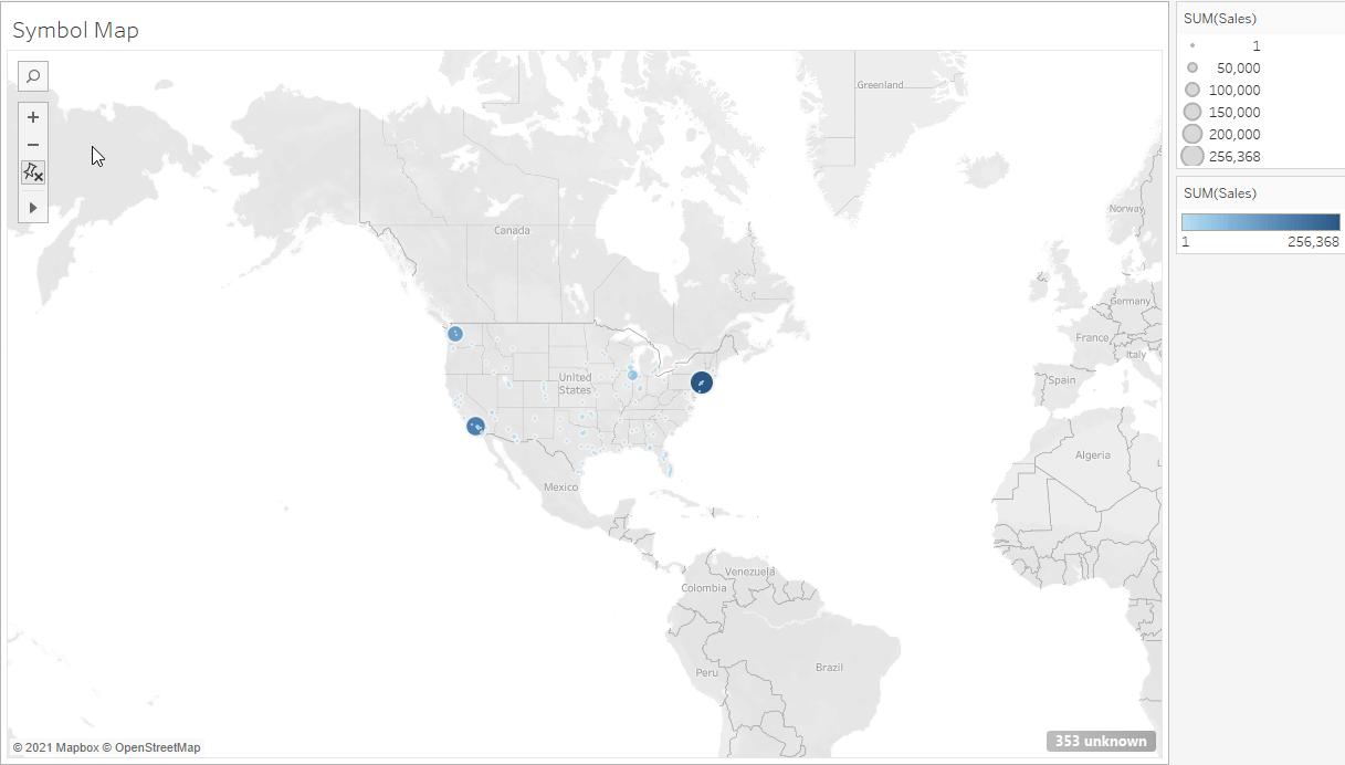
5. Symbol Map
The next one in the tableau chart is the symbol map. It is referred to as just another normal map that is used to showcase the geographical data with the help of latitudes and longitudes. The only difference here is that the area of the given coordinates is highlighted with a mark.
How to Create a Symbol Map?
Here are the steps to create a symbol map:
- Create a new worksheet
- Click on the Show Me tab
- Choose a category + CTRL + another category
- Visit the Show Me tab and choose Symbol Map
- Now, drag a category to Color on the Marks Card and another category to Size
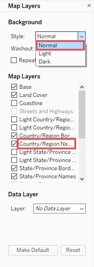
6. Map
These are meant to visualize every type of location information, whether country name, state abbreviations, postal codes, or custom geocoding. The map is a geographical representation of the longitude and latitude coordinates where each coordinated pair is regarded as the continent, country, region, or state.
How to Create a Map?
Here is how you can create a map:
- Open a new worksheet
- Double-click on State available under Dimensions in the Data Pane
- Drag Sales to Size on the Marks card from Measure
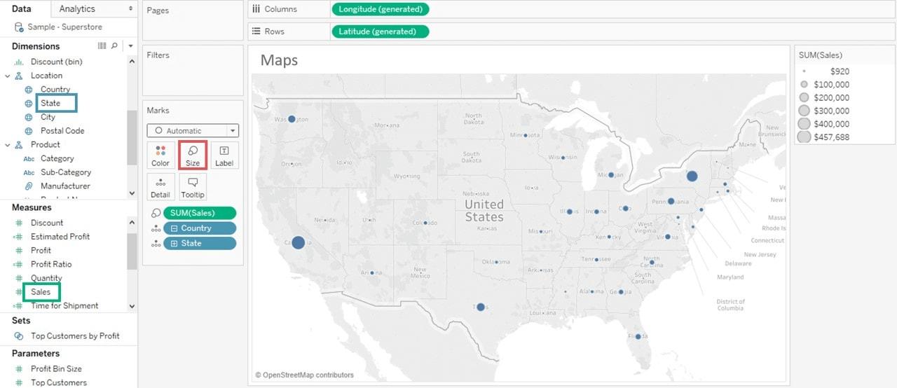
- Choose Maps and then Map Layers
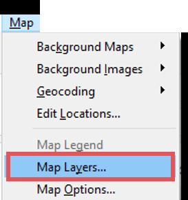
- In the pane of Map Layers, click the Style drop-down menu and choose Norma
- Clear the Country/Region Names under Map Layers
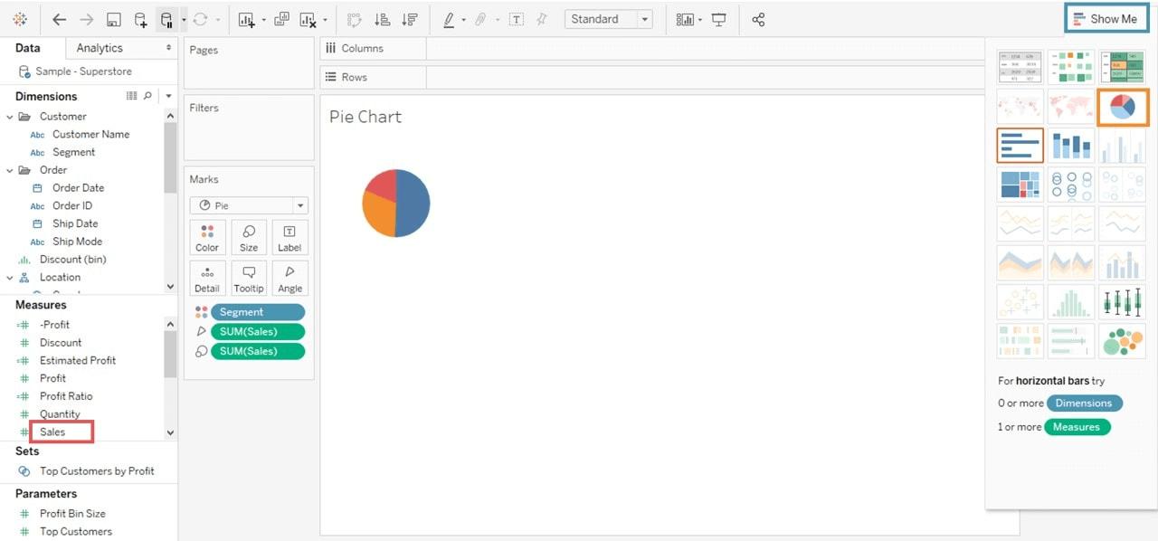
7. Pie Chart
The Pie Chart is one of the straightforward, simplest, and easy to comprehend data in the tableau chart. It is ideal for adding details to visualizations. It effortlessly organizes your data in a pie form and divides the same into varying slices. And then, every slice has a diverse size on the basis of its data’s magnitude.
How to Create a Pie Chart?
Here is how you can create a pie chart:
- Open a new worksheet
- Choose Segment as well as Sales from the given data pane
- Choose to Show Me in the top right corner
- Choose Pie Chart
| Related Article: Tableau Reports |
8. Bar Chart
Bar Charts are one of the standard methods of data visualization across all platforms. It is meant to represent the data in the form of bars. The bar length is proportional to the value of the variable. You can instantly highlight the difference between outliers, show trends, and categories. Also, you can reveal historical lows and highs at a glance.
How to Create a Bar Chart?
To create a bar chart, follow these steps:
- Open a new worksheet
- Now, drag a category in a column
- And then, drag Profit into rows
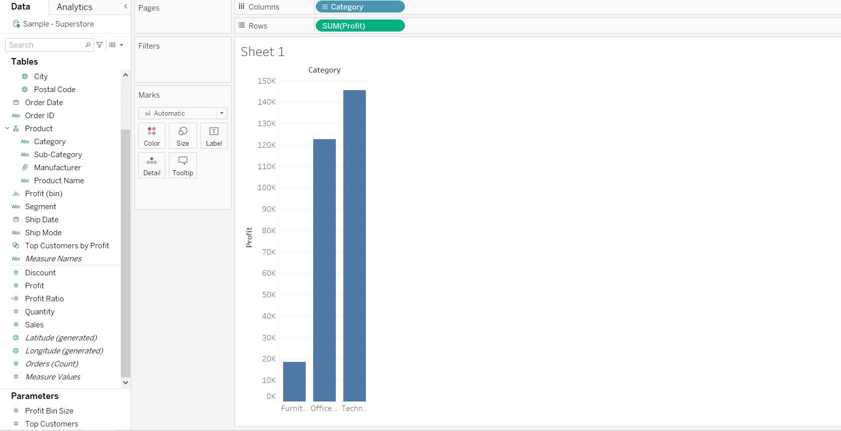
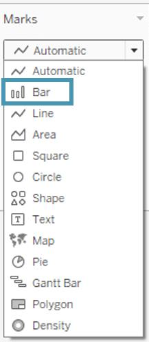
- A bar chart will now be created by default; however, if it doesn’t come up automatically, visit the Mars card and choose the Bar option
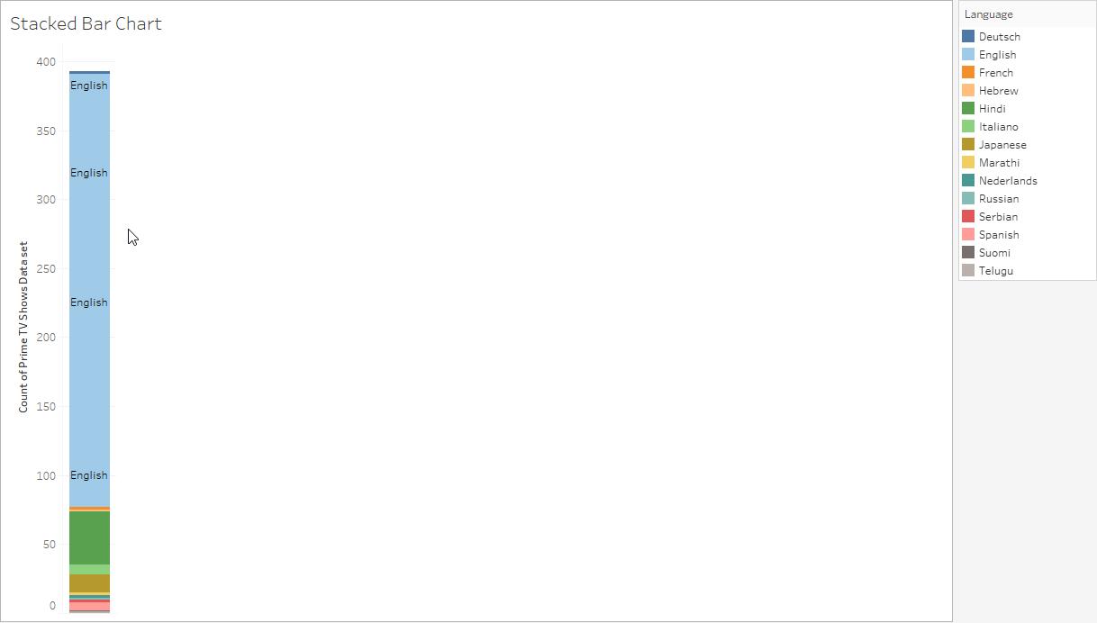
9. Stacked Bar Chart
A Stacked Bar Chart is the same as the bar chart mentioned above. However, in this tableau chart type, you will find segmented bars. Every bar here is representing a different value of a field on any of the axes.
How to Create a Stacked Bar Chart?
Jotted down below are some steps to create a stacked bar chart:
- Create worksheet
- Hover your cursor over the Show Me tab
- Now, choose a category + CTRL + a category
- Visit the Show Me tab
- Choose Stacked Bar Chart
10. Side-By-Side Bar Chart
This one is another chart that is similar to the category of the bar chart. The only difference, however, is that in this chart type, you will find the alignment of bars in a side-by-side style.
How to Create a Side-By-Side Bar Chart?
Here are a few steps to follow to create a side-by-side bar chart:
- Create worksheet
- Hover your cursor over the Show Me tab
- Drag a category to Columns
- Drag another category to Rows
- Visit the Show Me tab
- Choose the Side-by-Side Bar Chart option
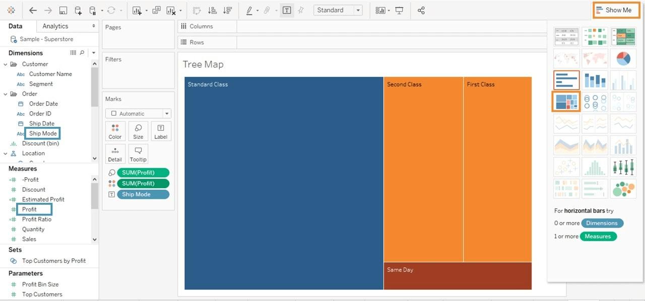
11. TreeMap
A straightforward rectangular chart, TreeMap is representing data in nested rectangles. Here, the dimensions are defining the structure of rectangles. Moreover, this helps relate varying segments of the data to the whole of it.
How to Create a TreeMap?
Here are the steps to create a TreeMap in tableau:
- First, drag and drop the Profit measure twice to the Marks Card; once to the Size shelf, and then to the Color shelf
- Next, drag and drop the Ship Mode dimension to the Label shelf
- Select the TreeMap option as the chart type from Show Me
- The following chart will appear on your screen
12. Waterfall Chart
Waterfall charts are a bit complicated in comparison to other illustrative charts. These are meant to display the cumulative effect of the sequential positive and negative values. Moreover, Waterfall charts show where a value is beginning, ending and how it is getting there incrementally.
How to Create a Waterfall Chart?
Here are the steps to create a waterfall chart:
- Create a new worksheet
- Now, on the green Profit Pill, right-click and choose Quick Table Calculation.
- And then, choose Running Total
- Change the Mark Type to Gantt Bar from Automatic
- Now, create a Calculated Field, namely NegProfit or anything alike.
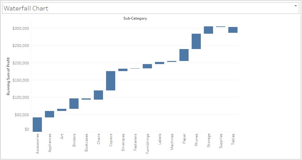
- Next, drag the NegProfit overSize in the Marks shelf
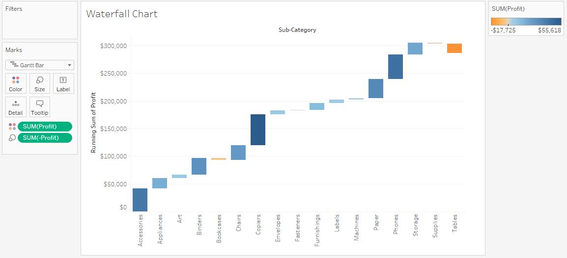
- In the Marks card, drag Profit over to Color
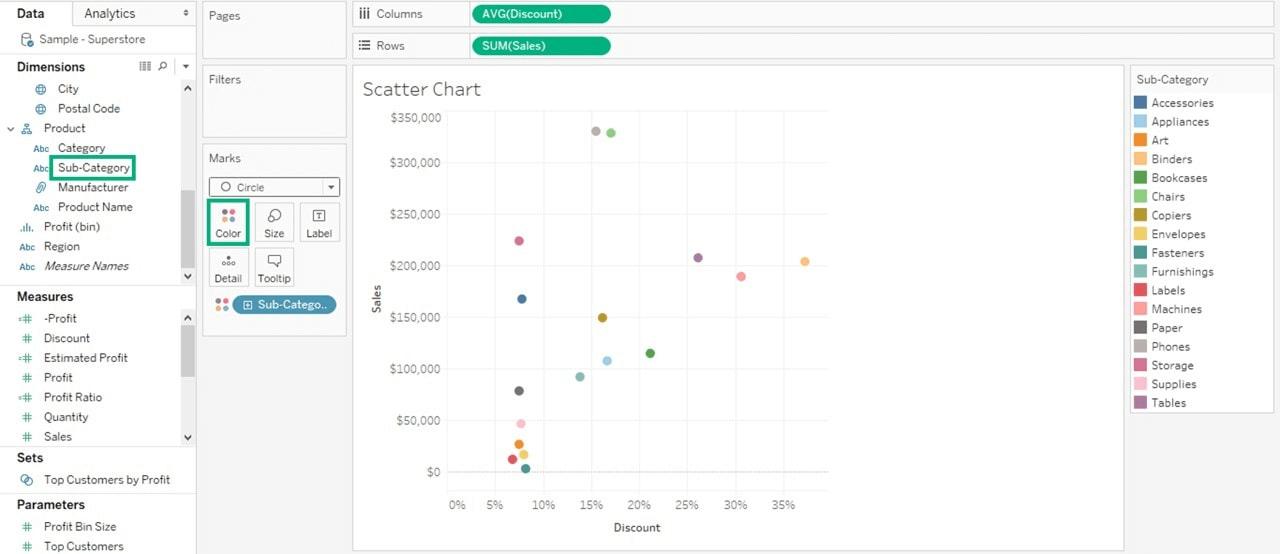
13. Scatter Plot
Scatter plots effectively gain a sense of concentrations, trends, and outliers that facilitate profound investigations of the data. They are used to compare the measures. The significant aspects of the data are expressed with the help of the size, shape, and color of the scatter plot.
How to Create a Scatter Plot?
Here is how you can create a scatter plot
- Create a new worksheet
- Then, drag Discount into Columns and Sales into Rows.
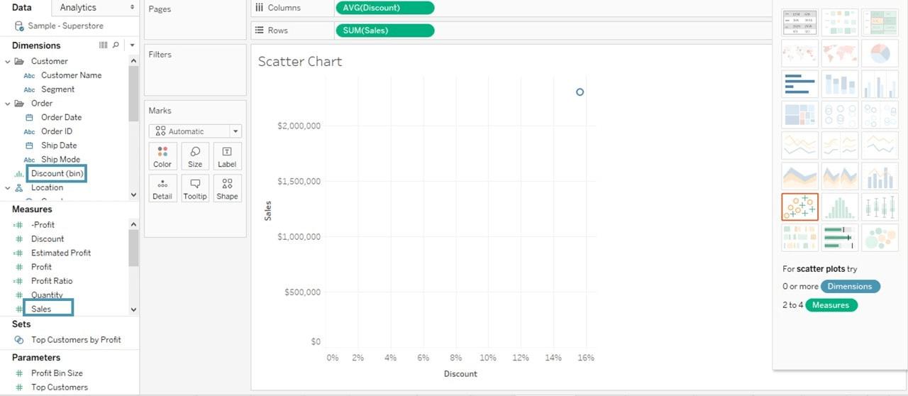
- This way, you can create a scatter plot by default
- Then, you can drag Sub-Category in the Color icon available in the Marks card
- It will create a scatter plot as shown below:
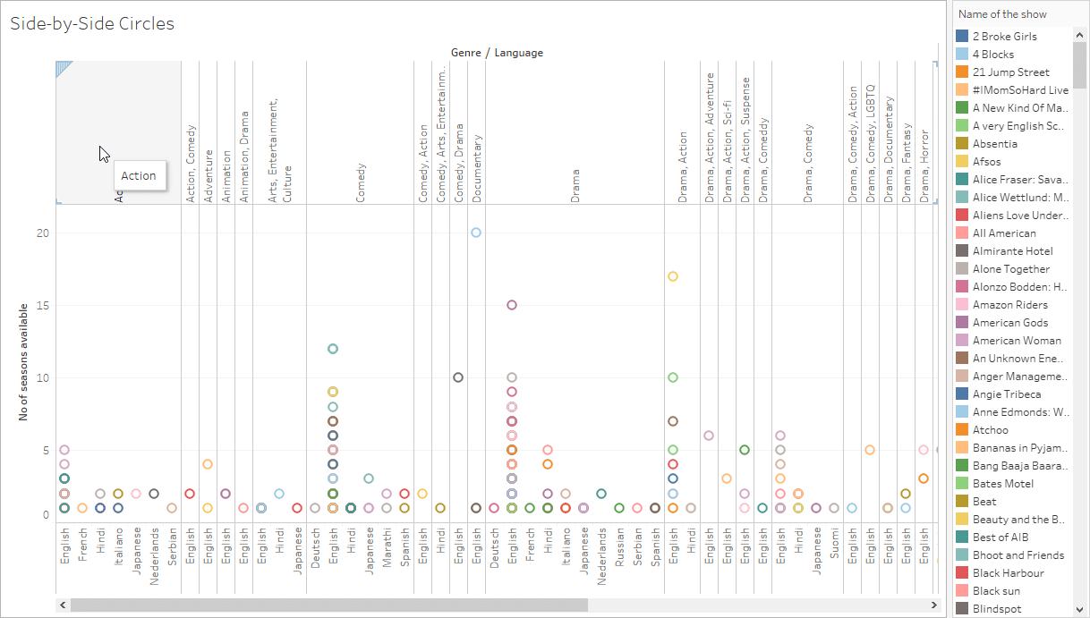
14. Side-By-Side Circles
A variant of the circle view, the Side-By-Side Circles Chart, lets users include more measures that can be compared to one another for a profound analysis.
How to Create a Side-by-Side Circle Chart?
Follow these steps to create a side-by-side circle chart
- Create worksheet
- Hover your cursor over the Show Me tab
- Drag a category to Columns
- Drag another category to Rows
- Visit the Show Me tab
- Choose the Side-by-Side Circle Chart option
15. Line Graph
Line Graphs, or Line Charts, are majorly used in combining individual points in a comprehensive sequence. It helps connect a variety of data points to display them as one consistent evolution. The result is a straightforward, simple way that visualizes changes in one value that is relative to another.
How to Create a Line Graph?
Here are some ways to create a line graph:
- Create a new Worksheet
- Now, drag the Order Date into Columns
- And then, drag Sales into Rows
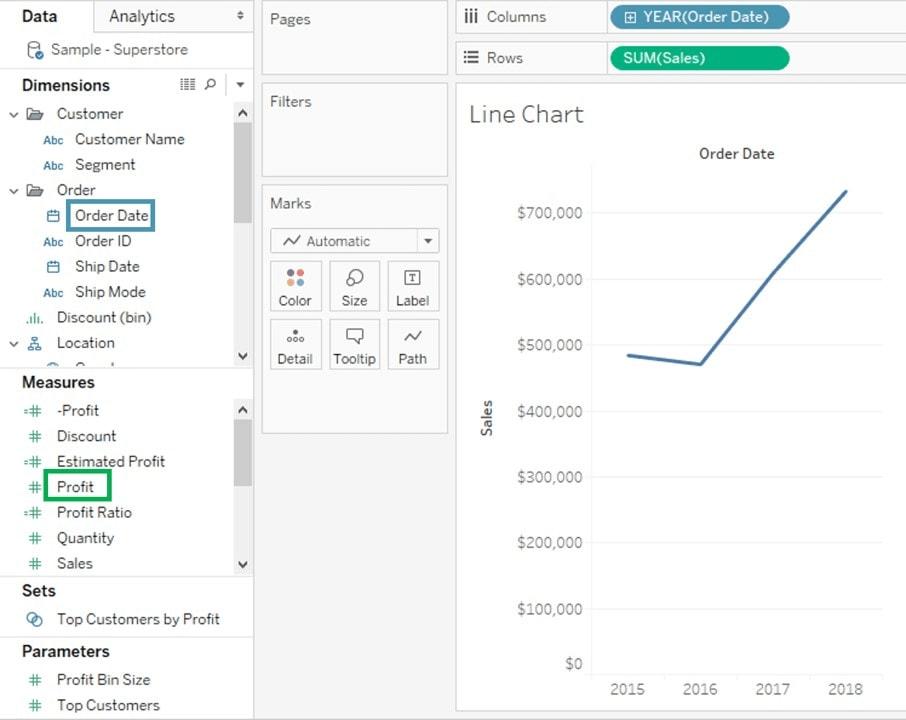
- A line graph will be created by default; if not, visit Marks Card and choose the Line option
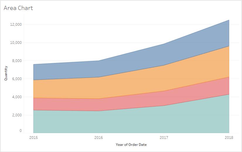
16. Area Chart
This one helps represent quantitative data over a variety of periods. An area chart is almost the same as a line chart. What makes them stand apart is the partitions that are done on the basis of nations, regions, or categories in the area chart.
How to Create an Area Chart?
Here are the steps to follow to create an area chart:
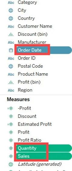
- Create a new worksheet
- Now, hold the control (CTRL) key in your keyword and choose Order Date and Quantity. A complete based on
- Then, click on Show Me at the top right corner.
- Choose the icon of the Area Chart.
- From the dimension pane, drag Region and add it to the Color icon of the Marks card.
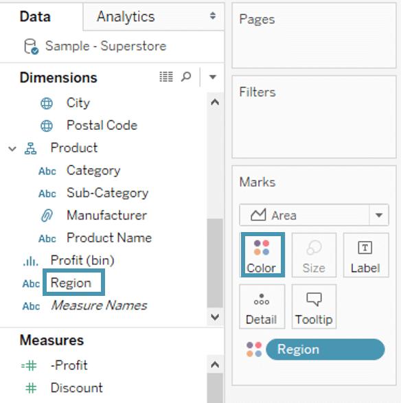
- An area chart will be created.
17. Dual Axis Combination
Dual-axis combination charts are also known as combo charts. These are effective when it comes to displaying relevant information by combining views. Dual Axis Combination is generally used when visualizing two varying measures in two different types of charts.
How to Create a Dual Axis Combination Chart?
Here are the steps to follow to create a dual-axis combination chart:
- Create a new worksheet
- Now, hold the Control (CTRL) key on the keyword and choose Order date, Quantity,dual-axis, and Sales.
- In the top right corner, click on Show Me
- Choose a dual combination icon
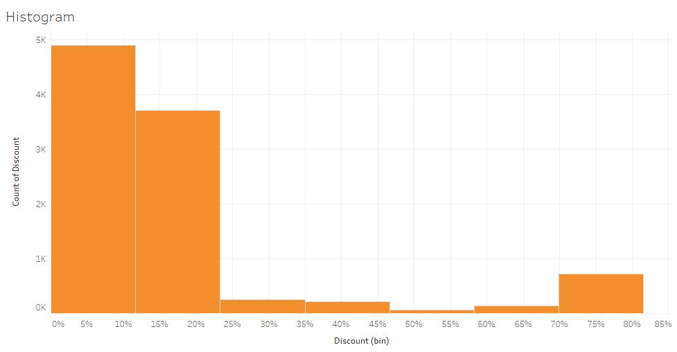
18. Histogram
With a histogram, you can figure out how the data is divided across varying groups. Although it is pretty similar to a bar chart, it groups the values that have consistent ranges. Every bar in the histogram represents the height of the values available in the range. It is an ideal option when it comes to visualizing how data will fall into categories.
How to Create a Histogram?
Here are some steps to follow when creating a histogram:
- Open a new worksheet
- Choose a Discount from the given measures
- Click Show Me in the top right corner
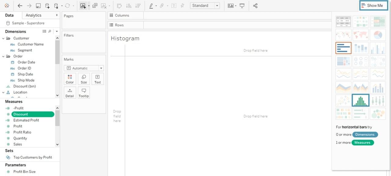
- Choose the icon of Histogram and it will appear as follow:
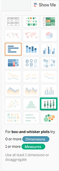
19. Box and Whiskers Plot
Also known as boxplots, these are commonly used to show data distribution. Box and Whiskers Plot offers a way of summing up the data as a set of data that can be evaluated on an interval scale. There is a box containing the data median and 1st and 3rd quartiles, and there are whiskers representing data within 1.5 times the interquartile range.
How to Create a Box and Whiskers Plot?
Here are the steps to create a box and whiskers plot:
- Create a new worksheet
- Now, drag the dimension of the Segment into Columns
- And then, drag the measure of Discount into Rows
- Drag the dimension of Region to Columns and drop it into the right of the Segment
- Click on Show Me in the toolbar and choose box-and-whisker plot
- Now, drag Region from the Marks card to the Columns again - towards the right of the Segment
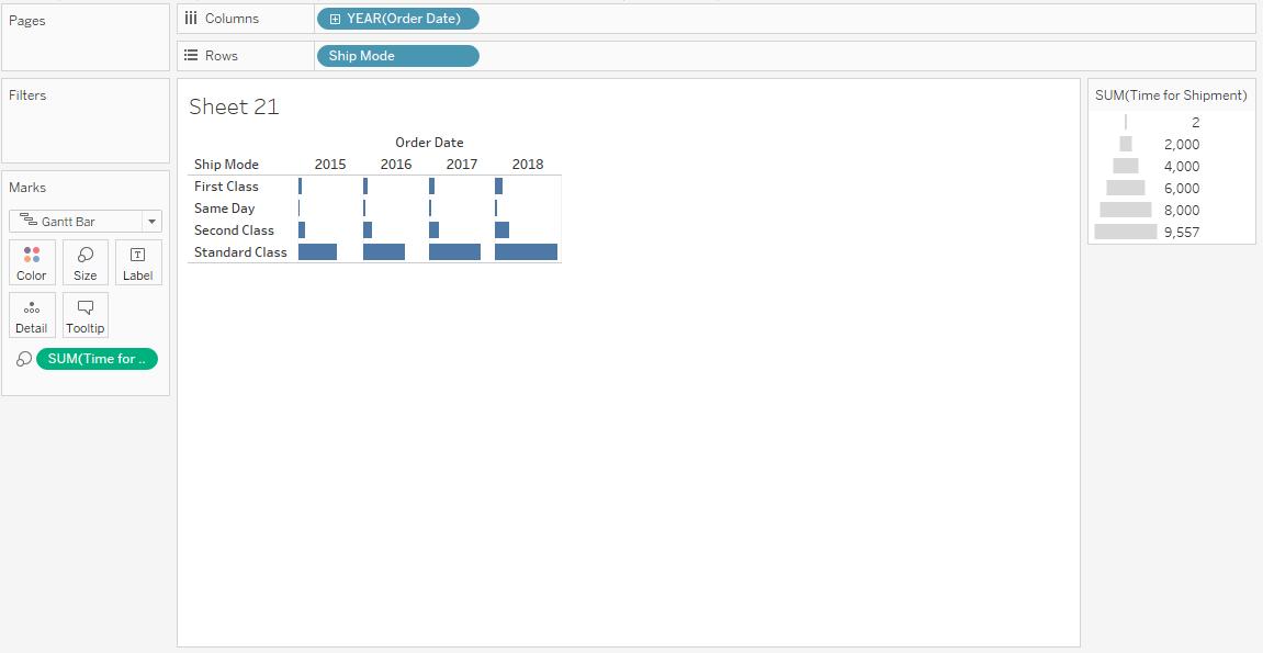
20. Gantt Chart
Gantt charts are built to illustrate the beginning and ending dates of steps in a project or a process. These are used to either visualize or discover the time duration for every activity or event. These charts make the interdependencies between tasks that visually illuminate the schedule of the workflow.
How to Create a Gantt Chart?
Here are the steps to create a Gantt chart:
- Create a new worksheet
- In the Marks Card, hover your cursor on the drop-down button
Choose Gantt Bar from the available list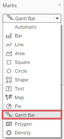
- Now, drag the Order Date into Columns
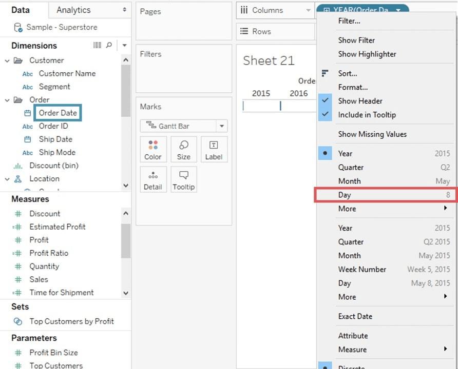
- On the Order Date, right-click and choose the Day
- In the Menu, choose Analysis
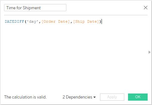
- Choose Create Calculated Field option from the list
- Enter the name as Time for Shipment
- Type in the formula as shown in the below image to create the difference between the Ship Date and the Order Date; click OK
- Now, in the Rows, drag Ship Mode...right-click.
- And, drag Time for Shipment into the size icon available in the Marks Card.
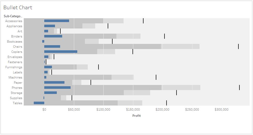
21. Bullet Chart
A bullet chart effectively compares a primary performance of a measure to one or more other measures. It shows the progress against an objective through comparison. At the core, it is just another variation of a bar chart. However, this one is curated to replace thermometers, meters, and dashboard gauges.
How to Create a Bullet Chart?
Here is how you can create a bullet chart:
- Create a new worksheet and then drag the Sub-Category dimension and drop it into the Column shelf
- Next, drag the Profit measures and drop them into the Rows of shelf
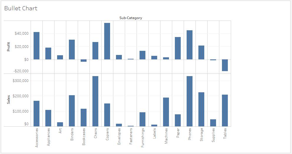
- Next, you can drag the Sales measure to the Marks Card
- Choose the Bullet graph option from Show Me
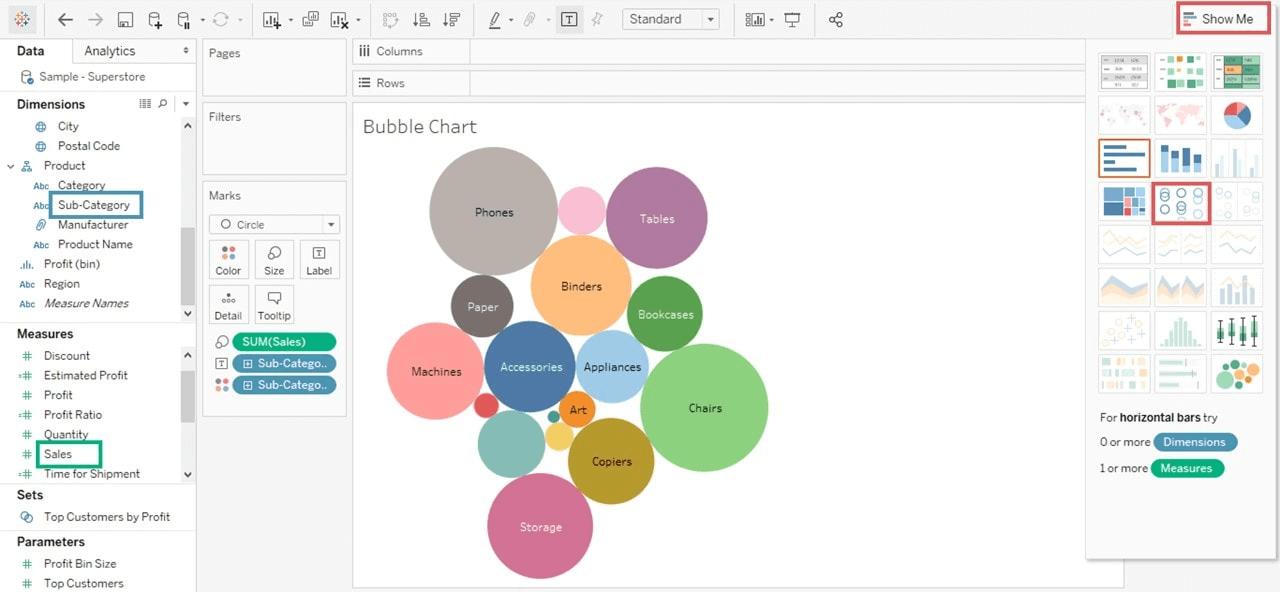
22. Stacked Bubble Chart
With the help of this chart type, you can effortlessly add attractive details to scatter plots and maps. A Stacked Bubble Chart offers a method to display data in the form of a packed bubble. Here, every bubble comes with a varying size based on its variable’s magnitude.
How to Create a Stacked Bubble Chart?
You can create a stacked bubble chart by following these steps:
- Create a new worksheet
- Now, from the keyword, hold the Control (CTRL) key
- Click Sub-Category and Sales
- Choose the Show Me option
- Choose the Packed Bubbles icon, and a chart will appear on your screen, as shown below
Conclusion
Now that you have understood everything about tableau charts, it is time to integrate them into your workflow. If you are somebody who deals with data on a daily basis, these various tableau charts will help you out to a great extent. Now, without further ado, choose the chart type that matches your requirements, or experiment with all of them to continue ahead.
 On-Job Support Service
Online Work Support for your on-job roles.

Our work-support plans provide precise options as per your project tasks. Whether you are a newbie or an experienced professional seeking assistance in completing project tasks, we are here with the following plans to meet your custom needs:
- Pay Per Hour
- Pay Per Week
- Monthly
| Name | Dates | |
|---|---|---|
| Tableau Training | Jul 25 to Aug 09 | View Details |
| Tableau Training | Jul 28 to Aug 12 | View Details |
| Tableau Training | Aug 01 to Aug 16 | View Details |
| Tableau Training | Aug 04 to Aug 19 | View Details |

Usha Sri Mendi is a Senior Content writer with more than three years of experience in writing for Mindmajix on various IT platforms such as Tableau, Linux, and Cloud Computing. She spends her precious time on researching various technologies, and startups. Reach out to her via LinkedIn and Twitter.


