
- Alteryx vs Tableau
- The Assistance of Tableau Rest API, You Can Now Automate Server Administration Tasks
- How to Blend Different Data sources in a Single Worksheet in Tableau
- Tableau Essentials
- Components Of Data Warehouse - Tableau
- How to Connect to Your Data and Generated Values of Tableau
- Create Visual Analytics Using Tableau Desktop
- Generate a new data with forecasts in an ad hoc analysis environment
- Future and Career Growth as a Tableau developer
- Import Custom Geocode Data / Map in Tableau
- Tableau Essentials: Chart Types
- How to Enhance Views with Filters, Sets, Groups and Hierarchies in Tableau?
- How to become a Tableau Developer -A Perfect Guide
- How to edit views in tableau server?
- Detailed Guide to Get Certified in Tableau
- Building Interactive Tableau Dashboards
- Introducing the Tableau Desktop Workspace - Tableau
- How to Join Database Tables with Tableau
- Introduction to Joins In Tableau
- Lumira Vs Tableau
- Top Reasons To Learn Tableau
- Authoring and editing reports via server in tableau
- Tableau 10.2.1 – New Capabilities and Corrected Issues in TABLEAU
- Tableau Advanced Interview Questions
- Introduction to Tableau API
- Why Tableau is Considered the Best BI Tool ?
- Growth of Tableau BI (Business Intelligence) Among Trending Technologies
- Tableau Calculated fields
- Table calculation in Tableau
- Tableau Careers and Salaries
- Tableau Case Statements
- Tableau Certification
- Create Pie charts, Scatter Plot, Area Fill charts & Circular View in Tableau
- Tableau Competitors
- Tableau Data Blending
- Tableau Desktop Tutorial
- Tableau Drivers
- Tableau Ecosystem Contains Of Different Components
- Tableau Interview Questions And Answers
- Tableau Latest Version
- What are the web mapping service pros and cons in tableau?
- Tableau Parameters
- Tableau Reporting
- Tableau Reporting Tool
- Tableau Reshaper Tool
- Tableau Server
- Tableau Server interview Questions
- Tableau Server Tutorial
- Tableau Show Me feature
- Tableau Tutorial
- Tableau Version History
- Tableau Visualization Course and its advantages in the current job market
- Tableau vs Cognos
- Tableau vs Domo
- Tableau vs Looker
- Tableau Vs Microstrategy
- Tableau vs Power BI
- Tableau vs QlikView
- Tableau Vs Spotfire
- Animating maps using the pages shelf or slider filters in Tableau
- Succession Planning analytics and Hr Dashboard in Tableau
- How to publish dashboards in tableau server?
- How Tableau geocodes your data?
- How to use Date Field in Tableau?
- How the Table Calculations Use Building Formulas in Tableau
- How to Add Flexibility to Calculations with Parameters in Tableau
- How to Build your first Advanced Dashboard in Tableau?
- How to Change the Scope of Trend Lines Tableau
- How to configure tableau server for the first time?
- How to consume information in tableau server?
- How to create a Standard Map View in Tableau?
- How to Create Calculated Values using Dialog Box in Tableau
- How to Customize Shapes, Colors, Fonts and Images in Tableau?
- How to deploy tableau server in high availability environments?
- How to deploy tableau server in multi-national entities?
- How to Determine your Hardware and Software needs in Tableau server?
- How to embed tableau reports securely on the web?
- How to improve appearance to convey meaning more precisely in tableau?
- Install Tableau Server and Reasons to Deploy it
- How to Install the Command Line Tools in Tableau?
- How to monitor activity on tableau server?
- How to organize reports for consumption in tableau server?
- How To Sort Data In Tableau
- Use Custom Background Images to Plot Spatial Data
- How to use maps to improve insight in Tableau?
- How to use performance recorder to improve performance in tableau server?
- Tableau Subscription and Report Scheduling
- How to use tabadmin for administrative task automation in tableau?
- How to Use Table Calculation Functions in Tableau
- Learning to leverage tabcmd in tableau
- Leverage existing security with trusted authentication in tableau server
- Managing tableau server in the cloud
- Planning for a successful tableau deployment at ACT
- How to Plot Your Own Locations on a Map in Tableau
- Tableau Self-Service Ad Hoc Analysis with Parameters
- Quality metrics in a hospital in tableau
- Trend Lines and Reference Lines In Tableau
- What Are Calculated Values and Table Calculations in Tableau?
- What are the advanced chart types in tableau?
- Tableau Dashboard Best Practices
- What are the common use cases for tabcmd in tableau?
- What are the licensing options for tableau server and tableau online?
- What are the Options for Securing Reports in Tableau?
- Sharing Connections, Data Models, Data Extracts in Tableau
- What are the tips, tricks and timesavers in tableau?
- What are the typical map errors and how to deal with them in tableau?
- What do tabcmd and tabadmin do in tableau’s command line tools?
- Tableau Aggregate Functions
- What is the right way to build a dashboard in tableau?
- What is the wrong way to build a dashboard in tableau?
- What kinds of tasks can be done with tabcmd commands
- When and how to deploy server on multiple physical machines in tableau?
- Tableau Extracts or Direct Connection - When to Use
- The Practicality of Using Tableau Mobile to Create Visualization
- Web Data Connector in Tableau Server
- Data Visualization and its influence on Businesses
- Tableau Charts Types
- How to Use Date Functions in Tableau
- Tableau Architecture and Ecosystem Components
- Looker vs Power BI
- How to Create Sets in Tableau
- Tableau Projects and Use Cases
- Tableau Integration with Salesforce
- Excel vs Tableau
- Tableau Server Administration
Information has been playing an important role in this technology-driven world. In Fact, the 21st century is often termed the information age. The growth of data is been multiplying over the years. And this information contains insights that help the organization in making smart moves. But it is impossible to understand the trends from the vast sets of data. To tackle this issue, data processing and visualization tools have entered the market. And Tableau is one of the top Business intelligence tools.
Tableau is a powerful data visualization tool that helps you in simplifying the data visualization process. Tableau uses a different type of charts which includes Bar Chart, Line Chart, Pie Chart, Maps, Scatter Plot, Gantt Chart, Bubble Chart, etc. Each Chart is unique and preferable for specific purposes. Maps are among the few frequently used charts in Tableau. Let's get to know more about Maps.
Tableau Map Visualization
| Table of Contents |

Maps in Tableau:
Maps are one of the best ways to represent the data in Tableau. Data visualizations using maps look very attractive and appealing. Map charts suites better when you want to show the demographic data such as Population census, income, housing, household rates, etc. Maps give an easy-to-infer advantage over the other charts available in Tableau and are highly interactive when you want to plot demographic or geographical data on a plot.
Here in tableau, we have different types of maps, which are:
- Tableau Proportional symbol maps
- Tableau Choropleth maps (filled maps)
- Tableau Point distribution maps
- Tableau Heatmaps (density maps)
- Tableau Flow maps (path maps)
- Tableau Spider maps (origin-destination maps)
Let's discuss each map in detail one by one.
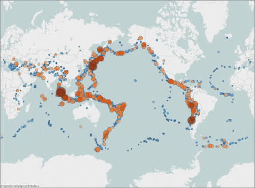
Proportional symbol maps:
Proportional Symbol maps are suitable for visualizing the quantitative data for individual locations. It shows the data of one or two quantitative values per location. (Among two values, one value is encoded with color and the other is with size). Let’s take an example of the Earthquakes that occurred between 1981 to 2014 around the Earth, and size them by magnitude. Tableau allows you to color the data point locations by magnitude for extra details.
Choropleth maps (filled maps):
Choropleth maps are also called Filled maps in Tableau. These maps are best suitable for visualizing the ratio data or statistical data in the form of various shading patterns or symbols on specific geographic areas. Choropleth maps are best suitable for visualizing data for polygons. And the Polygons may be countries, states, regions, or any area that can be geocoded in Tableau.
Point distribution maps:
Point distribution maps are those which help the organizations in visualizing how locations of particular data points are shared. Point distribution maps are often used to show approximate locations and are looking for visualized clusters of data. To create a data distribution map in Tableau, your data source should include Latitude and longitude coordinates.
Let us consider an example here, if you wish to find the hail storms that occurred in the U.S last year, you can use a point distribution map to see if you can spot any clusters.
Heatmap (density maps):
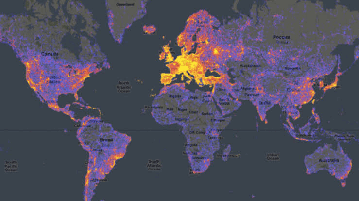
Heat maps are also called density maps in tableau. Heat maps work efficiently to make the large volumes of data to be made comprehensible. Heat maps are one of the great ways to spot trends and help in what to do next. Heat maps are good at self-explanatory, and intuitive compared to other maps.
If you wish to find user engagement on a website, the Heat map will help you with that. For example, you would like to find which area or content on a page has got more & fewer clicks on a site, then apply a heat map which highlights the area where users have clicked a maximum number of times with black color and give light color where users have given no or less attention.
| Related Article: Tableau HeatMaps |
Flow maps (path maps):
Flow maps are also called path maps in tableau. These maps are often used in Tableau to show a Path over time. Flow suites perfectly to show the journey of a particular thing from one place to another over a period of time, as the path of a storm. The best example is Thunder stores, you can get the area from where a storm started and ended.
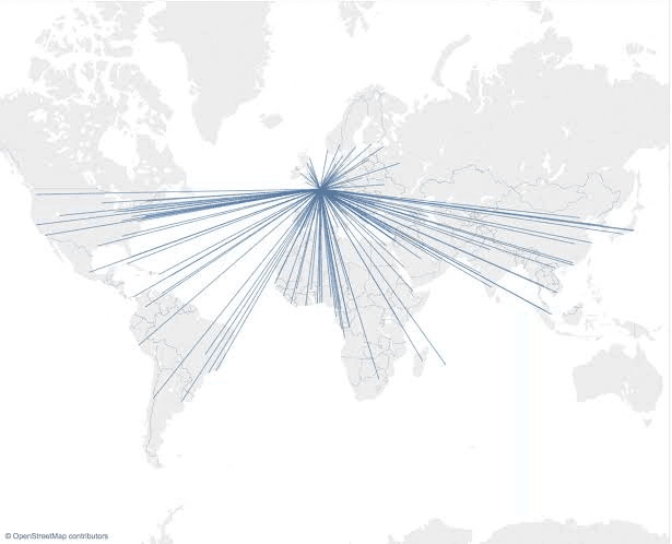
Spider maps (origin-destination maps):
Spider maps are widely used in Tableau to show the connectivity between the various points. It is the best possible way to show the path between the single-origin and various destinations or locations. Here in tableau, we have several ways to create spider maps. For instance, to map the migration of population between counties, storm tracks, or connection between your office location and the locations of your suppliers, customers, etc..
| Read these latest Tableau Interview Questions and Answers that help you grab high-paying jobs |
Mapping Concepts in Tableau:
It is very difficult to understand the insights of data even though the data is clearly processed and arranged in tables. To tackle this issue or to have a clear understanding of data you must use “Maps” which have occupied an important role in data visualization. We have multiple maps available in the table which plays a unique role in visualizing the data.
There may be several reasons to use maps or plot your data on the map. Maybe you have some location data or do you think plotting data on a map could help you in making your data pop? These two reasons are good enough to create a map visualization. In Tableau each type of map comes with unique features to cater to the specific needs of data mapping requirements.
Tableau maps answer your spatial questions and need to understand the trends in the data.
But you may have popped up with the question “what is the spatial question”?
The below-mentioned list is some of the spatial questions:
- Which state has the highest literacy rate in India?
- Which regions in the U.S. have the highest obesity rates?
- Where did storms move over a period of time?
- Which metro station is highly crowded with people in my city?
- Which state has more farmer’s markets in the U.S?
These are some of the Spatial questions, and the map is the best possible way to answer all your questions.
Circumstances to use maps:
Till now we have come to know that if you have spatial question maps would be the perfect way to answer your questions but there may be some exceptions in which you can answer the spatial questions better with other types of charts instead of maps.
Let’s consider one of the spatial questions we have asked above.
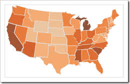
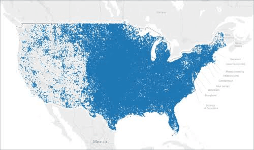
Take, for example, the last question from the list above: Which state has more farmers markets in the U.S?
Let us assume that you have entire data about the number of farmers markets across the U.S and you wish to know which state has the highest number of farmer markets. The obvious thing that would come to your mind is “Maps” to visualize this data. If you plot the given data related to the US farmers market you will get an image like below.
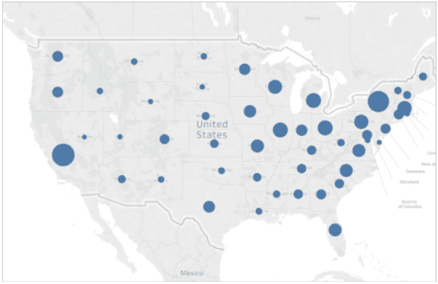
Does that clear to answer which state in the US has got more farmer’s markets? No, right?
What if you create a bar chart instead of a Map? Let's have a look at the below image.
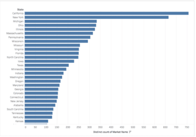
This would clearly give you the information on which state has the highest number of Farmers and the least number as well.
So when do you know whether you could go for map visualization or not?
To get the answer to this question you need to follow one thumb rule: Weather another visualization give you the answer faster or easier? If your answer is yes, then map visualization may not suit you better.
Before going to Plot your data on a map you need to be more cautious with the data. Your Map visualization should be appealing and data should not be misleading. If the data used for visualizing the map is incomplete or wrong one then everything goes in vain.
How to build a simple map in Tableau?
You can build multiple types of Maps for analyzing geographic locations. Even though if you are a newbie to Tableau, it will help you with its inbuilt capabilities in building the simple point or filled (polygon) maps.
Step 1:
Prerequisites:
Before going to build a simple map in tableau you need to have some predefined things. The data you are going to use in building maps should contain location data such as latitude, longitude, and location names.
Step 2:
Procedure to build a Simple Point map:
We need to follow the below process to Build a basic point map
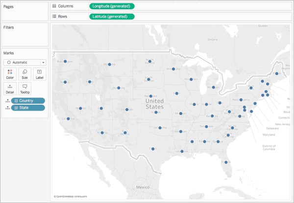
- Navigate to a worksheet
- Double click on the “state” which lies under the data pane under dimensions
- Click on Data pane → Dimensions → double click on State.
The State element contains the geographic data and a Map view is automatically created the same as the below image.
Step 3:
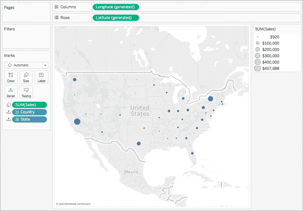
Drag Sales to size on the Marks Card from Measures,
After doing the above task the map will show the number of sales proportionally the same as the below image.
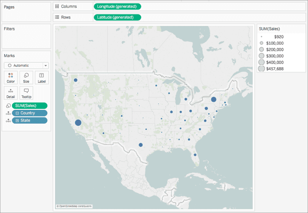
Step 4: Select Maps → Maps Layers.
Step 5: Do the following in the Map Layers Pane.
- Click on Style drop-down → Select normal.
- Under map layers clear country region Names.
Once you clear the country/ region “Name” the map the updated map will look like below.
Customize Maps:
Tableau is highly flexible and allows you to create any type of map, you can build customized apps according to your business needs. You can create a simple geographic map in tableau. Customization of maps would help us in setting your reports apart and get your maps in a brand.
The process to customize a map in Tableau:
In the tableau, we can have the flexibility to customize maps in different variations using different colors and backgrounds.
Lets us discuss various steps involved in customizing the maps in tableau:
- Select a Tableau background map style
- Import your own background map
- Add a static background image
- Show or hide map layers
- Add layers for country/region demographic data
- Change the mark type
- Add levels of detail
- Add color
- Add labels
- Adjust the size of your data points
- Create custom tooltips
| Check out Tableau Tutorial |
Creating Territories on a Map:
When you choose to analyze your data using a map view, you may require to group existing locations together to develop your own regions or territories, like marketing territories for your organization.
In tableau we have three different ways to create territories:
- Select and group locations on a map
- Creating a territory from geographical data
- Geocode a territory filed using a using another geographic filed
Let us discuss each territory creation type in short:
1) Select and group locations on a map:
Once you have created a map view you can select and group locations to create your own locations.
Let us consider an example over here,
The following map view is showing the total amount of sales by postcode of a company across Australia.
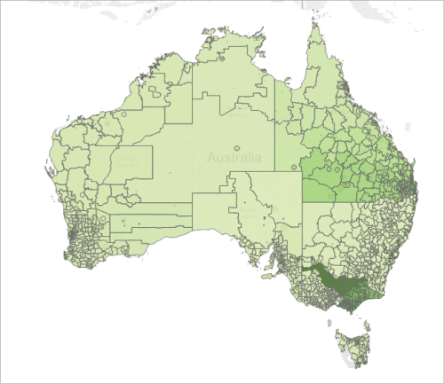
You may be wondering how to analyze all these postcodes. If you are looking for the sales of every single postal code or you may want to have the sales information of specific territories or regions or areas. So as we have already created a Map view all you need to do is split the map and group the regions that you wish to know.
To create a territory you need to select the locations directly from the map and group them together to create your own territories. The below steps would help you in creating territories.
Step1: Select locations on the map to group into a territory
Step 2: Create the first group (your first territory)
Step 4: Add the group field to the view
2) Creating a territory from geographical data
This is another way of creating territories by creating groups in the Data pane
To do so you need to follow below steps:
- Click on the data pane → give a right-click on the region field and select “create group”.
- In the create group dialogue box select regions that you wish to have in your first territory and click Group. Now each group you create represents a territory. Create the number of groups you need and click on “Ok”. Then the new group field is added to the data pane.
- Now drag the newly created group filed from the Data pane to Detail on the Marks card. You can also drag the field to Color or Label on the Marks card to differentiate between each territory.
3) Geocode a territory field using other geographic data.
If the data source contains a custom territory field, you can easily geocode it to a map in Tableau with the help of a geographic field in your data source.
You can do it by simply following the below 2 steps:
- Assign a geographic role to the territory field
- Add the territory field to the view
Note: If in case your data source does not contain a territory field, you can blend a territory field with another region field that is presented in your data source.
Customize How People Interact with a Map:
Once you are done with the creation of Map there are multiple ways in which you can interact or explore with the view. You can bend your Map in the way you want such as zooming in and out of the view, selecting marks, and also you can search for locations worldwide with the feature called map search.
In the same fashion, you can also have a chance to restrict your audience is interacting with your map.
We have a Map Options Dialogue box in Tableau which allows you to customize your audience's interaction with your map.
Below mentioned are the different Interaction customizations:
- Show a map scale
- Hide map search
- Hide the view toolbar
- Turn off pan and zoom
Let's discuss each customization in detail
Show a map scale:
The map scale option allows your audience to know the distance between the data points on the map. You would find this scale on the bottom right corner of the view, and updates automatically based on zoom in and out of a map.
To show map scale on your view below steps is used:
- Map → Options → Map Options dialogue box → view → Show map scale
- In map scale units, click the dropdown and select the number of measurements you want.
Note: There are many other measurement options as well under the Map scale units, you can choose the metric that you wish to show on the map.
Hide map search:
This option would allow you to hide the search option from the map or you can also restrict the user from searching.
To hide the map search icon:
- Select Map → Map Options → Map Options dialogue box → View → Clear Show Map Search
Hide the view toolbar:
This Hide view toolbar feature allows you to restrict your audience from zooming the map to all of your data or restricting the audience from locking the map at a single point.
To hide the view toolbar:
- Select Map → Map Options → Map Options dialogue box → view → Clear Show View Toolbar
Turn off pan and zoom
This Turn off pan and zoom-in map view will allow you to restrict the audience from pan, or zoom in or out of the view.
To turn off pan and zoom:
- Select Map → Map Options → Map Options dialogue box → view → Clear Allow Pan and Zoom.
Select Background Maps:
The Tableau background map comes with the updated map and stylistic improvements as well as demographic data. The background map feature has replaced the Tableau classic background map.
Tableau has a set of online and offline maps that allows you to create map views. But the default feature in the tableau is that it connects to an online map provider.
There are three background maps are available in the tableau which are,
- None
- Offline
- Tableau
To select a new background map you need to: select Map → Background Maps → select the background map you wish to have.
To select a default map:
- Select Map > Background Maps > Set as Default
To select an offline background map:
- In Tableau Desktop, select Map > Background Maps > Offline
Use Mapbox Maps:
You can add these Mapbox maps to your workbooks or create map views in Tableau Desktop.
When you publish a view that is aligned with the Mapbox maps to Tableau online, Tableau server, or Tableau public, your audience can have access to your Mapbox map and data without even having a Mapbox account.
Add Mapbox map to your workbook
You can add a Mapbox map to your workbook on the Tableau desktop and also use the Mapbox map as a background map. Once you add a Mapbox map to your workbook, it gets saved in the workbook and available to those with whom you have shared a workbook.
To add Mapbox to your workbook:
To add In Tableau Desktop, select Map → Background Maps → Mapbox Map
To know more about the MapBox maps concept click here
Use WMS Servers :
Tableau Desktop allows you to connect to map servers by using Web Map Service (WMS) protocol. Web Map Service acts as a standard protocol for accessing or receiving the geographically referenced imagery.
In Tableau Desktop you can have a facility to connect to a WMS server that supports the WMS 1,0.0, 1.1.0, or 1.1.1 standards.
To connect to a WMS server in Tableau Desktop:
- Select Map → Background Maps → WMS Servers
- You will get a WMS dialogue box in which you are supposed to type the URL for the server that you want to connect in Tableau, and then click on OK.
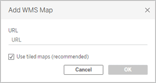
You can add how many map servers you want to a workbook. Every WMS server that you add becomes like a background map in the menu of Background Maps menu. To know complete information about WMS servers click here
Save a Map Source:
Once you add a Mapbox or WMS server to the workbook, you can store that as a Tableau map Source (.tms). Once you save the WMS server or Mapbox when you share it with others they can easily import it into their own workbooks and also use it to create a new map view.
To save the map:
- Select MAp → Background Maps → Map Services. You will be displayed with the dialogue box.
- You can select the Map that you wish to save as a Map source of Tableau and then click on Export. This will take you to the Export Connection dialogue box.
- Give a name to the file, select a location, and then hit the save button.
Import a Map Source:
In Tableau, you have a facility to import a Map Source (.tms) that someone shared with you into a workbook, and you can use the same Map source to develop custom map views.
- Select Map → Background Maps → Map Services. This will open the Service dialogue box.
- Hit on import. This will take you to the Import Connection Dialogue box.
- It will automatically navigate you to the saved Tableau map source file (.tms) that you are looking to Import, then select and click on Open. This would close the import connection dialogue box and the Map Service dialogue box added with the list of Tableau maps.
Explore Data in Maps:
Tableau maps allow you to find the locations easily and analyze data worldwide. We have different ways to explore the data in Tableau. You can do a lot of things with maps such as Zoom in and out, search for locations on the map and select marks with a toolbar, etc. To know more about data exploration click here.
Animating maps:
Animation in Tableau is used for examining the trends or placing the measure of a particular period. To create an animation in Tableau you need to have things like a succession of pages screens or frames. All you need to do is place the time measures on the page that would produce the animation. To know complete information on how to make animated maps in tableau click here
Conclusion:
Tableau has been a great tool in the data visualization industry. Its unique features and high-end data visualization techniques make data presentation more clear. Till now we have dealt with various concepts of Maps in tableau. I hope you have found useful information on this blog. If you have any doubts please feel free to comment on them in the comment section, we will respond at the earliest. Happy learning!
 On-Job Support Service
Online Work Support for your on-job roles.

Our work-support plans provide precise options as per your project tasks. Whether you are a newbie or an experienced professional seeking assistance in completing project tasks, we are here with the following plans to meet your custom needs:
- Pay Per Hour
- Pay Per Week
- Monthly
| Name | Dates | |
|---|---|---|
| Tableau Training | Jul 21 to Aug 05 | View Details |
| Tableau Training | Jul 25 to Aug 09 | View Details |
| Tableau Training | Jul 28 to Aug 12 | View Details |
| Tableau Training | Aug 01 to Aug 16 | View Details |

Vinod M is a Big data expert writer at Mindmajix and contributes in-depth articles on various Big Data Technologies. He also has experience in writing for Docker, Hadoop, Microservices, Commvault, and few BI tools. You can be in touch with him via LinkedIn and Twitter.


