
- Power BI Slicers - A Definitive Guide
- How to Download and Install Power BI Desktop
- How to Share Reports in Power BI for Mobile
- Power BI Architecture: A Complete Tutorial with Diagram
- Power BI Career Opportunities
- What are the Components of Power BI?
- DAX In Power BI - Learn Power BI DAX Basics
- Power BI Tutorial - Power BI Desktop Tutorial
- Power BI Interview Questions and Answers
- Power BI Services and Benefits
- Power BI Visuals List and Chart Types
- Power Apps Interview Questions and Answers
- Power Apps Tutorial
- What is Power BI? The Definitive Guide
- What is Power Apps?
- Power BI Projects and Use Cases
- Power Pivot vs Power Query
- Power BI Vs QlikView
- Power BI Heatmap
- Power BI Gateway - Power BI Gateway Architecture
- Power BI vs SSRS - What are the Differences
- Power BI Dashboards vs Reports - Which is better?
Data visualization is one of the most interesting and technical techniques. Apart from a huge knowledge bank, you must be empowered with a highly supportive and well-equipped data visualization tool. If you have already started your search, you would know looking for a great open-source data visualization tool is not an easy task and can even cost a fortune.
And in this guide, I'll reveal the best free data visualization tools and help you choose the best one for you.
The tools and techniques used in creating the graphical representation of the information and data at hand comprise the data visualization tools. Several visual elements like graphs, charts, maps, pointers, etc are used to represent the data in an understandable format.
| If you need to boost your professional credibility and prestige within your own network, then learn Power BI from Mindmajix's Power BI Online Training Course. |
Top 15 Open Souce Data Visualisation Tools
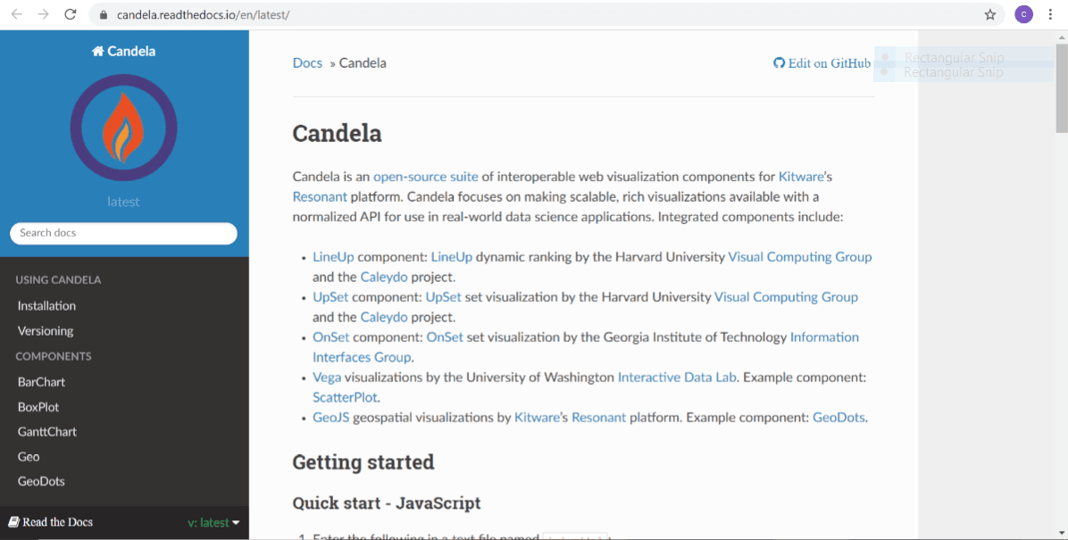
1. Candela
-
Candela is the first choice when it comes to open source data visualization tools.
-
The tool works on Kitware’s resonant platform and offers a range of elements for data visualization.
-
It allows you to make super-rich visualizations that are scalable and available within a normalized API.
| [Related Article: Data Visualization Interview Questions] |
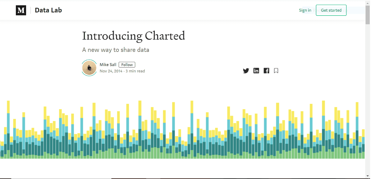
2. Charted
-
Charted is an automatic
-
free tool developed by the popular blogging platform Medium.
-
It is one of the most up-to-date tools when it comes to data visualization since it is empowered with data re-fetching every 30 minutes.
-
It allows several types of files and is best for ad-hoc query handling.

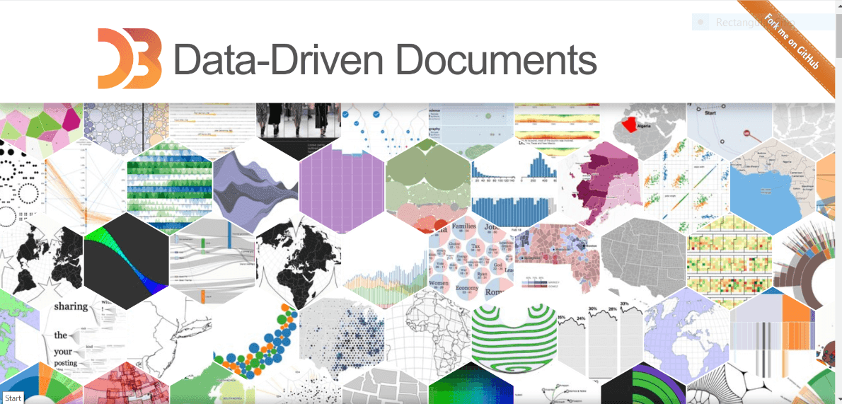
3. D3.js
-
This open-source JavaScript library is best for creating interactive data visualizations in the web browser.
-
It allows powerful data visualization components and a data-driven approach to DOM manipulation.
-
It operates on an arbitrary set of nodes called selections.
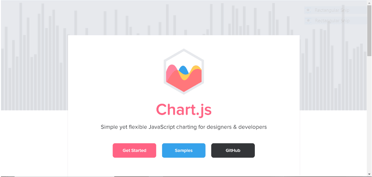
4. Chart JS
-
Chart JS is an open-source clean charting library that is maintained by a community.
-
The tool works on JavaScript and helps data scientists in creating visualizations of the data.
5. Leaflet
-
The leaflet is also a JavaScript library that helps in creating interactive mobile maps.
-
It is a high-performance, easy-to-use tool that comes in very lightweight.
-
It is an extremely versatile tool that can be worked across almost every desktop and mobile.
-
It also has a well-documented API for greater performance.
| [ Related Article:- Best Power BI Interview Questions and Answers ] |
6. Datawrapper
-
Datawrapper is an open-source data visualization tool that is extremely mobile-friendly and helps data professionals in creating correct, simple, and workable charts in a matter of a few minutes.
-
You can get this tool in both paid and free versions.
7. Dygraphs
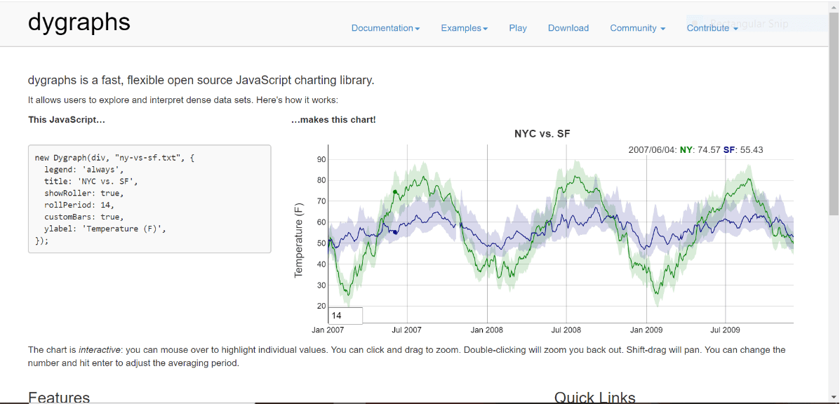
-
Dygraphs is a charting library that is both open-source and JavaScript-based.
-
It allows the users to work on dense data sets and explore what can be done with those.
-
Though it has a precondition or pre-requirement of some basic web programming at the users’ end.
8. RAW Graphs
-
RAW is by far the most flexible and serving data visualization tool.
-
It allows you to simply copy-paste or cut-paste, upload, provide a link to the data that needs to be processed, and then it automatically creates a wide variety of visualizations generally in the form of charts.
-
Another feather in its cap is the fact that it is equally simple to use for non-programmers as well.
9. ColorBrewer
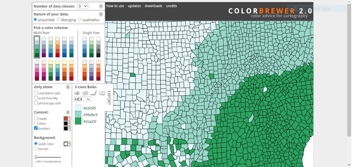
-
This is a free online tool that is primarily designed to help you choose the color schemes for all your data visualization projects and maps.
-
It is a great platform to see if the selected color theme goes well with the given visual.
-
This tool provides a wide range of data classes to choose from and work upon.
10. Chartist
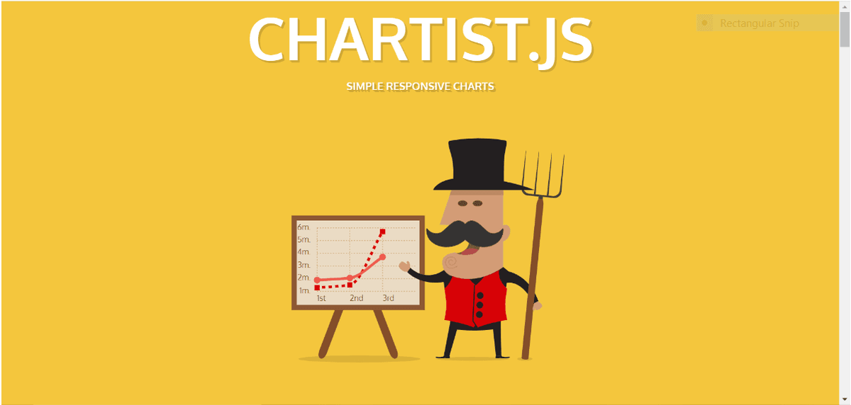
-
If you are looking forward to developing some highly responsive, scalable, and customizable charts then your first choice should be chartist.
-
This open-source data visualization tool allows you to choose conventional methods with a lot of flexibility and keeps the portions of the project separated by colors for a better understanding.
| [ Related Article:- Power BI Slicer ] |
11. Google charts
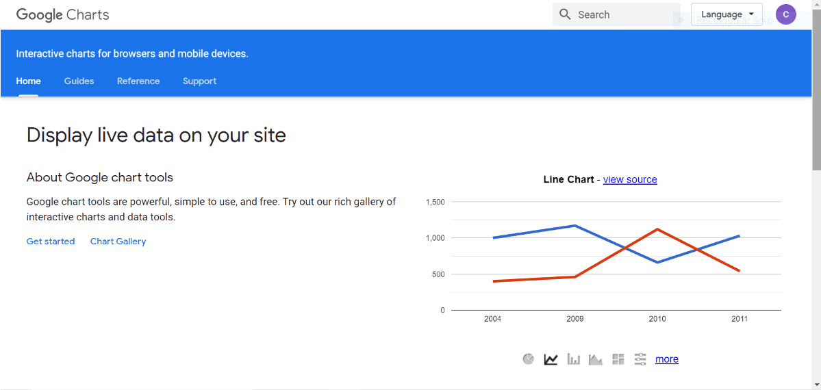
-
Carry the excellence of google, google charts is a free web service allowing users to create charts from the data that has been supplied to it.
-
It allows you to use a large variety of charts that includes hierarchical treemaps and scatter plots etc.
-
The users are exposed to an extensive range of options and can control charts and dashboards.
12. Flot
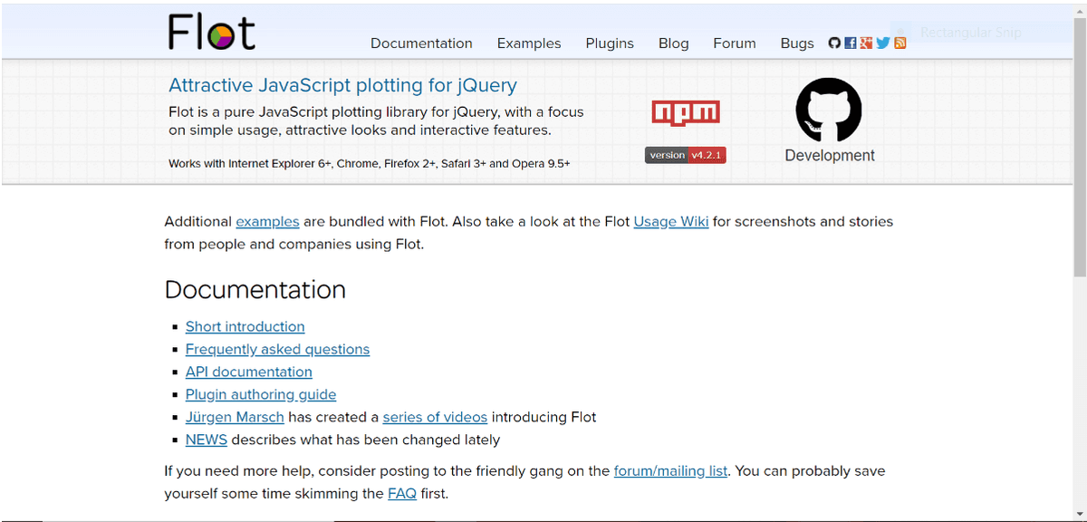
-
Flot is one of the best tools dealing in jQuery which is open source and based on JavaScript.
-
It is highly interactive and adds to the user experience.
-
This tool is highly scalable in terms of being used across different web browsers like Explorer 6+, Opera 9.5+, Firefox 2+, Chrome, etc.
13. myHeatmap
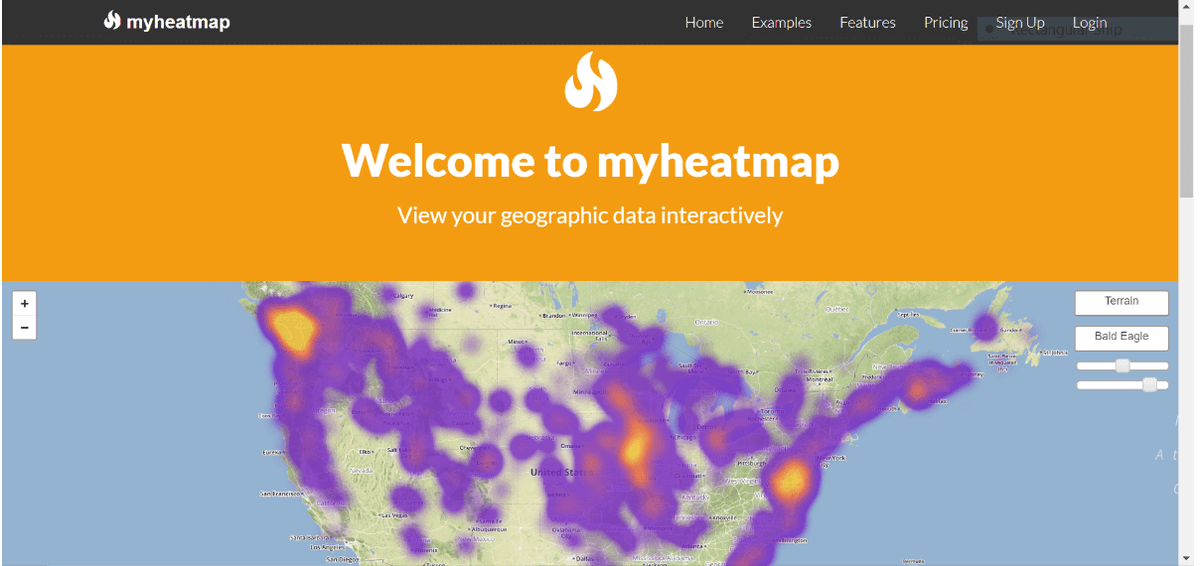
-
myHeatmap is a tool that allows you to represent data based on the cold and hot region.
-
It is a great tool to visualize data in the simplest manner.
-
It also allows a deep level of zoom in and out and allows users to hop between different data sets.
14. Palladio
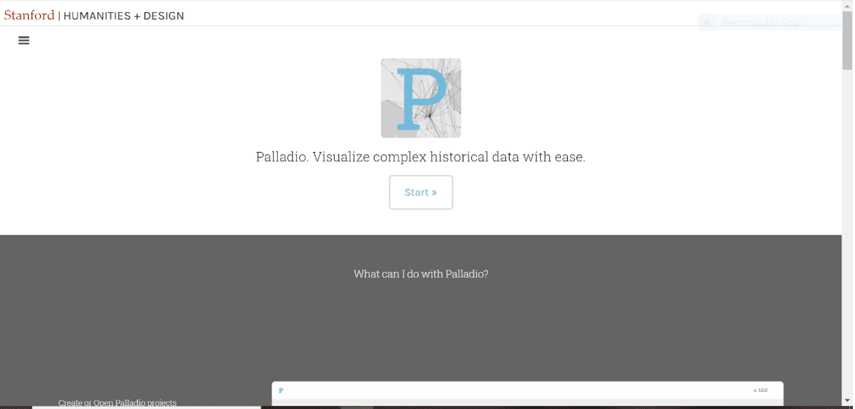
-
Palladio is best used for visualizing data that is complex and multi-dimensional.
-
This tool basically originated from Stanford University where you can even view the coordinates as points on a map.
-
It also allows you to visualize the relationship between two dimensions.
15. Polymaps
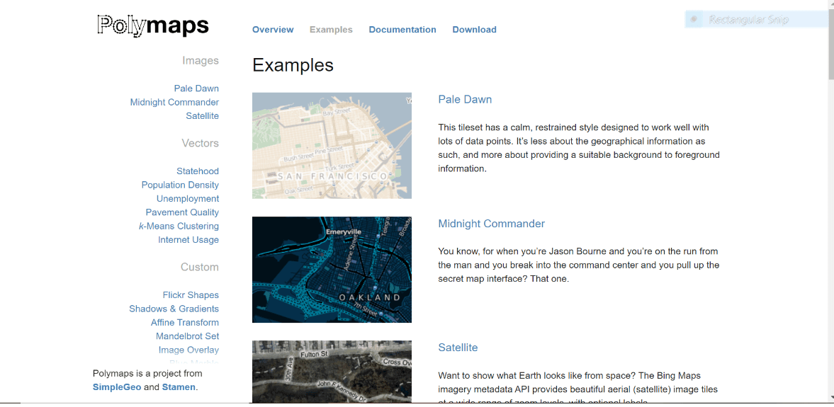
-
Primarily used for making maps with the modern library elements, polymaps is a JavaScript-based open-source platform that allows you one of the most speedy zooms over the maps.
-
It is one of the best apps that helps your narrow down from a country level to individual streets through state cities and towns.
| Explore Power BI Sample Resumes! Download & Edit, Get Noticed by Top Employers! |
Why should you use an open-source data visualization tool?
Data visualization is not limited to just presenting data in a graphical form but is also a way to tell what is the story weaved in those representations. Data visualization is a crucial and impacting aspect that comes at a fair share of the price. Especially when it comes to business decision-making, data visualization has a great deal to serve. The decision-makers can analyze data that is self-explanatory and graphically represented to ease the decision-making process. With the graphical representation of data, categories and sections can easily be created allowing a great deal of transparency and smoothness in the system. An open-source data visualization tool can help you avail of the best benefits without being ripped off your budget.
Final Verdict:
Data visualization forms an integral part of how your work and philosophy are presented in the form of the audience and users. A highly dependable data visualization tool will allow you to represent all your work and thoughts in the most interactive and presentable manner without hindering its true functionality. Reach out in the comments section below to know more about data visualization and the best tools.
 On-Job Support Service
Online Work Support for your on-job roles.

Our work-support plans provide precise options as per your project tasks. Whether you are a newbie or an experienced professional seeking assistance in completing project tasks, we are here with the following plans to meet your custom needs:
- Pay Per Hour
- Pay Per Week
- Monthly
| Name | Dates | |
|---|---|---|
| Tableau Training | Jul 18 to Aug 02 | View Details |
| Tableau Training | Jul 21 to Aug 05 | View Details |
| Tableau Training | Jul 25 to Aug 09 | View Details |
| Tableau Training | Jul 28 to Aug 12 | View Details |

Pradeep is tech-savvy, currently working as a content contributor at mindmajix.com. He writes articles on various tech spaces -Business Intelligence, Testing, Cloud, Project Management, Document Management etc.


