
- Power BI Slicers - A Definitive Guide
- How to Download and Install Power BI Desktop
- How to Share Reports in Power BI for Mobile
- Power BI Architecture: A Complete Tutorial with Diagram
- Power BI Career Opportunities
- What are the Components of Power BI?
- DAX In Power BI - Learn Power BI DAX Basics
- Power BI Tutorial - Power BI Desktop Tutorial
- Power BI Interview Questions and Answers
- Power BI Services and Benefits
- Power Apps Interview Questions and Answers
- Power Apps Tutorial
- What is Power BI? The Definitive Guide
- What is Power Apps?
- Top 15 Data Visualization Tools
- Power BI Projects and Use Cases
- Power Pivot vs Power Query
- Power BI Vs QlikView
- Power BI Heatmap
- Power BI Gateway - Power BI Gateway Architecture
- Power BI vs SSRS - What are the Differences
- Power BI Dashboards vs Reports - Which is better?
According to DOMO, over 2.5 quintillion bytes of data are generated every single day, and 90% of the data in this world has been created in the last two years. It is a tough task to manage this huge amount of data and make sense of all of it.
So, the majority of organizations are using Business Intelligence Visualization tools to derive value from data. Among these, Power BI is one of the best visualization tools to handle the data in distinct patterns and make observations. Data proliferation can be managed as part of the data science process, which includes data visualization. Using different Power BI visuals or chart types in 2023, you can manage a vast amount of data quickly and effectively.
| Power BI Visuals List and Chart Types - Table Of Content |
Now, let us know what is data visualization and its importance in this business world.
What is Data Visualization?
Data Visualization is a process of taking raw data and transforming it into graphical or pictorial representations such as charts, graphs, diagrams, pictures, and videos which explain the data and allow you to gain insights from it. So, users can quickly analyze the data and prepare reports to make business decisions effectively.
| Explore a variety of resources dedicated to Power BI training, offering valuable insights and practical knowledge to enhance your proficiency in data visualization and analysis using this powerful tool. |
Importance of Data Visualization
We are inherently in the visual world where pictures or images speak more than words. So it is easy to visualize a large amount of data using graphs and charts than depending on reports or spreadsheets.
Data visualization is a quick and easy way to convey concepts to the end-users, and you can do experiments with different scenarios by making slight changes. It can also:
- Clarifies which element influences customer behaviour.
- Identifies the area to which you need to pay attention.
- Guides you to understand which product should be placed in which location.
- Predicts the sales volume.
The better you visualize your points, the better you can leverage the information to the end-users.
You might have confusion regarding selecting the correct data visualization for the data sets you have. The right data visualization helps you to boost the impact of your data. Business Intelligence platforms like Power BI help in dealing with the different visualizations of data sets in a secure manner.
| Related Article: Architecture in Power BI |
Now, we are going to discuss the list of Power BI chart types in 2023.
Top Microsoft Power BI Visuals List
Here are the chart types in Power BI:
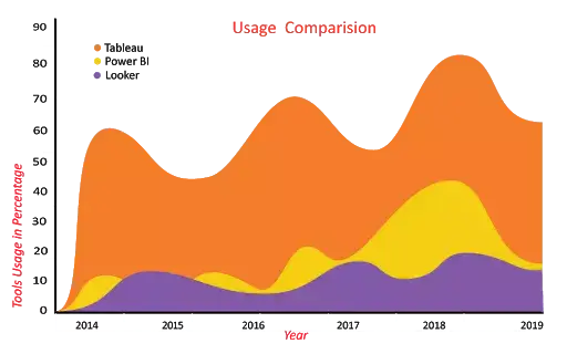
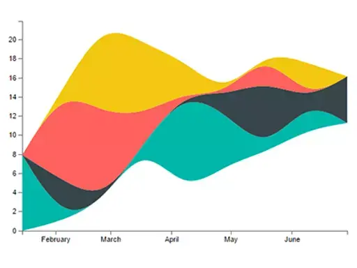
1. Area Charts
The area chart depends on line charts to display quantitative graphical data. The area between the axis and lines is commonly filled with colors, textures, and patterns. You can compare more than two quantities with area charts. It shows the trend changes over time and can be used to attract the attention of the users to know the total changes across the trends.
For Instance:
The below Area chart clearly shows you how the usage of Tableau, Power BI, and Looker varies over the past six years.
2. Line Charts
Line charts are mostly used charts to represent the data and are characterized by a series of data points connected by a straight line. Each point in the line corresponds to a data value in the given category. It shows the exact value of the plotted data. Line charts should only be used to measure the trends over a period of time, e.g. dates, months, and years
For Instance:
The below line chart shows the popularity of the Microsoft Power BI keyword in Google search across the world. It's clearly indicating that the popularity of Power BI has been increasing gradually since its inception.

[]
3. Bar Charts
In the list of Power BI visualization types, next, we are going to discuss bar charts.
Bar charts are mostly used graphs because they are simple to create and easy to understand. Bar charts are also called horizontal charts that represent the absolute data. They are useful to display the data that include negative values because it is possible to position the bars above and below the x-axis.
For Instance:
We have shown you the Power BI Developer Salary trends (Based on neuvvo.com) in different countries using the bar chart.
The above image shows the comparison of Power BI developer Salary trends in 5 different countries (UK, India, Canada, Australia, USA).

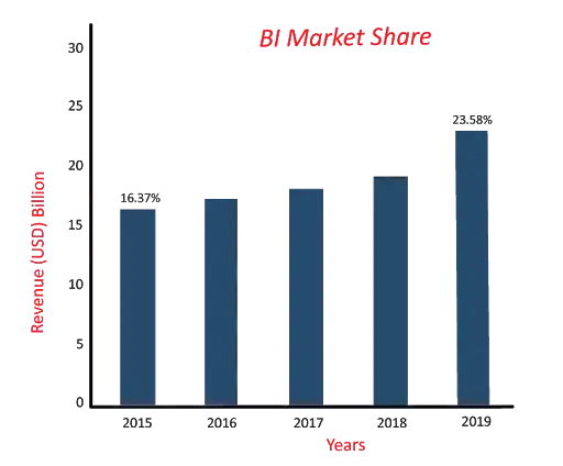
4. Column Charts
Column charts are similar to bar charts, and the only difference between these two is, column chart divides the same category data into the clusters and compares within the clusters. Also, it compares the data from other clusters.
For Instance:
Let us consider one example in which we compared the BI market share with the past years.
If you have observed the below column chart, it is clear that the BI market share has been increasing gradually.
[]
| Related Article: DAX Basics |
5. Combo Charts
A combo chart is a combination of both the column charts and line charts that help you to make a quicker comparison of the data. The combo chart shows the relationship between two measures in a single visualization. It also helps to compare multiple measures with different values.
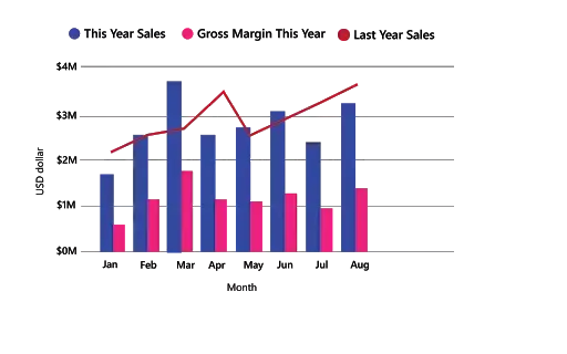
For Instance:
In the above combo chart, you can see the comparison between last year's and current year's sales of a product and also the current year's gross margin. With the help of this combo chart, an organization can quickly analyze the data about the product to make business decisions quickly.
| Also Read: Comparision Between Tableau and Power BI |
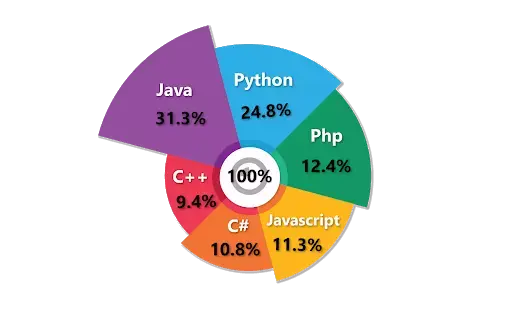
6. Pie Charts
A pie chart is a circular statistical chart, and it shows the whole data in parts. Each portion of a pie chart represents the percentages, and the sum of all parts should be equal to 100%. The whole data can be divided into slices to show the numerical propositions of each part of the data. Pie charts are mostly used to represent the same category of data. It helps users to understand the data quickly. They are widely used in education, the business world, and communication media.
For Instance:
In the below Pie chart, it is clear that which programming language is on the top list in 2019.
7. Doughnut Charts
Doughnuts are similar to pie charts, and it is named doughnut chart because it looks similar to a doughnut. You can easily understand the data because doughnut charts show the whole data into the proposition. It is the most useful chart when you need to display various propositions that make up the final value.
For Instance:
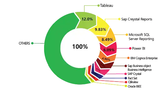
Let us consider an example, top BI tools market share across the globe.
8. Gauge Charts
A gauge chart is also known as a speedometer or dial chart. It uses the needle to read the data, and it shows the information on a dial. The gauge chart, it represents the value of each needle as it reads the data according to the axis or colored data. These charts are useful to compare the values between the variables either by using multiple needles on the same gauge or different gauges.

For Instance: The above gauge chart shows you the average gross sales of the company.
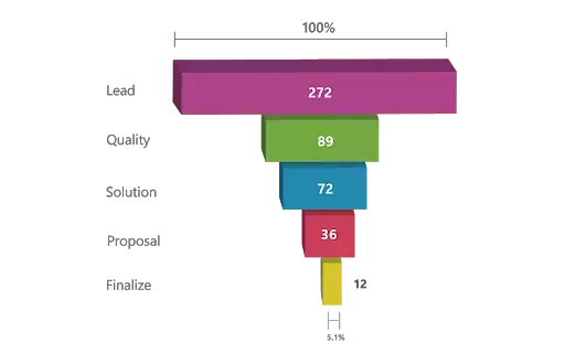
9. Funnel Charts
The funnel chart is a type of chart which is used to visualize the data that flows from one phase to another phase. In the funnel chart, the whole data is considered as 100%, and in each phase, it is represented as numerical propositions of the data.
For Instance:
The above Funnel charts show the flow of each phase. In the below image you can see the total leads per day is 272, the quality leads are 89, solution leads are 72, proposal leads are 36, and finalize leads are 12.
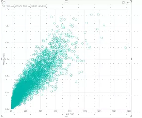
10. Scatter Charts
Scatter charts are used to visualize the data using the dots that represent the values obtained from two different variables, such as the x-axis and y-axis. These charts are used to show the relationship between two different variables. It is also called a correlation plot because it shows how two variables are correlated to each other.
Till now, we discussed the top 10 Power BI visualization types. Now we are going to discuss the remaining visualization types with detailed information.
| Also Read: Slicers in Power BI |
11. Bubble Charts
Bubble charts show the data in the form of a circle. The values of the variables are represented by the x-axis and y-axis. The size of the circle represents the measure of the variables.
For Instance:
In the below bubble chart, you can observe that on X-axis, the community is measured, and quality is measured on Y-axis. Each bubble represents the size of the community.

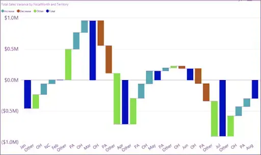
12. Waterfall Charts
A waterfall chart is used to show how initial values are increasing and decreasing gradually by a series of values to arrive at the final value.
For Instance:
Let us consider an example in which you can plot your company's annual profit in different countries, and you can add different sources of income and losses to know the net profit of your company.
13. Maps
Maps are divided into three types, and they are listed below:
- Regional Maps
- Point Maps
- Flow Maps
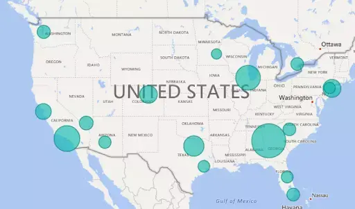
A) Regional Maps:
Regional maps use different colors to represent the distribution of a specific range of values on the map.
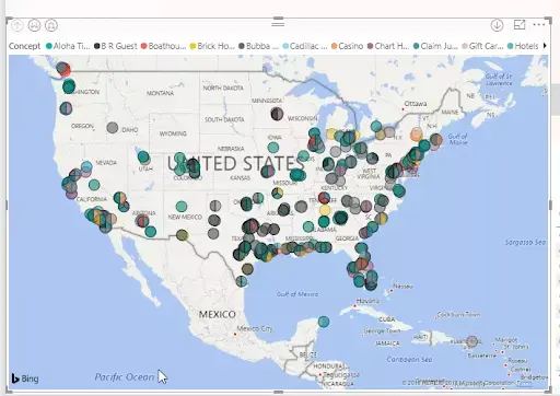
B) Point Maps
A point map is used to represent the geographical distribution of data by plotting the same size points on the geographical background. It helps the user to grasp the overall distribution of the data, but it is a tough task if you want to observe specific data.
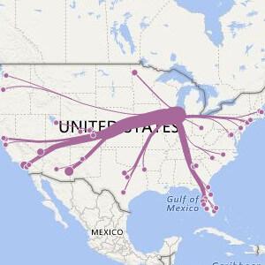
C) Flow Maps
A flow map is a type of map that is particularly designed to show specific themes connected with a particular geographical area. It is used in cartography to show the movements of the objects between two or more areas.
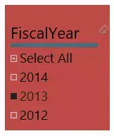
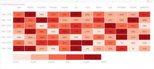
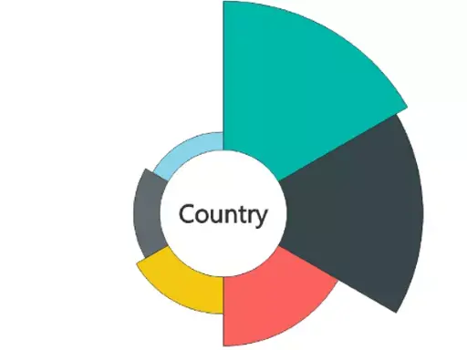
14. Slicers Charts
Slicers charts are visual filters. Using slicers, you can filter or sort your data by clicking on the type of data you want. In the below example, you can see all-region sales. In case if you want to see particular region sales, then click on that region, and it shows the specific region's sales.
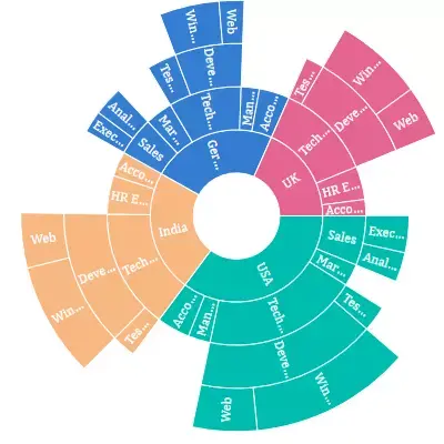
15. Tree Maps
Treemaps display hierarchical data set in a nested rectangle. At each level, hierarchy is represented by a color. The size of the space in the rectangle depends on the data values. The rectangular boxes are arranged in size from top left to bottom right.
For Instance:
For example, you are analyzing your sales, and you have top-level branches for clothes categories: Rural, Mix, Youth, and Urban. Power BI treemaps split your categories into rectangle boxes (leaves); these boxes would be shaped and sized based on the number of sold.
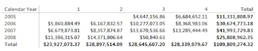
16. Matrix Chart
A Matrix chart shows the relation between two or more variables in a data set. It is mainly made up of columns and rows to represent the data in the grid format. At least two variables are required to create a matrix chart if there is any third or fourth variable, and color or other dimensions that can be added to the matrix to represent the data.
For Instance:
The below matrix chart represents the company’s revenue in different years with other factors.
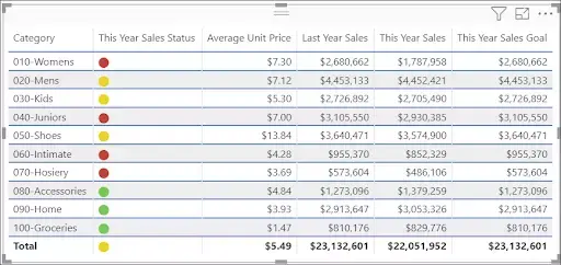
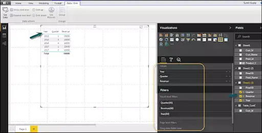
17. Tables
A table is a grid that contains the related data in a series of rows and columns. Tables are useful if you are comparing the same category for many values.
For Instance:
In the below example, you can see the same category having multiple measures to compare.
| Read these latest Power BI Interview Questions and Answers that help you grab high-paying jobs |
We have seen the list of Power BI visualizations with detailed information. Now we are going to discuss how to create Power BI Visualisations.
How to Create a Power BI Visualization?
Power BI consists of various in-built data visualization components such as pie charts, maps, and bar charts. And, it contains complex models including funnels, gauge charts, waterfall, and many other components. The below image shows the default visualization icons.
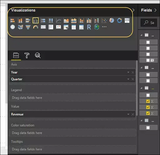
You can create the Power BI visualizations in two ways. In the first method, you can easily drag and drop the fields from the right sidebar to the axis. According to your business requirements, you can add multiple fields to the axis.
In the second method, you should add a field from the right-side panel to the report canvas. In Power BI, the table visualization type is the default visualization, and it is possible to move the visualization on the reporting canvas by dragging and clicking on it. You can also change to different visualization from the visualization pane.
What is Power BI Desktop Visualization?
Power BI Desktop is a free application you can download on your computer, and that allows you to connect, transform and visualize the data. Power BI Desktop allows you to communicate with multiple sources of data and combines them to create relationships between the data to enhance the data model.
End-user can build visuals such as charts, graphs, and even videos and they can share these data visuals with others in the organization to create reports and dashboards using the data model.
| Related Article: Microsoft Power BI Tutorial |
How to Create Custom Visualizations in Power BI?
Custom visuals are created by developers using the custom visuals SDK to enable business users to see their data in a way that fits the business best. Report authors can import the custom visuals files into their reports and use them as any other Power BI visuals. Custom visuals are 1st class citizens in Power BI and can be filtered, highlighted, edited, and shared.
Now, we will discuss how to create custom visualization. The following are the steps to create custom visualization.
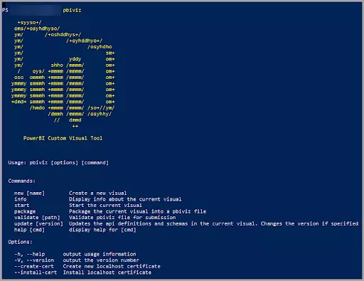
Step 1: Enter pbiviz command in the Powershell prompt and verify whether the Power BI tools package has been installed or not; if not, install the tool in your system.
pbiviz+syyso+/
oms/+osyhdhyso/
ym/ /+oshddhys+/
ym/ /+oyhddhyo+/
ym/ /osyhdho
ym/ sm+
ym/ yddy om+
ym/ shho /mmmm/ om+
/ oys/ +mmmm /mmmm/ om+
oso ommmh +mmmm /mmmm/ om+
ymmmy smmmh +mmmm /mmmm/ om+
ymmmy smmmh +mmmm /mmmm/ om+
ymmmy smmmh +mmmm /mmmm/ om+
+dmd+ smmmh +mmmm /mmmm/ om+
/hmdo +mmmm /mmmm/ /so+//ym/
/dmmh /mmmm/ /osyhhy/
// dmmd
++
PowerBI Custom Visual Tool
Usage: pbiviz [options] [command]
Commands:
new [name] Create a new visual
info Display info about the current visual
start Start the current visual
package Package the current visual into a pbiviz file
update [version] Updates the api definitions and schemas in the current visual. Changes the version if specified
help [cmd] display help for [cmd]
Options:
-h, --help output usage information
-V, --version output the version number
--install-cert Install localhost certificateStep 2: Review the output and add a list of supported commands.
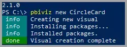
Step 3: Enter the CircleCard command in the Powershell prompt to create a custom visual.
pbiviz new CircleCard.
pbiviz new CircleCard
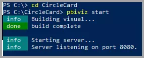
Step 4: Now, navigate to the project folder.
cd CircleCard
Step 5: Start a custom visual. Your CircleCard is running on your hosted computer.
pbiviz start
Power BI - Individual Custom Visualizations Types
1. Aster Plot
Aster plot charts are similar to pie charts and doughnut charts. In the aster plot, you can be able to visualize up to two measures. The first measure controls the depth and the second measure controls the width of each section.
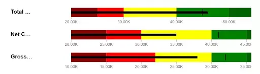
2. Bullet Charts
Bullet charts are the replacement of dashboard gauges and meters. They are useful to compare one or more measures to enrich the data. Bullet charts may be vertical, horizontal and may be stacked to allow the comparison of the data.
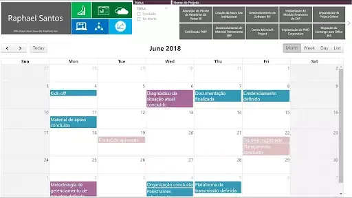
3. Calendar Charts
The calendar charts are unique charts and allow you to represent the distribution of values across a calendar. The custom calendar supports one data field and many measurable columns that are necessary for your project.
4. Chiclet Slicer
Chiclet Slicer is similar to the slicer and it is made of buttons. It has a lot more flexibility and includes the ability to use images instead of text as filters.
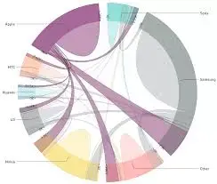
5. Chord
Chord diagram provides an easy way to identify the interrelationship data visualization in a matrix. A circular chart shows the relationship between the variables, and it connects the data points in the form of an arc in the chord chart.
6. Dot plot
A dot plot chart is similar to the scatter chart and bubble chart, and it allows you to compare multiple measures by their magnitudes and represent the data with the dot. It also allows you to plot the data along the x-axis.
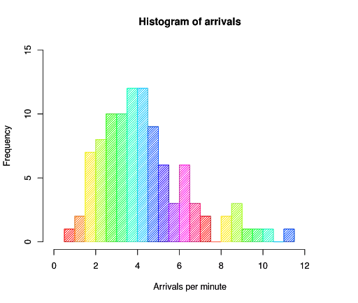
7. Histogram
A histogram chart is similar to a column chart, and it visualizes the distribution of data over a certain time. Each bar in the histogram shows the frequency at each interval.
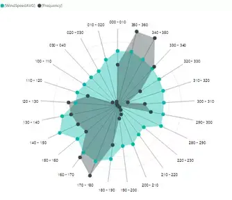
8. Radar Chart
A radar chart is a graphical chart to display various types of data in the form of two-dimensional charts. It compares two or more variables to display on the axes starting from the point. Stream Graph: A stream graph is a type of stacked graph which represents data around the central axis, it shows the changes in the data over a certain time through a flowing, organic shape that resembles a river-like stream.
9. Stream Graph
A stream graph is a type of stacked graph which represents data around the central axis, it shows the changes in the data over a certain time through a flowing, organic shape that resembles a river-like stream.
10. Sunburst
The sunburst chart is also called a multi-level pie chart, radial treemap, and ring chart which is used to visualize the typical hierarchical data. It consists of inner circles surrounded by rings of deeper hierarchy levels. The angle of each part is divided equally under its parent node.
11. Synoptic Panel
The synoptic panel allows you to present one or more images, assigning an arbitrary area. These areas are colored and highlighted to display the information.
| [ Related page: Power BI Gateway ] |
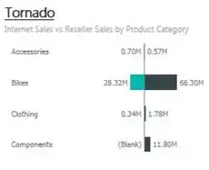
12. Tornado
Tornado charts are useful to analyze the sensor data compared to the relative variables. These charts are also called tornado charts or plots and a special type of bar chart.
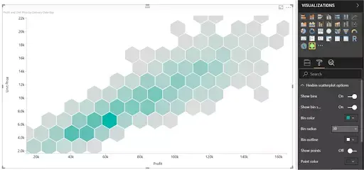
13. Hexbin Scatter Plot
Hexbin scatters plot is a custom visual effect for Microsoft Power BI that displays the points on the top of hexagonal bins.
14. Enhanced Scatter Plot
Enhanced Scatter Plot is an open-source visual. In this chart, some more properties are added on top of the scatter visual including background images and shapes of positioning elements onto an image background.
| Related Article: Power BI Services & Advantages |

Conclusion
Till now, we discussed the different types of Power BI Visualizations and how to create custom visualizations in Power BI. There are much more Power BI Visuals List and Chart Types available on this Microsoft platform. We hope that we gave detailed information on how and when to use the visualizations according to your business needs.
Got any questions? Leave a comment below and we will get back to you
 On-Job Support Service
Online Work Support for your on-job roles.

Our work-support plans provide precise options as per your project tasks. Whether you are a newbie or an experienced professional seeking assistance in completing project tasks, we are here with the following plans to meet your custom needs:
- Pay Per Hour
- Pay Per Week
- Monthly
| Name | Dates | |
|---|---|---|
| Power BI Training | Jul 11 to Jul 26 | View Details |
| Power BI Training | Jul 14 to Jul 29 | View Details |
| Power BI Training | Jul 18 to Aug 02 | View Details |
| Power BI Training | Jul 21 to Aug 05 | View Details |

Usha Sri Mendi is a Senior Content writer with more than three years of experience in writing for Mindmajix on various IT platforms such as Tableau, Linux, and Cloud Computing. She spends her precious time on researching various technologies, and startups. Reach out to her via LinkedIn and Twitter.


