
- How to Download and Install Power BI Desktop
- How to Share Reports in Power BI for Mobile
- Power BI Architecture: A Complete Tutorial with Diagram
- Power BI Career Opportunities
- What are the Components of Power BI?
- DAX In Power BI - Learn Power BI DAX Basics
- Power BI Tutorial - Power BI Desktop Tutorial
- Power BI Interview Questions and Answers
- Power BI Services and Benefits
- Power BI Visuals List and Chart Types
- Power Apps Interview Questions and Answers
- Power Apps Tutorial
- What is Power BI? The Definitive Guide
- What is Power Apps?
- Top 15 Data Visualization Tools
- Power BI Projects and Use Cases
- Power Pivot vs Power Query
- Power BI Vs QlikView
- Power BI Heatmap
- Power BI Gateway - Power BI Gateway Architecture
- Power BI vs SSRS - What are the Differences
- Power BI Dashboards vs Reports - Which is better?
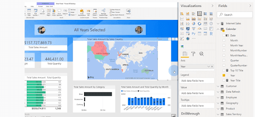
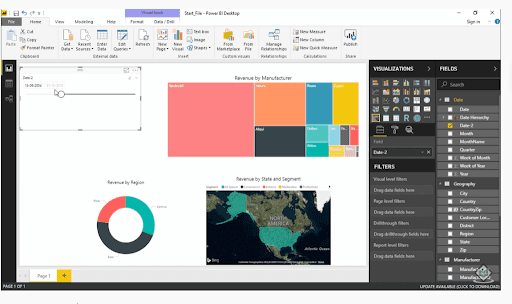
Visualization of data is a key concept in Power BI. This visualization can be achieved by representing the data in data models or by creating graphs or charts. So, for creating and representing only the important data and hiding unnecessary data in charts or data models for data visualization we need creative forms called Slicers.
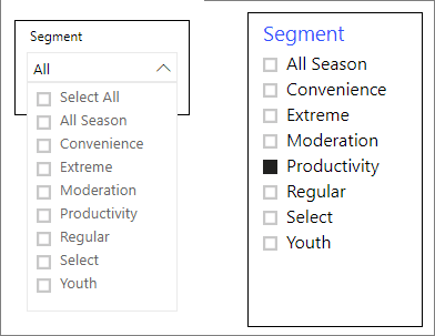
What are Slicers in Power BI?
Slicers in Power BI are the simple forms of filters that play a key role in designing customized charts and reports on the Power BI Desktop. These Slicers play the most crucial role in creating comparative charts or customized reports. And, Power BI Slicers act as an alternative solution in filtering the narrow portions of datasets that are represented in the form of other visualizations in a particular report.
Where to Use Power BI Slicers?
Power BI Slicers can be used in the below scenarios:
- To display important or commonly-used filters on the report canvas for easier access.
- To filter by columns to eliminate the hidden or unnecessary data in the tables.
- To design more creative reports by placing slicers next to important visuals.
- To show the currently applied filtered data without opening any filters or drop-down lists.
| Want to become a Data Visualization expert? Then visit here to Learn Power BI Online Certification Course Course from Mindmajix |
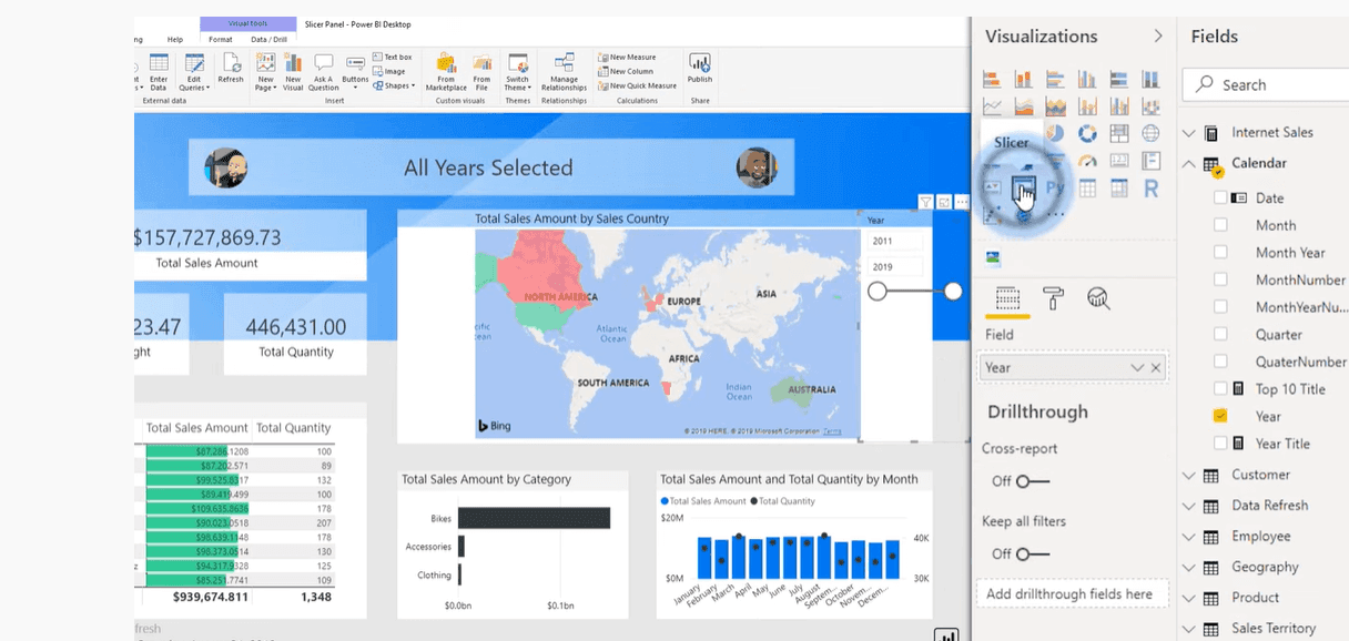
How to Add New Slicers in Power BI?
To add a Slicers in Power BI one must go through the following steps, and they are:
Step 1: Drag or select the data field first to create a visualization.
Step 2: Now, select the slicer icon present in the visualization pane to turn the visualization into a slicer.
| Visit here to learn about Power BI Visualization Types |
What are the Different Types of Slicers Available in Power BI?
The types of slicers in Power BI are listed below:
1. Relative Date Slicer
The date is the most important element at the time of business analysis because it helps us to identify the future forecast and how we are going to generate revenue in the upcoming years.
There are four types of Power BI data slicers and they are:
- Between
- Before
- After
- List
Between
In the Date Slicer "Between" provides the range of dates between the start and end date.
Before
When we select the Before option in the Date Slicer, the start date automatically grades out, which means we can get the report before the end date.
After
When we click on the “After” in the date slicer pane the end date becomes stagnant so that we can fetch the results after the start date.
List
List in the Date Slicer provides a list of all the date ranges so that we can select dates accordingly for the results.
:
| Do You Know How to Use Power BI |
2. Numeric Range Slicer
The Numeric range slicer in Power BI is mainly used to apply all kinds of filter sorts to any numeric column in the data model. It even provides the most effective way to filter the data between numbers.
How to Create a New Slicer in Power BI?
Below are steps to create a new slicer to filter data by District Manager:
Step 1: In the Power BI service or Power BI desktop, open the Retail Analysis Sample.
Step 2: Select the slicer icon present in the visualization pane to create a new slicer.
Step 3: Next, select the District>DM from the pane of fields to populate the slicer.
Step 4: New slicer is created with a list of names having selection boxes before them.
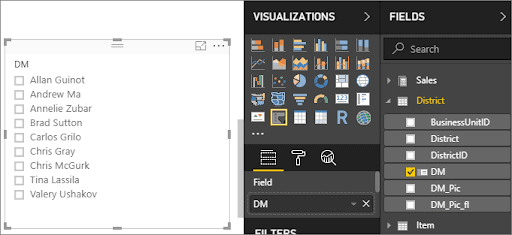
Step 5: Drag and resize the elements present on the canvas to make room for the slicer.
Step 6: Select the names that are present on the slicer and make a note of the effects on the other visualizations on the page. Selecting all the names will have the same effect and impact as selecting none.
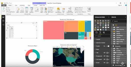
How to Format a Slicer
To format your slicer, select the format icon and it displays all the formatting control options.
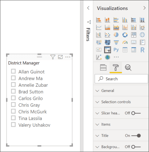
In the below example, the slicer that is present first has been converted to a dropdown in order to consume less space, and then the option Select all has been added whereas the second slicer has been formatted with colors, and font sizes, and allows only a single selection.
| Related Article: Power BI Architecture |
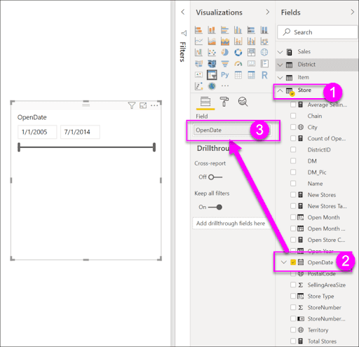
Procedure for Creating a Slicer to Filter Data by Date Range
Step 1: Firstly, without selecting anything on the canvas, just drop down the Store element from the pane of fields and then drag the OpenDate option to the values which are present in the visualization pane in order to create an effective visualization.
Step 2: Select the slicer icon to convert the new visualization to a slicer.
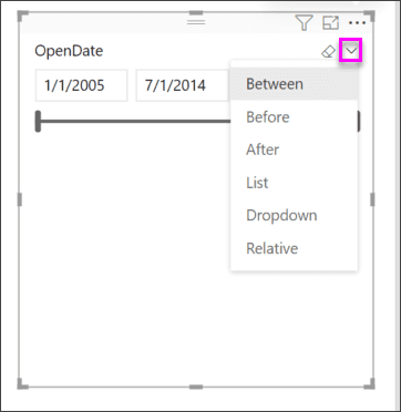
Step 3: Drag and resize the elements present on the canvas and the slicer to make room-size space for the slicer. Just note that the slider always resizes with the slicer size.
Step 4: Using the slider select different data ranges and keep an eye on effects on the other visualizations on the page.
Step 5: To change the slicer type, choose any one of the options from the box that you hover over the upper-right area of the slicer and make a note of the changes in the slicer's appearance.
| Visit here to know about the Download and Installation Process of Power BI Desktop |
Steps to Convert Vertical Slicer to a Horizontal Slicer
Step 1: With the selection of the slicer, in the Visualization pane, now select the Format tab.
Step 2: Click on the General section for orientation and then select the horizontal option in it.
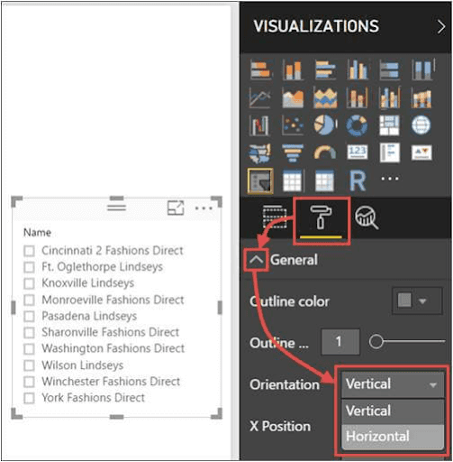
Step 3: If you want to extend for more values, probably make the pane wider.
Step 4: Right under the orientation in the general section of the Format tab, slide responsive (preview) to on.
| Learn and Practice Power BI Interview Questions and Answers |
How can you Sync Slicers in Power BI and Use them on other Pages?
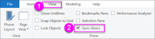
Step 1: Select the Sync slicers checkbox present in the view menu on Power BI Desktop.
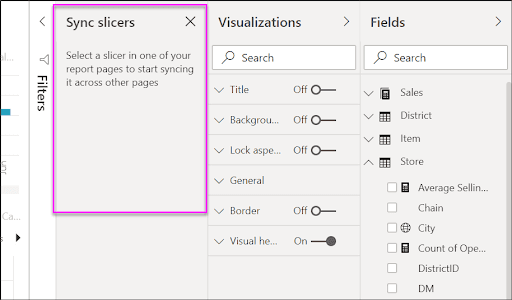
Step 2: The pane of Sync slicers is present in between the Visualizations pane and Filters.
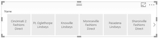
Step 3: Select the District Manager slicer present on the District Monthly Sales page.
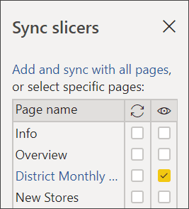
Step 4: Now, select the Overview page and the page of New Stores present in the Sync column in order to make sure that the District Monthly Sales slicer directly syncs to those particular pages.
Step 5: Next, select both Overview and New Stores pages in the Visible column. The below image shows the representation of the Sync Slicer.
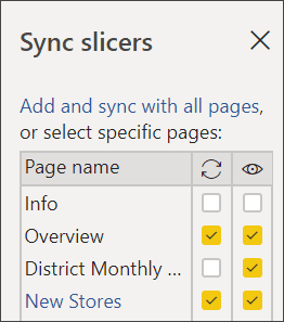
Step 6: In this step, the District Manager slicer present on the District Monthly Sales page shows the same selections as the one on the Overview page. On the page of New Stores, selections available in the Store Name Slicer are affected by the selections present in the District Manager slicer.

Power BI Slicers’ Limitations
- Slicers in Power BI don't support visual-level filters.
- Input fields are not supported in Power BI Slicers.
- Slicers do not support Drilldown.
- Slicers in Power BI cannot be pinned to a dashboard
| Related Article: Power BI Services And Benefits |
Final Thoughts
You can use Slicers very efficiently in Power BI for filtering small portions of datasets. They also play a key role in representing the most significant data in the form of charts or graphs. The Power BI desktop can be made more colorful by applying different slicer effects. Power BI Slicers are simple yet powerful. Use it wisely, and it can have a positive impact on data visualizations.
We hope that you now have a clear knowledge of slicers in Power BI. Got any questions? Leave a comment below and we will get back to you
 On-Job Support Service
Online Work Support for your on-job roles.

Our work-support plans provide precise options as per your project tasks. Whether you are a newbie or an experienced professional seeking assistance in completing project tasks, we are here with the following plans to meet your custom needs:
- Pay Per Hour
- Pay Per Week
- Monthly
| Name | Dates | |
|---|---|---|
| Power BI Training | Jul 21 to Aug 05 | View Details |
| Power BI Training | Jul 25 to Aug 09 | View Details |
| Power BI Training | Jul 28 to Aug 12 | View Details |
| Power BI Training | Aug 01 to Aug 16 | View Details |

Pranaya is working as a Content Writer at Mindmajix. She is a technology enthusiast and loves to write about various technologies which include, Java, MongoDB, Automation Anywhere, SQL, Artificial Intelligence, and Big Data. You can connect with her via LinkedIn and Twitter.


