
- Power BI Slicers - A Definitive Guide
- How to Download and Install Power BI Desktop
- How to Share Reports in Power BI for Mobile
- Power BI Architecture: A Complete Tutorial with Diagram
- Power BI Career Opportunities
- What are the Components of Power BI?
- DAX In Power BI - Learn Power BI DAX Basics
- Power BI Tutorial - Power BI Desktop Tutorial
- Power BI Interview Questions and Answers
- Power BI Services and Benefits
- Power BI Visuals List and Chart Types
- Power Apps Interview Questions and Answers
- Power Apps Tutorial
- What is Power BI? The Definitive Guide
- What is Power Apps?
- Top 15 Data Visualization Tools
- Power BI Projects and Use Cases
- Power Pivot vs Power Query
- Power BI Vs QlikView
- Power BI Gateway - Power BI Gateway Architecture
- Power BI vs SSRS - What are the Differences
- Power BI Dashboards vs Reports - Which is better?
Power BI is one of the most widely-used business intelligence tools that help companies conduct in-depth customer analyses to drive valuable insights. It offers numerous data visualization and analytics tools that allow users to make valuable dashboards or reports to make data-driven decisions. The Power BI Heatmap is the most often used visualization to display distributed networks, customer behavior, etc.
After reading this article, you will have a solid understanding of what Power BI Heatmaps are and how to use them for Data Visualization.
| Power BI Heatmap - Table Of Content |
What is Power BI Heatmap?
As its name implies, a heatmap is a type of visualization used to project the density of data at each specific position on a map. A Power BI Heatmap is an example of a visualization that displays the density of data on a map. In this type of data visualization, individual values in a matrix are represented as colors.
| If you want to enrich your career and become a professional in Power BI, then visit Mindmajix - a global online training platform: "Power BI Training" This course will help you to achieve excellence in this domain. |
Categorical data is color-coded, but numerical data needs a color scale that changes from one color to the next in order to distinguish between high and low numbers. Since most companies work with structured data, where variables are arranged in rows and columns so that you may Color-Highlight table cells that contain essential data, a Heatmap is a helpful tool for cross-examining multivariate data. This is accomplished by using a Warm-to-Cool Color Spectrum to highlight behavioral data.
Power BI Heatmaps may demonstrate variation across several variables, highlight patterns, determine whether two variables are similar, and uncover relationships between them. Also, Power BI Heatmaps also provide important information about a data point or an entity based on specific variables in the dataset.
The areas on a heatmap with the highest data density are displayed with dark colors, followed by light colors that are directly proportional to density. This color pattern can be shown using geographical maps, tables, or histograms.
Why are Heatmaps Useful?
Heatmaps can provide a significant level of intuitive visual representation of data on multiple levels. One of the best ways to obtain business intelligence is using this strategy. Additionally, a lot of businesses utilize it for the following factors:
- To have a broad understanding of the customer's behavior.
- Boost business performance.
- An excellent alternative to visual analytics.
- An approach that data scientists can use to show how features are related.
Power BI Heatmap Applications
Below listed are the Power Heatmap applications across organizations:
- Getting an overview of the marketplace
Heatmaps are popular because they enable customers and businesses to visualize data quickly and identify existing and new customer clusters. You can plot potential clients' workplaces for more accurate analysis.
- Refining distribution networks
Businesses might use heatmaps to locate new locations for service or distribution operations. Companies can use color patches to evaluate customer density and map the regions from which they can efficiently service the most significant number of customers.
- Analyzing third-party data for marketing campaigns
You can quickly choose where to conduct your marketing activities and locate the right clients by mapping the data sets collected from various websites. The locations and times of day when most of your target audience is most likely to be found can be determined, for instance, using demographic data.
- Identifying the areas for expanding the franchise
Furthermore, using demographic heatmaps, a company can identify areas where it might expand and open new franchises to maximize profits. Customers in the projected area might be grouped around a new franchise with the aid of radius analysis.
- Studying disease trends or areas for further investigation
By plotting health data sets on heat maps, we may quickly evaluate various variables affecting cancer patients' prevalence in particular places. For instance, you might examine the relationship between pollutants and the local increase in cancer cases by combining data on pollutants with statistics on people's lives.
[Releted Article : Power BI Interview Questions]
How to create a Heatmap in Power BI?
A heat map is not included in Power BI Visualization by default. But there are various approaches to creating a heat map.
- Use the official domain-specific email address to log in to view map- and table-specific heat maps from the marketplace.
- Utilize any external file you downloaded to the system.
- A table or matrix can be converted into a heat map using conditional formatting of background colors.

1. Power BI Heatmap Visual
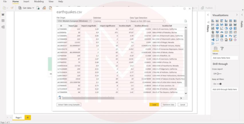
We'll create a Power BI heatmap for earthquakes in the following steps that happen over a certain amount of time. But when creating other categories, the process is roughly the same.
- Load the sample data sets in Excel or CSV format and go to the Power BI Desktop interface.
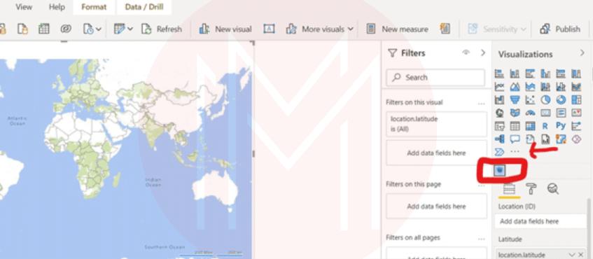
- To add the heatmap visualization, select Get additional visuals from the More menu, or click the Heatmap icon in the Visualization panel.
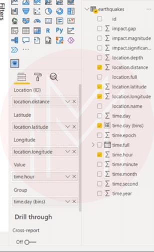
- Now include the necessary fields and data variables to create a heat map.
- Add the data variables to the required fields as shown in the picture below:
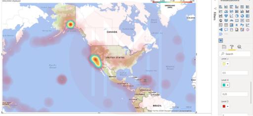
- The UI will display a simple heatmap visualization.
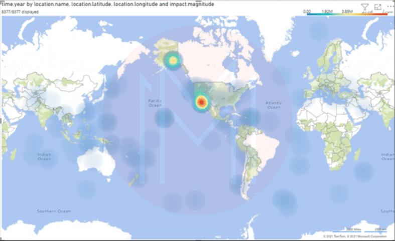
- The regions in the above image that have experienced more earthquakes are marked in red, while the regions that have experienced fewer earthquakes are highlighted in blue.
- Although we can differentiate between locations with various earthquake frequencies, it still needs to be more notable.
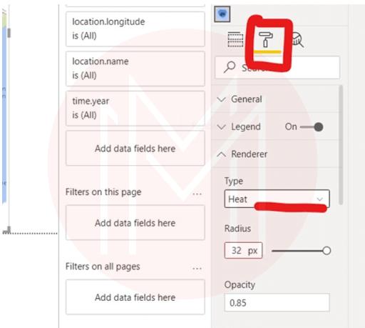
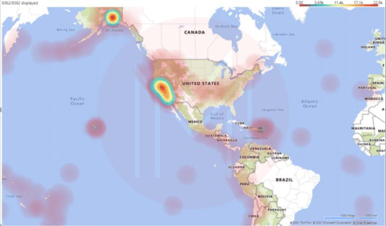
- Therefore, select the Format option in the Visualization tab and switch the renderer type to Heat to improve the heatmap.
- Now, add different colors to various levels.
- Finally, your Power BI heatmap visualization can be used in dashboards or reports.
2. Power BI Heatmap Table
Following are the steps to create a Heatmap table in Power BI
- In the Power BI Desktop interface, load the data sets and choose Tablevisual from the visualization panel.
- Add the MonthName and DayofWeekName to the rows and columns, respectively. Also, include SalesAmount in the Values section.
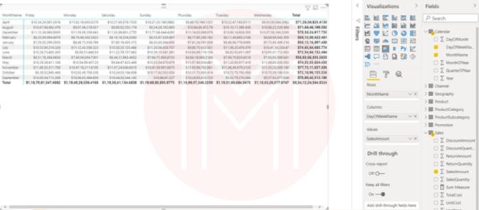
- On the Power BI interface, a standard table will be created.
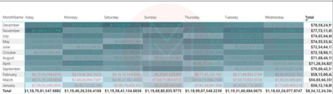
- Now switch your table's style to minimal and turn on the background and font color.
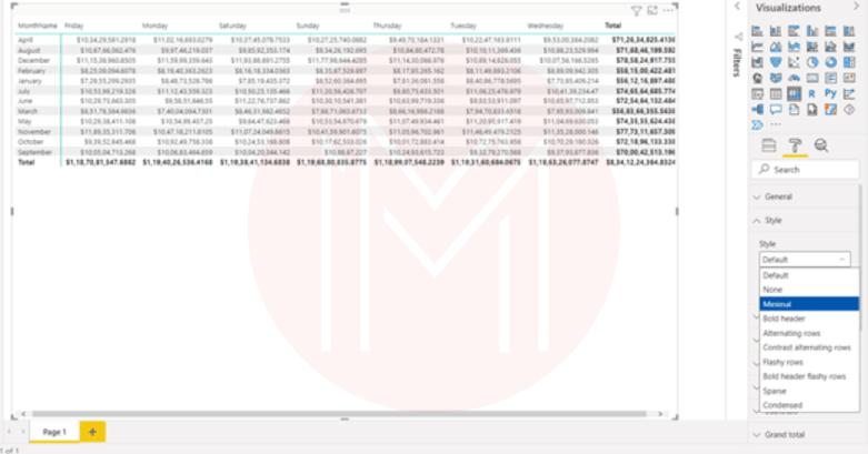
- Finally, change the table's colors as per your needs, then you will be ready with a Power BI heatmap table.
Key things to remember when using Power BI Heatmaps
You must remember some key factors while creating Heatmaps with Power BI.
- Heatmaps in Power BI are customized visualizations only accessible through the Power BI Marketplace.
- The Power BI Marketplace has a wide variety of visualization charts, although they are rarely used. Common charts are only available in the visualization area.
- When creating a heatmap, always choose a color representing Heat or density.
- Only numerical data can be used in heat maps.
- Some of the cells in your data matrix might not have any values after conversion. In this case, PowerBI gives you the option to set those values to zero, which is helpful.
- For your Power BI heatmap, you can use predefined colors or create custom colors.
- Based on density and intensity, heat maps are created. It is essential to use colors that accurately represent that information.
Power BI Heatmap FAQs
1. Does Power BI have a heat map?
Yes. Power BI provides various data analytics and visualization tools to build informative dashboards or reports to make data-driven decisions. We can easily combine data from different sources and convert them to valuable insights.
A heatmap in Power BI is one of the most well-known visualizations for showing distributed networks, the effectiveness of marketing, etc.
2. What is a heatmap used for?
Heatmaps show relationships between two variables using one variable on each axis. By observing how cell colors vary along each axis, you can identify any trends in the values for either one or both variables.
3. What does a heatmap show you?
For internet-driven activities, heatmap visualizations show how the customers interact with those platforms based on clicks, scrolls, etc. Companies can use that data to make intelligent business decisions.
4. What is the difference between a tree and a heat map in Power BI?
Both maps are helpful for data analysis. A treemap shows a data hierarchy in rectangles, whereas a heat map visualizes and compares different kinds of data.
5. Are heatmaps worth the use?
Heatmaps are worth the use when you're trying to respond to queries related to intensities or densities.
6. What can be used instead of the heatmap in Power BI?
Heatmaps can be replaced with Grouped bar charts. They are utilized to compare several data types or to study the distribution of data points.
Conclusion
This blog has given a thorough explanation of what heatmaps are and how they benefit. You also know how to use Power BI to create your heatmap visualization.
If you're interested in improving your Power BI skills, check out MindMajix's Power BI Training Course.
 On-Job Support Service
Online Work Support for your on-job roles.

Our work-support plans provide precise options as per your project tasks. Whether you are a newbie or an experienced professional seeking assistance in completing project tasks, we are here with the following plans to meet your custom needs:
- Pay Per Hour
- Pay Per Week
- Monthly
| Name | Dates | |
|---|---|---|
| Power BI Training | Jul 25 to Aug 09 | View Details |
| Power BI Training | Jul 28 to Aug 12 | View Details |
| Power BI Training | Aug 01 to Aug 16 | View Details |
| Power BI Training | Aug 04 to Aug 19 | View Details |

Madhuri is a Senior Content Creator at MindMajix. She has written about a range of different topics on various technologies, which include, Splunk, Tensorflow, Selenium, and CEH. She spends most of her time researching on technology, and startups. Connect with her via LinkedIn and Twitter .


