
- Power BI Slicers - A Definitive Guide
- How to Download and Install Power BI Desktop
- How to Share Reports in Power BI for Mobile
- Power BI Architecture: A Complete Tutorial with Diagram
- Power BI Career Opportunities
- What are the Components of Power BI?
- DAX In Power BI - Learn Power BI DAX Basics
- Power BI Tutorial - Power BI Desktop Tutorial
- Power BI Interview Questions and Answers
- Power BI Services and Benefits
- Power BI Visuals List and Chart Types
- Power Apps Interview Questions and Answers
- Power Apps Tutorial
- What is Power BI? The Definitive Guide
- What is Power Apps?
- Top 15 Data Visualization Tools
- Power Pivot vs Power Query
- Power BI Vs QlikView
- Power BI Heatmap
- Power BI Gateway - Power BI Gateway Architecture
- Power BI vs SSRS - What are the Differences
- Power BI Dashboards vs Reports - Which is better?
Industrial data is believed to be 'unstructured' in about 80% of cases. According to a survey published by GlobalNewswire, the worldwide business intelligence industry is expected to reach USD 33.3 billion by 2025. The tremendous growth of the business intelligence market can be attributed to a number of factors, including an increasing focus on digital transformation, more financing for analytics, high demand for data visualization dashboards, greater cloud usage, and increased data generation. This has made data insights, increased data quality, and correct data condensed in a single document even more important. Businesses that want to make the most of their data should invest in a business intelligence solution.
Are you interested in learning more? If that's the case, we've put together several Power BI Project Ideas in this article to help you improve your possibilities of becoming an expert in Power BI. But first, let's define Power BI and why it's so crucial before we begin looking at Power BI projects.
Power BI Projects - Table of Contents
What is Power BI?
Power BI is a set of apps, connectors, and software services that work together to turn unstructured data into logical, interactive insights, and visually immersive. Your data can be in the collection of on-premises hybrid data warehouses and cloud-based or in the form of an Excel spreadsheet. Power BI makes it easier to establish a connection with your data sources, visualize and uncover what is important, and produce your results to whomever you want.
Power BI is made up of multiple components that function together, beginning with these three fundamentals:
- Power BI Desktop is a Windows desktop application.
- Power BI mobile applications are available for Android, iOS, and Windows.
- The Power BI service is a Software-as-a-Service (SaaS) application.
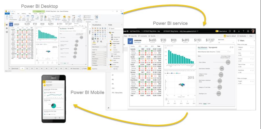
These three Power BI components are intended to assist you in producing, disseminating, and consuming business insights in the most efficient manner possible for you and your role.
Apart from those three, Power BI has two more features:
- You can use the Power BI Report Builder to create paginated reports that you can distribute via the Power BI service.
- After developing your Power BI reports in Power BI Desktop, you can publish them to Power BI Report Server, which is an on-premises report server.
| If you want to enrich your career and become a professional in Power BI, then enroll in "Power BI Training". This course will help you to achieve excellence in this domain. |
Why Power BI?
Power BI is regarded as one of the greatest Business Intelligence(BI) tools in the world for the following reasons:
- Connecting to data sources is simple: A wide range of data sources are supported by Power BI, allowing users to more easily match data sets from various sources and use them to create visually appealing reports. It contains more than 70 connectors which can extract data from Google Analytics, Azure Data Warehouse, CSV, Excel, OneDrive, SQL databases, Dropbox, and other sources.
- High Performance: The Power BI pivot data modeling engine is a columnar database that shrinks original data sets from 1GB to 200 MB, significantly improving performance metrics.
- Custom Visualisation: Power BI has a large number of pre-designed data visualizations that can be used to build interactive reports. Custom visualizations generated and produced by in-house developers in the Power BI community can also lend a special touch to the reports.
- R Integration for Advanced Analytics: Thousands of packages specializing in visualization and data mining are available in R, the programming language. R is a programming language used by data scientists for complex data modeling, statistical computation, and machine learning. We can import data models generated in R directly into Power BI dashboards and turn them into visualizations.
- Integration with Cortona: Microsoft's digital assistant Cortana is also supported by Power BI, allowing users to ask questions about data and access dashboard content using their voice. Users on mobile devices can even create many views by merely speaking or typing their queries.
| Related Article: Power BI Career Opportunities |
Best Power BI Projects
Let's have a look at some Power BI project examples that you can construct and mention in your resume or portfolio. These projects can also be used to practice and gain hands-on experience with the different Data Visualisation Tools.
Power BI Project Ideas For Beginners
# 1. Analysis of the Energy Trade
Various areas of global energy production and exchange are explored in this study. This project examines a number of themes, including the rise of wind energy and the use of energy consumption to compare country economies, among others.
For this research proposal, make use of the international energy statistics dataset. As a result of this work, Power BI dashboards will provide overall energy statistics, such as primary/secondary energy production, trade, and usage, as well as new/renewable energy sources and conventional/non-conventional energy sources. Power BI data visualization tools can be used in this project for a variety of scenarios, as seen below:
For the overview/summary page, flow maps, use cards, bar charts, and so on, for the energy production and exchange pages, use bar charts, treemaps, ribbon charts, and so on.
# 2. Analysis of Financial Performance

For financial analysis, Microsoft Power BI is used to collect and evaluate KPIs (Key Performance Indicators), financial statements, and charts. This BI project's goal is to improve financial reporting in an organization that offers client accounting services that require crucial financial reports delivered quickly. You will be able to swiftly and easily access solid financial reports as a result of this study. This project may make use of multi-company financial datasets.
The project described here can also be used to migrate from Excel to BI dashboards for traditional financial reporting, allowing clients to keep a better watch of their financial health and productivity. The following three scenarios can be used using Power BI data visualization choices in this project:
- For the summary page or overview page, combo charts and funnel charts (such as line charts, column charts, and waterfall charts) are recommended.
- For the income statement page, use Funnel Charts, Cards, and Combo Charts (such as Column Charts and Line Charts).
- For the balance sheet page, there are tables and cards.
# 3. Detecting Anomalies in Credit Card Transactions

Credit cards are increasingly being utilized, resulting in a rise in fraudulent activities (unauthorized access to an individual's payments or accounts). One of the most crucial uses of anomaly detection is credit card fraud detection. Here is where Power BI enters the picture. Credit Card Transaction Anomaly Detection Project is a method for detecting suspicious events (outliers) or data that could cause issues for the concerned authorities. It's a machine learning technique for detecting unexpected things, occurrences, or observations while making credit card purchases that appears suspicious. This approach can be used in three different ways, as shown below:
- For trained datasets, semi-supervised.
- For datasets with no labels, unsupervised learning is used.
- For labelled datasets, supervision is required.
You can utilize either the credit card dataset or the card fraud detection dataset if you're working on this project. The first step is to load the dataset into the Power BI desktop, which can be done using a web connector if necessary. You can then use Power BI to train or apply a pre-trained model to detect anomalies. In Power BI, you can find outliers that can be labelled using the get outliers() method after executing a Python script in the Power Query Editor.
The Outliers can then be visualized using Power BI Dashboards. Bubble charts, Line charts, treemaps, and other data visualization tools may all be found in Power BI dashboards.

# 4. Analysis of Marketing Campaign Insights
A well-executed marketing campaign is an excellent approach to reaching out to potential customers, leads, and clients. An examination of your campaign statistics might reveal important information about your marketing channels, budget, and target audience. Then you'll be able to figure out how to carry out your next marketing campaign (or how not to conduct it). Here is where Power BI stepped in.
We recommend this project to demonstrate the effectiveness of different marketing campaigns as well as the characteristics of product and platform performance analysis. This project can be used to evaluate the marketing campaign's success and other activities that are carried out under his supervision. The Marketing Analytics dataset can be used for this beginner-level project (This project gives information on the channel's performance and customer preferences).
EDA, visualizations, and statistical analysis are all possible with this dataset. Smart Narratives for emphasizing key components of the campaign, Cards for highlighting individual insights, Bar charts for spending by category, Customer-specific expenditure bubble charts, Campaign success rates in column charts, and so on may all be included in a Power BI dashboard.
# 5. Analyzing Data on Life Expectancy
Life expectancy is an important indicator for assessing population health. When assessing the health of a population, its characteristics, and researching human diseases and natural population fluctuations, it is important to analyze life expectancy data. This is where Power BI enters the picture.
Mortality, Immunizations, finances, social issues, and other health-related topics will all be considered in the Life Expectancy Data Analysis study. This will enable countries to identify the determinant of a shorter life expectancy. It will also assist a country in determining which areas should be targeted in order to improve life expectancy. You can use the WHO life expectancy dataset for this project. Power BI data visualization tools can be used for a variety of scenarios in this project, as seen below:
- For the overview page, you can use gauge charts, line charts, pie charts, point maps, and so forth.
- For displaying statistics by country, use Doughnut Charts, Treemaps, and Tornado Charts.
Power BI Project Ideas For Intermediate Level
# 6. Analysis of Airport Performance

Passenger numbers in the aviation industry increased dramatically over the world. Currently, approximately 5,000 aircraft transport passengers and goods around the globe. Keeping these flights running these flights(Maintaining), on the other hand, demands swift decision-making and a great deal of planning. Here is where Power BI enters the picture.
Airport data will be studied in the Data Analysis of Airport Authority project to provide a comprehensive picture. The count of flights (outgoing and incoming), the count of delays (departures and arrivals), passenger comments, and ground processing times are all displayed on the summary page of Power BI dashboards. When flight adjustments, crises, or delays occur, This type of analysis could be used by airport management agencies to make fast choices. This project proposal can make use of the Airline Delays and Cancellations dataset. Power BI data visualization tools can be used for a variety of scenarios in this project, as seen below:
- For flight analysis, use cards, tornado charts, bar charts, flow maps, treemaps, and other visual aids.
- For passenger input, use column charts, bar charts, cards, and other visual aids.
# 7. Analysis of Global Health Expenditures

Over the last two decades, analysis of global health expenditure has provided comparative statistics on 192 countries' health spending. PyCaret (a Python machine learning library) is utilized in this project to implement Power BI clustering analysis. Clustering is the process of accumulating data objects with similar characteristics. Data clustering aids in finding underlying data structures, whereas these classifications aid in detecting patterns, reviewing datasets, and analyzing data.
The World Health Organization’s (WHO) current health expenditure dataset, i.e Global Health Expenditure Database can be used for this project. You might also perform your clustering analysis using the K-Means technique. After you've loaded the dataset into Power BI Desktop and then train your clustering model in Power BI, you can use Power BI Dashboard to display the cluster labels and obtain insights. For the summary page dashboard, you may use visualization chart kinds like filled Maps, Bar Charts, and so on, while for the deep visualization, Point Maps can be used.
# 8. Analysis of Covid Insights

Covid-19 wreaked havoc on humanity's entire civilization, as we all know. Global leaders were obliged to take urgent steps to prevent the sickness from spreading due to the rapid breakout across all countries. This is where Power BI enters the picture.
This Covid insight analysis project aims to provide a full explanation of the situation at the national level as well as a comprehensive summary of the pandemic's important parameters. A Power BI dashboard that presents useful information on active cases, deceased patients, and recovered cases, as well as mortality and recovery rates by nation and timeframe, may be created.
A dashboard can potentially provide a deep examination of individual report pages, as well as a management summary of the key performance indicators. It's a fantastic project that keeps you informed about how things are progressing. Heat Maps can also be utilized to improve the representation of your project's dashboard.
You can utilize the Covid-19 dataset for this project concept. Power BI data visualization tools can be used for a variety of scenarios in this project, as seen below:
- For the overview page, you can use point maps, bar charts, column charts, line charts, and so on.
- Doughnut charts for a case analysis by category.
- Decomposition Trees for Case Analysis by Country.
# 9. Analysis of Customer Retention

Customer migration is a big concern for modern businesses (churn). Customer attrition, often known as churn, occurs when customers cease buying from or interacting with a company. The goal is to understand why consumers leave, as well as the variables that influence their decision so that suitable actions can be done to keep them. This is where Power BI enters the picture.
This Customer Churn Analysis study will help you figure out why customers cease using your product or service. This Power BI project can be used by business executives, managers, or analytical users to analyze regional business growth and profit distribution among customers. They can obtain a lot of information if they use the correct display and data structure.
Regional cash inflows, as well as product-specific churn over time, will be considered as part of the study. You'll need the customer segmentation dataset to do this beginner-friendly project. Power BI data visualization tools can be used in this project for a variety of scenarios, as seen below:
- For the overview page, there are combo charts, line charts, bar charts, tables, cards, and so on.
- For the customer segmentation page, there are bubble charts, column charts, tables, point maps, and so forth.
# 10. Analysis of Product Sales Data

Businesses should retain accurate sales records because they can give them significant insight into how well their firm is operating, which things are proving to be profitable, and what changes they can make. Businesses with an excellent track record have a better chance of succeeding. The issue develops when there is a large amount of data to keep track of, making it difficult to keep track of everything. This is where Power BI stepped in.
Companies can keep track of their sales and obtain answers to all of their inquiries about how they fared with the Sales Data Analysis Project. We'll use Microsoft's example dataset to visualize profit by product and sales, as well as other important elements that can affect a company's performance. However, the data collection must be connected to Power BI Desktop in order for irrelevant data to be deleted before the filtered data can be visualized and exported as dashboards. For the dashboard, you can use Doughnut Charts, Pie Charts, Funnel Charts, Bar Charts, and other Power BI visualization types, such as Pie Charts, Bar Charts, Doughnut Charts, and Funnel Charts. More Power BI projects and complex visualizations can be created using the same sample dataset (Microsoft's sample dataset).
| Related Article: Power BI Visualisation Types |
Advanced Level Power BI Project Ideas For Practice
# 11. Insurance Company Cashflow Optimization with AutoML
Automated Machine Learning (AutoML) is a technique for automating the time-consuming, iterative processes of Machine Learning. It allows data scientists and analysts to quickly build machine learning models while maintaining model quality. The ultimate goal of any AutoML system is to choose the best model based on a set of performance metrics.
You can use the Kaggle medical cost personal dataset in this project. The business problem includes an insurance company that wants to enhance its cash flow estimates by accurately anticipating patient charges at the time of hospitalizations using demographic and primary patient health risk indicators. The first step is to open the Power BI Desktop, then load and duplicate the dataset. After that, the Python script can be run in Power Query, where the compare models() method may be used to train, compare, and assess alternative models.
You can also use the automl() function to discover the model that performs the best out of them all. You can use Power BI dashboard tools like Bar Charts, Bubble Charts, Tables, and more to create the final dashboard.
# 12. Visualization of Film Sales

The Movie Sales Visualization project's goal is to turn a dataset depicting movie sales over time into an interactive visual experience. You can utilise the IMDb dataset, which is available on both IMDb and Kaggle, for the years 2006 to 2016. A list of movies with an IMDb score of 6 or higher, as well as the characteristics Budget, Gross, Genre, and Scores, are included in the dataset.
To be connected directly into PowerBI, you can design a custom Radial Bar Chart and use Slicers to select Genre, Country, and score range. For the selected set, this would show parameters like Average Score and Gross Collections. Alternatively, drawing a Histogram on the score variable using year and genre as slicers will provide the IMDb score frequency distribution. A density graph and insights into the average rating for a specific genre and distributions over a given timeframe can be obtained from a KDE plot.
# 13. Analysis of Healthcare Sales

The goal of the project is to make it easier for those in the Animal Healthcare industry to keep track of the sales of items used to treat minor animal species. Businesses can compare product sales in the top-ranking and bottom-ranking cities in real-time. The project could create a detailed report on sales by therapeutic group and sales trends for any given time period.
On Kaggle, you can look at the pharmaceutical sales dataset. Tables for displaying therapeutic group-wise sales; Column Charts for monthly sales trends; Bar charts for top and bottom-ranking cities; and Treemaps, Cards, Smart Narratives, and other data visualization options available in Power BI. You can also look for beginner-friendly power bi project examples in the Microsoft Power BI community.
| Related Article: Power BI Interview Questionns and Answers |
# 14. Examination of a Loan Application

This project concept involves analyzing loan application data to identify abstract 'themes,' which are then utilized to determine the impact of specific subjects (loan kinds) on the default rate. It is built on using Power BI to create the Latent Dirichlet Allocation (LDA) topic, model. The goal of topic modelling is to evaluate a collection of texts and automatically find the abstract 'themes' within them.
You can use the Kiva dataset, which is available on GitHub and contains loan data for 6,818 accepted potential borrowers, for this project. The information includes the loan amount, country, gender, and some text data from the borrower's application. After you've trained your model and added the topic weights to the original dataset in Power BI, you can view it using the Word Cloud tool, Pie Charts on basic maps, Scatter Charts, Bar Charts, and so on in the Power BI dashboard.
# 15. Data Analysis for Construction Permits

The goal of the project is to enable construction companies to have a better understanding of the business by allowing them to go deeper into the details and investigate significant instances. You can narrow down your project to specific details like investment growth over time, investment concentrations in specific areas, whether the investment is influenced by Category, Contractor, or Individual, market status, and which categories, individuals, and permits are driving the market forward.
Use Kaggle's Seattle building permits dataset for this project proposal. Regional Maps, Pie Charts, Bar Charts, Tables, Cards for the main page, Bar Charts, and Line Charts for illustrating contractor competitions and category-wise growth, and so on can be used to visualize data in Power BI.
Conclusion
Power BI is a business intelligence application that allows you to analyze and visualize data. We went over what is Power BI, why it's important, and the top Power BI project ideas to hone your visualization abilities and data analysis throughout this article. In general, examples of the Power BI projects assist businesses in getting actionable insights from enhanced data visualization. Users may construct dynamic dashboards and share that across the internet with Power BI. Also Power BI allows you to work on separate projects with additional stakeholders and users.
Intermediates, Beginners, and professionals will be able to hone their abilities and learn how to truly combine data science and business intelligence with these Power BI project ideas. You'll develop a better knowledge of how Power BI may be utilised for a data-driven approach to different data science sectors as you work on these project ideas.
 On-Job Support Service
Online Work Support for your on-job roles.

Our work-support plans provide precise options as per your project tasks. Whether you are a newbie or an experienced professional seeking assistance in completing project tasks, we are here with the following plans to meet your custom needs:
- Pay Per Hour
- Pay Per Week
- Monthly
| Name | Dates | |
|---|---|---|
| Power BI Training | Jul 28 to Aug 12 | View Details |
| Power BI Training | Aug 01 to Aug 16 | View Details |
| Power BI Training | Aug 04 to Aug 19 | View Details |
| Power BI Training | Aug 08 to Aug 23 | View Details |

Madhuri is a Senior Content Creator at MindMajix. She has written about a range of different topics on various technologies, which include, Splunk, Tensorflow, Selenium, and CEH. She spends most of her time researching on technology, and startups. Connect with her via LinkedIn and Twitter .


