
- About QlikView Scripting & Qlikview Hidden Scripts
- QlikView Circular Reference
- OLE DB/ ODBC Connection to Qlikview Data Sources
- Best Practices for Data modelling in QlikView
- Definition And Advantages of QVDs in QlikView
- How to Fix Circular References & Remove Synthetic Tables
- Concatenating Two Tables in QlikView
- Creating Data Islands in QlikView using Data Source
- Optimize QlikView Application User Interface
- Learn SET Analysis Syntaxes, Examples in QlikView
- QlikView Table Viewer - Previews Records
- Process of Incremental Load in QVD QlikView
- QlikView Architecture
- Binary Load in QlikView
- QlikView Data Transformations in Flat Files
- Intervalmatch Function in Qlikview
- QlikView Interview Questions
- Qlikview Management API
- Qlikview Mapping
- QlikView Metadata
- QlikView Qualify
- QlikView Tutorial
- QlikView vs Qlik Sense
- Color Alerts and Calculated Colors In QlikView Scripting - QlikView
- How Debugging works in QlikView Script Debugger
- Rename Field and Qualify in Qlikview
- Script Editor Features and Commands in QlikView
- Script Expressions & Quotation marks in Qlikview
- Qlikview Scripting Features and Functions
- Star schema and Snowflake schema in QlikView
- Synthetic keys in QlikView
- Table Viewer in QlikView
The bubble chart in QlikView is an extension to the scatter chart. Compared with scatter charts, bubble charts contain an additional dimension to represent the size. Bubble charts are helpful in detecting outliers and correlations that are uncovered. Through this article, you will get detailed knowledge about building bubble charts.
The Bubble chart in the QlikView will deliver within the browser using VML or else SVG. It also displays certain tips when the position of the bubble is moved. It is mostly used to visualize the given data sets in two or else four dimensions. The visualization of the first two dimensions is as coordinates and the third one is for color and the fourth is as size.
| If you would like to become a Qlik Sense Certified professional, then visit Mindmajix - A Global online training platform: " Qlikview Training Course ". This course will help you to achieve excellence in this domain. |

How to build a Bubble chart in QlikView?
Everyone has had a basic knowledge of custom tables in the QlikView technology before. It mainly allows the users to build the reports and also helps to select the required combination of dimensions and measures of pre-defined lists. It also helps to perform a job like multiple tables and also encourages user-driven analysis. It is also a sort of precursor to Qlik Sense.
| Related Article: QlikView IntervalMatch |
In a simple manner, the bubble chart is considered as the variation of scattering with an additional measure that can be shown or represented by size. It is probably used to spot correlations and outliers which might have probably been missed. When creating a custom bubble chart, one must face a challenge which is compared to the table that shows certain conditions. The specific inputs are given as X-axis, y-axis, and bubble size. There are certain measures that are possible with certain conditions that may not give a guarantee on the correct order. When there is a requirement of only one dimension then it is more easy and elegant to calculate or else maintain single dimensions.
Follow the below steps to create a custom bubble chart
First, you have to create a table with all the required measurements and dimensions. It is better to perform it in the spreadsheet which can be easily used and updated in the further requirements.
In the below screenshot, you can see a table in the spreadsheet.
- After that load them as data islands that make sure to hide from various fields from the given users. Probably the measurements need to be loaded three times. You can also repeat for Y and Z as well
In the below screenshot, you can see the selection of the x-axis and z-axis.
- You can simply, build your chart by adding calculated dimensions and the three required measures.
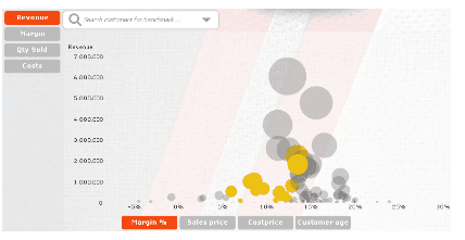
In the below screenshot, you can see the bubble chart built using the corresponding table.
- The last step is to add four list boxes that you require calculating with the given conditions in the chart. This will happen when the selections are missed and the colors show more information about the dimensions.
| Related Article: Metadata in Qlikview |
Making of Bubble Chart
This scatters chart or else Bubble chart is quite easy to make in QlikView Technology. There are a few things where you may probably get confused. The basic thing to get confused about is the Dimension where you may think whether it is identical to one ax of the chart. Sometimes, the logical dimensions are not the same as the graphical ones as well.
Generally, each bubble represents the country which could be one bubble for the customer, product, or else supplier. There will be some dimensions and also measures that will play a vital role in the chart.
| Related Article: QlikView Interview Questions |
Where Should be the Bubble Be Positioned?
In some of the graphs, the X-Coordinate is for the per Capita GDP and the y-coordinate is for life expectancy. One can also probably use certain gross margins, total order values, net cost, or else some other numbers. All these are generally used for the axes in the graph. There is a requirement of two expressions wherein the other purpose, you can also have use of the third expression. The third expression will be for the size of the bubble. When it probably comes to the measures, the next confusing thing is that the country has its own one GDP but this QlikView wants an aggregation function such as sum() or else Avg(). The main cause or else reason is that QlikView will not “know” the data in the several records which is exactly for each dimensional value. To tell the exact value, there will be a usage of aggregation function to tell that QlikView to perform that it must contain more than one record. For sure there should be one record per dimensional value which is not a matter of using sum() and avg().

You can generally perform it in an exact manner once the dimensions or else expressions are known clearly.-
- Firstly, create a chart and then use a scatter chart. Then click on the Next button
- Add the dimensions that you thought of and click on the Next button
- Then add extra fields where you can use two expressions like X and Y controls
- If you want the requirement of a bubble chart then you must add the third expression that determines the size of the bubble
- Check ‘advance mode’ to the lower left. Then the QlikView 11 probably jumps to the sort page so that you need to click on the back for verification of the right aggregation functions for the expressions that are used. The functions can also be changed as per the opinion
- Then click on the Finish
| Related Article: Data Modeling in QlikView |
After completion of the above process, Now you have made a bubble chart. To make more beautiful with certain styles then you must follow given below
- Choose the style as per your wish that is [style-look]
- Increasing of bubble size [Presentation-Max bubble size]
- You can event change of one or both axes [Axes]
- In this, you have to remove the Force 0 options
- Use a logarithmic scale

The color code of the bubble will be as per the performance that can also communicate with a target line.
By using this chart in the QlikView, it is a high efficiency that helps to take up the next advanced level. Here are the main reasons to use are
- Within the tiny space, a lot of communication can take place
- The best output is taken which shows the relevance of any ratio against absolute outcomes
- Probably indication will be given in 2 or else 3 measures that also shows the relationship of the data
- Instantly, you can see outliers
- It is highly powerful when it comes to information design
| Explore QlikView Sample Resumes! Download & Edit, Get Noticed by Top Employers! |
Conclusion
A bubble chart is useful for analyzing and displaying the data. We can study the relations between the given data. I hope this article helps you in getting the required information.
If you have any queries, let us know by commenting in the below section.
 On-Job Support Service
Online Work Support for your on-job roles.

Our work-support plans provide precise options as per your project tasks. Whether you are a newbie or an experienced professional seeking assistance in completing project tasks, we are here with the following plans to meet your custom needs:
- Pay Per Hour
- Pay Per Week
- Monthly
| Name | Dates | |
|---|---|---|
| QlikView Training | Jul 21 to Aug 05 | View Details |
| QlikView Training | Jul 25 to Aug 09 | View Details |
| QlikView Training | Jul 28 to Aug 12 | View Details |
| QlikView Training | Aug 01 to Aug 16 | View Details |

Vinod Kasipuri is a seasoned expert in data analytics, holding a master's degree in the field. With a passion for sharing knowledge, he leverages his extensive expertise to craft enlightening articles. Vinod's insightful writings empower readers to delve into the world of data analytics, demystifying complex concepts and offering valuable insights. Through his articles, he invites users to embark on a journey of discovery, equipping them with the skills and knowledge to excel in the realm of data analysis. Reach Vinod at LinkedIn.


