
- Django Interview Questions
- Python Array Examples
- Python enum
- Python Enumerate with Example
- Python Flask Tutorial For Beginners
- Python For Beginners - Way To Success
- Python For Data Science Tutorial For Beginners
- Python for loop
- Python GET and POST Requests
- Python IDEs for Python Programmers
- Python Interview Questions
- Python Lists with Examples
- Python Partial Function Using Functools
- Python Print
- How to generate random numbers in python
- Python Regular Expression (RegEx) Cheatsheet
- Python Sleep Method
- Python List Methods
- Python Split Method with Example
- Python String Functions
- Python Tutorial
- Python Variable Types
- Python vs Java
- Python vs SAS vs R
- Python Operators
- Code Introspection in Python
- Comprehensions in Python
- Python Exception Handling
- Defining Functions - Python
- Generators & Iterators in python
- Install Python on Windows and Linux
- Introduction to Python Programming
- Lists concepts in Python
- Loops in Python
- Regular Expression Operations in Python
- Python Serialization
- String Formatting - Python
- R vs Python: Which is better R or Python?
- Six Digit Salary With Python
- Top 20 Python Frameworks List
- Why Learn Python
- Python Substring
- OOPs Interview Questions
- Career Shift To Python : Success Guaranteed
- Face Recognition with Python
- Go vs Python
- Pyspark Interview Questions
- Python Pandas Interview Questions
- OpenCV Interview Questions
- Python Project Ideas
- Flask Interview Questions and Answers
- Array Interview Questions
- What is PyCharm?
- What is Anaconda Navigator
- Numpy Broadcasting - Detailed Explanation
- Python Data Science Interview Questions
- Genpact Interview Questions
- Python Developer Job Description
- Pandas Projects and Use Cases
- DataFrame Tutorial
- How to install Python on Windows
- Pyspark DataFrame
Seaborn is an open-source web framework that developers can use to create web applications.
Seaborn is a Python package that is mainly used for creating statistical visuals. It offers lovely default styles and color schemes to enhance the appeal of statistics charts. It is constructed on top of the Matplotlib toolkit and is tightly integrated with the Pandas data structures. Seaborn is compatible and easy to use with data frames and the Pandas library.
The following list is some of the advantages of using data visualization.
- When using graphs, it is simpler to convey your data to non-technical folks.
- Graphs can help us identify helpful data trends in any machine learning or forecasting project.
- Readers will find presentations and reports more enticing when the graphs are visually pleasing.
The goal of Seaborn is to make the process of data exploration and comprehension heavily reliant on visualization. It includes dataset-oriented APIs, enabling us to transition between several visual representations for the same variables to understand the dataset better.
| What is Seaborn in Python - Table of Contents |
What is Seaborn in Python?
Python Seaborn is a data visualization library primarily used when statistical plotting visuals in Python is required. Seaborn comes into play when there is a need for such a library.
Here are a few points to include on seaborn in the Python library is
- Seaborn Python includes a wide variety of styles activated by default in addition to stunning color palettes, contributing to the visually appealing appearance of the statistical graphs.
- It does this by integrating the Matplotlib package with the data structures that are already available in pandas.
- It allows us to generate data visualizations with a heightened level of detail.
- It helps us understand the data by putting it in a visual context, which enables us to discover any hidden relationships between variables or trends that might not have been visible at first. In contrast to Matplotlib's low-level interface, Seaborn's is far more user-friendly and intuitive.
The Seaborn in python library's primary goal is to give users a graphical depiction of the library's inner workings to better understand and interact with the data. Many application programming interfaces (APIs) focus primarily on datasets, allowing users to switch between different visualizations while keeping the same data intact. The goal is to gain a deeper comprehension of the facts provided visually in the form of visuals or graphs.
| If you want to enrich your career and become a professional in Python, then enroll in "Python Online Training". This course will help you to achieve excellence in this domain. |
How to Install Python Seaborn?
Before we use Seaborn, we must first install it, and I will demonstrate some methods for doing so on your computer.
Installing and getting started with Seaborn is as follows:
Using Pip Installer
The pip package manager has become the de facto standard for Python applications.
pip install seaborn
Using Anaconda
Anaconda is a Python distribution that combines a package manager with an environment manager and a wide variety of open-source modules. After installing Anaconda, you can use the conda command or the Anaconda package manager to install any additional packages you may require.
conda install seaborn
You can install Seaborn straight from GitHub's development branch by entering this line at the command prompt.
pip install git+https://github.com/mwaskom/seaborn.git#egg=seaborn
Additionally, ensure that the following dependencies are installed on your computer
- Matplotlib
- SciPy
- Statsmodels
- NumPy
- Pandas
- Python 3.6+

Python Seaborn Plotting Functions
The Seaborn library offers a variety of plotting tools, which facilitate the viewing and interpretation of data more simply. During this session, you will review some of the more important Seaborn Plots.
Let's move on to talking about how to plot categorical data with seaborn! A few primary sorts of Seaborn Plots can be used for this
Now let’s understand seaborn in python plotting functions to understand better how these categorical variables might be represented graphically.
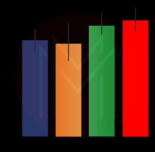
1. Barplot
A seaborn barplot's primary use is to aggregate categorical data according to a predetermined method, typically the mean, but other options are also possible. It is also possible to interpret it as a depiction of the group due to their actions. To apply this seaborn barplot, we first select a numerical column for the y-axis and a category column for the x-axis. Then, we observe that it generates a barplot that takes a mean for each categorical column.
Syntax
barplot([x, y, hue, data, order, hue_order, …])Example
- Python3
# set the background style of the plot
sns.set_style('darkgrid')

# plot the graph using the default estimator mean
sns.barplot(x ='sex', y ='total_bill', data = df, palette ='plasma')

# or
import numpy as np

# change the estimator from mean to standard deviation
sns.barplot(x ='sex', y ='total_bill', data = df,
palette ='plasma', estimator = np.std)
Output

Explanation
When we look at the plot, we see that males have a higher average total bill than females. It leads us to conclude that the difference between the sexes is significant. The palette is what's used to decide what hue the plot will be. The statistical function known as an estimator is utilized for estimating values within each category bin.
2. Countplot
A Seaborn count plot counts the categories and outputs a count of how frequently each category appears. It is one of the seaborn library's plots that is regarded as being among the simplest.
Syntax
countplot([x, y, hue, data, order, …])Example
- Python3
sns.countplot(x ='sex', data = df)Output
Explanation
Looking at the plot, we can see that the number of males in the dataset is significantly higher than the number of girls. Because it simply returns the count based on a category column, the only parameter that needs to be specified by us is the x parameter.
3. Boxplot
The Seaborn boxplot, or whisker plot and box, is a graphical representation of the distribution of numerical data used to draw comparisons between the two variables. The middle two-fifths of the data set are depicted by the box, with the outliers, or "whiskers," extending outside the box to display the whole distribution.
Syntax
boxplot([x, y, hue, data, order, hue_order, …])Example
- Python3
sns.boxplot(x ='day', y ='total_bill', data = df, hue ='smoker')Output
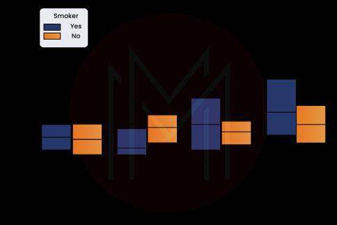
Explanation
The column denoted by x is the category column, and the column denoted by y is the numerical column. As a result, we can view the cumulative bill for each day. The "hue" option is used to provide a categorical differentiation further. When we look at the plot, we can see that the people who don't smoke had a more significant bill on Friday than those who smoke. It is because non-smokers have a higher average bill.
4. Violin plot
Seaborn violin plot is comparable to the boxplot, with the exception that it offers a higher and more sophisticated level of visualization, and it employs the kernel density estimate to offer a more accurate representation of the data distribution.
Syntax
violinplot([x, y, hue, data, order, …])Example
- Python3
sns.violinplot(x ='day', y ='total_bill', data = df, hue ='sex', split = True)Output

Explanation
The sex category is combined with color to segregate the data further. Using the split=True parameter will result in each level drawing one half of a violin. The direct comparison of the distributions may become more straightforward due to this.
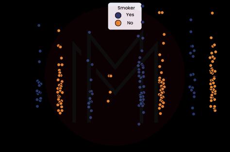
5. Strip plot
The Seaborn strip plot generates a scatter plot depending on the category in its most basic form.
Syntax
stripplot([x, y, hue, data, order, …])Example
- Python3
sns.stripplot(x ='day', y ='total_bill', data = df,

              jitter = True, hue ='smoker', dodge = True)
Output
Explanation
- We use the jitter option to provide some randomization because it is hard to tell which points are stacked atop one another when using a strip plot.
- When multiple points overlap, the jitter parameter is used to add a certain degree of jitter (just along the category axis), which may be helpful to make the distribution easier to see. The jitter parameter introduces some jitter (only along the category axis).
- Hue is used to provide a more thorough level of category separation.
- To create distinct strip plots based on the category indicated by the hue parameter, you must set split=True in your plotting tool.
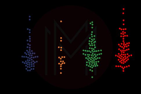
6. Swarm plot
Some individuals like to combine the concepts of a Seaborn violin plot and a strip plot to create the Seaborn swarm plot, which is otherwise quite similar to the strip plot except that the points are adjusted so they do not overlap.
Unfortunately, Seaborn python swarm plots only sometimes work well with large numbers, and organizing them can be computationally intensive. Therefore, a swarm plot can be correctly visualized by plotting it on a violin plot.
Syntax
swarmplot([x, y, hue, data, order, …])Example
- Python3
sns.swarmplot(x ='day', y ='total_bill', data = df)Output
7. Factorplot
Being the most generic of all python Seaborn plots, it allows us to select the specific plot type we need using a parameter named "kind," avoiding the need to rewrite them all individually. The Seaborn factor plot parameter "kind" accepts values such as "bar," "violin," "swarm," and so on.
Syntax
sns.factorplot([x, y, hue, data, row, col, …])Example
- Python3
sns.factorplot(x ='day', y ='total_bill', data = df, kind ='bar')Output
| Related Article: Python Programming |
Data Visualization in Python
Python provides many plotting libraries, such as Matplotlib and Seaborn, as well as many other data visualization packages. Each includes a unique set of features to create informative, customizable plots and visually appealing to present data most straightforwardly and efficiently possible.
Attempting to understand data by presenting it in a graphical format reveals correlations, trends, and patterns that might not be discernible in any other way. This is the core of the discipline of data visualization.
Python provides many excellent graphing libraries, each packed with various capabilities. Python provides an excellent library for you, whether you want to generate interactive charts or fully customized ones.
The following list of a few of the most well-known Python plotting libraries should provide you with a solid overview:
1. Seaborn
Python users interested in creating statistical representations might use the Seaborn package, which focuses on datasets. It is based on Matplotlib and may be used to create many different types of graphs.
Seaborn is connected with the data structures that pandas provide. It is recommended to utilize a Jupyter/IPython interface in Matplotlib mode. The library internally performs the appropriate mapping and aggregation to create relevant graphics.
2. Matplotlib
Matplotlib is a Python-based visualization library that may be used to plot two-dimensional arrays.
Python is the programming language used to create Matplotlib, and one of its dependencies is the NumPy library. It also works with the IPython and Python shells, as well as Jupyter notebooks and web application servers.
Matplotlib comes with a broad selection of plots that can assist us in gaining a more profound knowledge of trends, patterns, and correlations.
Some examples of these Matplotlib plots include line, bar, scatter, and histogram plots. In the year 2002, John Hunter was the one who first presented it.
3. Altair
Altair is a Python package for declarative statistical visualization. The Altair Application Programming Interface (API) is developed on top of the Vega-Lite JSON specification, making it user-friendly and consistent.
The declarative library suggests that while constructing any graphics, we must establish the connections between the various data columns and the channels (x-axis, y-axis, size, color).
Using Altair's help, generating visually informative content with a small amount of code is feasible. The visualization and interactivity within Altair are both controlled by declarative grammar.
4. Bokeh
The Bokeh library is an interactive visualization tool used with modern web browsers. It is appropriate for working with massive or flowing data sources and may be applied to creating interactive graphs and dashboards.
The collection contains various easy-to-understand graphs that can be used in developing solutions. It has close integration with the PyData utilities. The library is an excellent resource for creating individualized visuals tailored to particular use cases. Also, it makes the graphics interactive to serve as a model for what-if scenarios. Every one of the codes is open source and can be found on GitHub.
5. ggplot
The ggplot Python software package implements graphical grammar. When individuals refer to the "Grammar of Graphics," they mean the mapping of data to geometric objects (lines, points, bars) and aesthetic qualities (color, form, and size).
The grammar of graphics states that data, geoms (also known as geometric objects), coordinate systems, scale, stats (also known as statistical transformations), and facets are the essential elements that make up a graphic.
With the help of ggplot, you can create engaging visualizations in Python. You may build these visualizations iteratively, first understanding the details of the data and then adjusting the components to enhance the visual representations.
6. plotly
The plotly library in Python is an open-source, browser-based visualization tool that is declarative, interactive, and high-level declarative. It contains various helpful visualizations, including 3D graphs, scientific charts, financial charts, and statistical charts, among others.
Viewing a Plotly graph requires either a Jupyter notebook, a standalone HTML file, or hosting the graph online. The Plotly library includes a variety of options for editing and interacting. The powerful API performs faultlessly simultaneously in both the web browser and local modes.
| Related Article: Python Interview Questions |
Seaborn vs Matplotlib
The goal of Seaborn, according to its creator Michael Waskom, is to make difficult tasks easier. Technologies like Seaborn and Matplotlib are crucial for making sense of all the data as the use of big data increases.
Seaborn was designed with simplicity and ease, which is especially important given how quickly things can get complicated when using Matplotlib. Each tool has its benefits and drawbacks in providing a suitable means for data visualization.
#1 Interface
- Seaborn: Seaborn provides a high-level interface that you can use without putting in a lot of work to figure out the various syntaxes because they are pretty readable.
- Matplotlib: Matplotlib, on the other hand, has a low-level interface, which means that it may be challenging for novices to get started with the library and build stunning visuals on time. Matplotlib comes with a low-level interface.
#2 DataFrames
- Seaborn: Handling DataFrames in Python is particularly significant given that the vast majority of the datasets or pieces of data brought into the organization are either organized into DataFrames or saved within them. Without causing any additional headaches or complications, Seaborn can directly handle and interact with the Python DataFrame format that Pandas provides.
- Matplotlib: Matplotlib does not operate well with DataFrames, which can be a significant turnoff for people who only use DataFrames for their input data. It can be a huge turnoff for people who use only DataFrames for their input data.
#3 Themes
- Seaborn: When it comes to the availability of themes, Seaborn is ahead of the competition because it comes with a significant number of individualized themes and offerings that software developers can utilize for the graphs, plots, and charts they create.
- Matplotlib: If Seaborn is used instead of Matplotlib, the time that would have been spent making the plots appear appealing would have been better spent doing something constructive. Matplotlib requires significant time and effort to make the plots appear appealing.
Conclusion
Data visualization uses the Seaborn module that is available in Python. Seaborn is a very effective method for accomplishing the same goal. Because it is built on matplotlib, the user may easily customize his graphs and plots to meet his requirements. It is one of the many advantages of using the Seaborn feature.
After reading this article, you will understand what a seaborn library in python is and the varieties that fall under it. We have also understood its dependencies and programs written in Python that display the plots using seaborn.
 On-Job Support Service
Online Work Support for your on-job roles.

Our work-support plans provide precise options as per your project tasks. Whether you are a newbie or an experienced professional seeking assistance in completing project tasks, we are here with the following plans to meet your custom needs:
- Pay Per Hour
- Pay Per Week
- Monthly
| Name | Dates | |
|---|---|---|
| Python Training | Jul 25 to Aug 09 | View Details |
| Python Training | Jul 28 to Aug 12 | View Details |
| Python Training | Aug 01 to Aug 16 | View Details |
| Python Training | Aug 04 to Aug 19 | View Details |

Madhuri is a Senior Content Creator at MindMajix. She has written about a range of different topics on various technologies, which include, Splunk, Tensorflow, Selenium, and CEH. She spends most of her time researching on technology, and startups. Connect with her via LinkedIn and Twitter .


